
Rules to Better Interfaces (Forms) - 26 Rules
For specific Windows Forms Application rules, go to Rules to Better Windows Forms Applications.
There are different ways to align your form labels and each has its own pros and cons.
1. Left-aligned
When labels are left-aligned, the spacing between labels and input fields becomes inconsistent. The excessive visual distance between the labels and their corresponding input fields is a problem.
✅ Pros
- Easy to scan labels, especially if you have a lot of optional labels
- Takes a little more attention to fill in, so useful for complicated forms that require accuracy
❌ Cons
- Horizontal space, unlike vertical space, is not limitless, and an unintended horizontal scrollbar is the first sin of web development
- Slowest completion times
- Poor multilanguage support
- Not even very good responsive support
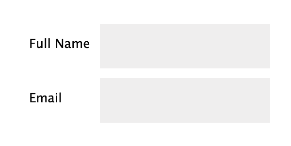
Figure: Bad example - Inconsistent spacing between labels and input fields 2. Right-aligned
Right-aligning labels ensures a consistent visual distance between the labels and their corresponding fields across the form. This strengthens the association between them, as objects placed closer together are perceived as related.
However, the inconsistent spacing on the left side of the forms makes it harder to scan the fields, leading to user discomfort and slower completion of lengthy forms.
✅ Pros
- Best at linking label and form
- Good completion rates on small, common forms (i.e. Login, Sign up)
❌ Cons
- Hardest to read and scan
- Poor multilanguage support
- Poor responsive support
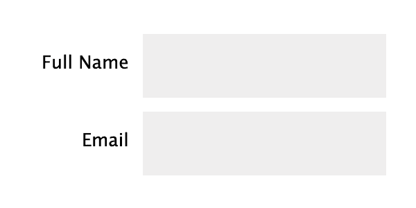
Figure: OK example - If aligning labels inline is necessary, opt for right-aligned labels 3. Top-aligned
In addition to being more visually appealing, placing labels above the input fields minimizes the visual distance between the label and the input field, creating a stronger cognitive association and enabling faster user response.
The downside of this alignment is that it increases the overall height of the form.
✅ Pros
- Easiest to process
- Fastest completion times
- Good for multiple languages
❌ Cons
- Takes up a lot of vertical space
- Makes a long-form look even longer
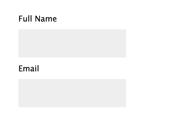
Figure: OK example - Top-aligned labels are space-efficient, making it adaptable to all resolutions 4. Adaptive placeholders
Adaptive placeholders are form labels that become into placeholders and vice-versa, depending on which fields have been filled or not. The placeholder is placed inside the form and slides up on focus and after field is filled. It gives the form a great UX.
✅ Pros
- Best for readability
- Best for visual connectivity
- Best for completion rates
- Decent multilanguage support
- Decent responsive support
❌ Cons
- Time-consuming to implement. Need to consider the cost/benefit
- Not always available on 3rd party platforms, like Wufoo or Microsoft Forms
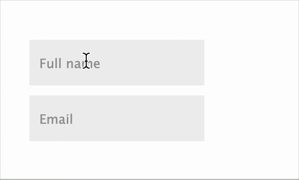
Figure: Good example - Using adaptive placeholders
You can find more useful information and examples in this nice article: Form design best practices.
Labels are essential for guiding users on what information to enter in a form field. To improve readability and consistency, keep labels clean and concise. Avoid unnecessary words and don’t end them with a colon (:), which is a common but outdated practice.
❌ Bad label examples ✅ Good label examples Please enter your full name: Full name Email Address: Email Your phone number: Phone Enter date of birth: Date of birth Company Name: Company Create a secure password: Create password Please confirm your password: Confirm password Any comments or feedback: Comments Tip: In web UIs like profile cards or contact pages, labels should be avoided whenever the content is self-explanatory (e.g.: “Phone:” or “Email:”). Keep it clean: less is more.
Usually there are problems fitting buttons next to datagrids or listboxes when trying to imply that those buttons add functionality to the datagrid or listbox.
Figure: Bad Example - This form places the Add and Delete buttons in the top right. 
Figure: Buttons aligned vertically, however they cut off useful information in the datagrid (Better) 
Figure: Good Example - Buttons align horizontally at the bottom right of the grid which provides plenty of room for then needed information When there are too many choices always Default to the most common ones. Then add a checkbox to allow the advanced users to turn off the common choices.
[x] Only include common choices
Likewise in a contacts database where you have entries from all around the world it is good to add a check box on the search screen similar to the following:
[x] Only include customers that have been updated by employees (not directly entered from the web)
A good example on that the checkbox on the search screen of TimePRO.NET:
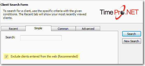
Figure: Default search tick box in TimePRO.NET Read our rule on Validation - Do you avoid capturing incorrect data?
If the form controls are different entities, they usually have different data and different validation, thus they should not be combined.Having the controls separated also make the form easier to read.
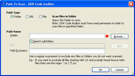
Figure: Bad Example - Different entities are combined 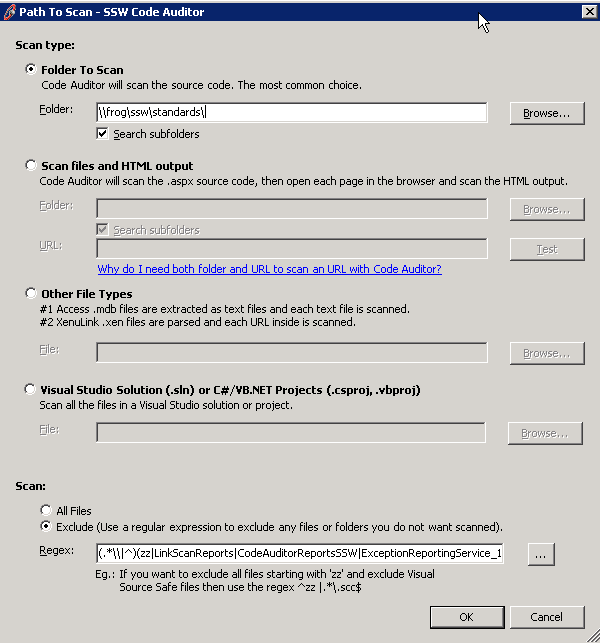
Figure: Good Example - Different entities are separated For any case of 'Add New', choose to open a new window (popup) for entering data.
Figure: The 'Add New' button changes from a view into a data entry form 
Figure: Bad Example - The 'Add New' button, shown in Figure 1, opened the page in the same window It is better to open in a new form, reasons being:
- It is better for the user in terms of clarity. The change of view to data entry form can be a surprise
- It is better to code e.g. if you are using this control in a couple of places you may need to show or hide 'Save' buttons etc. Otherwise, it is a pain to make it behave differently in different contexts.
However, you do need to call back on save and requery it.Use a modal form and requery it (DON'T use JavaScript, instead use the Modal Popup Form Example)An example of this is in Outlook with the 'New' button.
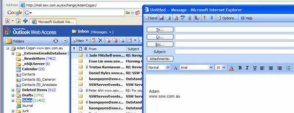
Figure: Good Example - the 'New' button in Outlook opens a new form for you to construct your email 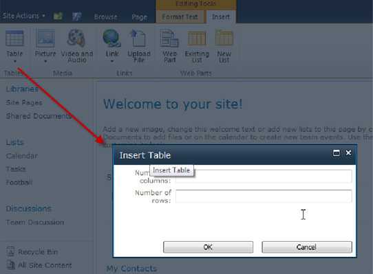
Figure: Adding a table in SharePoint have a popup with dimmed background The buttons that a user will typically use should not be dynamically labeled across your applications.
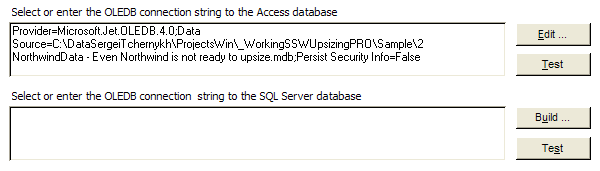
Figure: Bad Example - Buttons are dynamically labeled "Build ..." and "Edit ..." depending on text in the text box 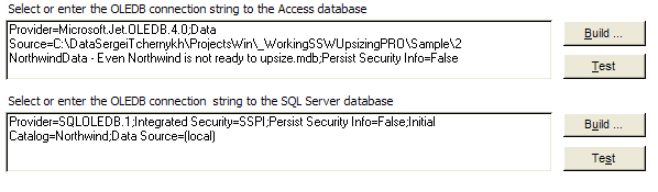
Figure: Good Example - Buttons are not dynamically labelled Using a separate menu to maintain ComboBoxes is never a good idea. A better solution is to use an ellipses button to drill down into the menu.
Figure: Bad Example - Menu driven ComboBox maintenance form 
Figure: Good Example - Use ellipses to drill down into a ComboBox maintenance form Combining data entry and find navigation is a mistake. I think 2 forms are better than one. I prefer a list box on one form with "Add", "Edit" and "Delete" buttons to a popup form. Rather than a listbox and the data entry fields on one form.
Figure: Bad Example - ListView with data entry fields in one form 
Figure: Good Example - ListView with only 'Add' 'Edit' 'Delete' buttons When you want to create a new entry or edit one, just click the buttons and open a new form with all the data entry fields.
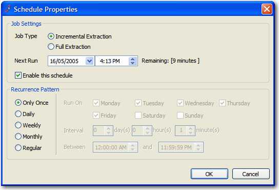
Figure: Good Example - Separate form with all the data entry fields Instead of using plain textboxes for notes, use rich textboxes. It allows you to use links to URLs, formatting (including bold, underline, italics, font type and font size, etc.), bullet points and numbering.
Figure: Bad Example - use of a plain textbox limits the detail of the user's notes 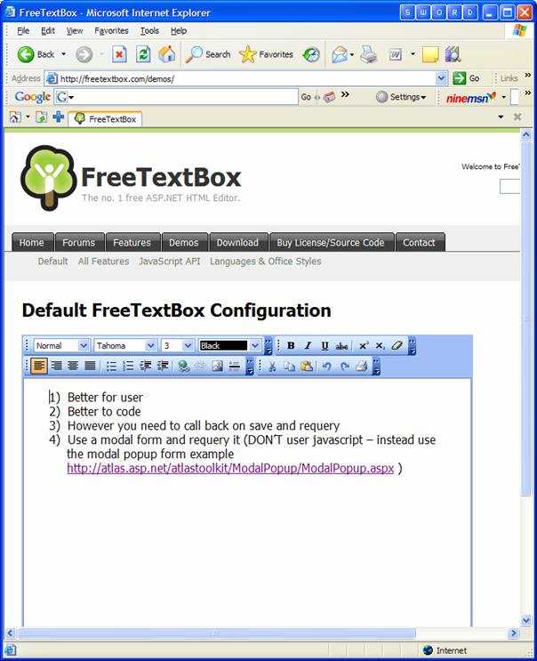
Figure: Good Example - with use of a rich textbox, you can use features such as bold, underline, highlighting and hyperlinks. See our page on The Best 3rd Party Web Development Tools and you will find the FreeTextBox Demo.
If you want to edit a single item in your form we suggest you use a popup form. This gives each form a definite function and neat UI design.
Figure: Bad Example - Edit controls and main UI are messed up. 
Figure: Good Example - Use a popup form to do edit. Despite seeming trivial, the most subtle elements of your form can have the greatest impact on your users.
Figure: Bad Example - See below what is wrong with this form The form shown in this screenshot is an example of bad control placement:
- The fonts used are non-standard
-
The controls have no consistency in terms of margins, spacing or even control alignment. See, for example:
- The navigation buttons at the bottom of the screen having uneven margin space on the right and bottom sides. They're also the wrong size.
- The dimensions of all input controls and buttons do not follow standard convention (see below)
- The right side of the "Build..." button is not aligned with the right of the "Connection String" text box
- The left margins inside the two frames are inconsistent.
- The space surrounding the logo in the top right corner is uneven
This detracts from the visual appeal of the user interface, and results in an uneven user experience. After looking at all of this you may be thinking " do I really need to work out exactly what spacing and dimensions I want to use for every detail of a form I make? "
The good news is that you don't need to: Microsoft have gone to a great deal of effort to define standards for exactly how your form controls should be laid out, and these standards are worth taking into consideration. By all means, if you have disagreements with anything listed here then please discuss it with us and we'll consider changing our own standards (Microsoft have changed theirs over the years, after all), but we recommend using the following as a guide.
These examples assume that you are using the standard system font as defined in the rule mentioned above. Please note that although Dialog Units (DLUs) are better suited for generic (font independent) use, they are not available in the Visual Studio designer.
Figure: Good Example - The form follows Standards of good form design discussed below The Rules
-
Buttons must be...
- Spaced apart by 6 pixels from other buttons except in the case of wizards where the < Back and Next > buttons may be closer together
- Spaced 6 pixels from the inside border of a form on the sides closest to it
- usually 75 pixels wide
- 23 pixels high
-
Single-line textboxes and most controls must be...
- 21 pixels high (width depends on content)
- Aligned correctly with any related controls
-
In a form...
- Margins must be consistent (see Microsoft's diagram illustrating this)
Ultimately the goal of all of this is to ensure consistency . Keeping these ideas in mind at all times while doing user interface design will give users a better overall experience and will boost the professionalism of your products.
One From The Good Guys
Here's a good example for you to take inspiration from. This dialog is from Microsoft Outlook. Let's check out some points:
- Consistency across wizard pages is very good
- Spacing and sizing of buttons is precise
- The logo has been positioned evenly
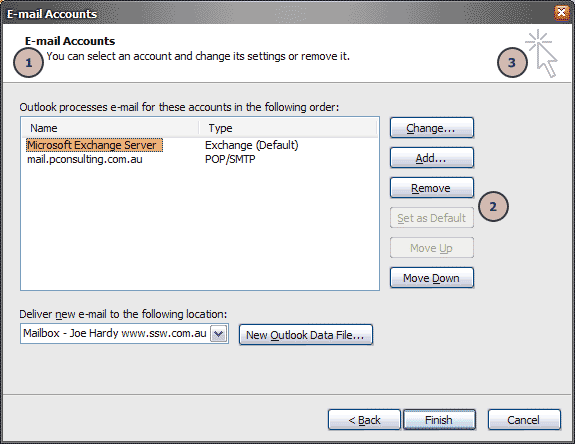
Figure: Good Example - Microsoft have defined to exacting measures what spacing should be used in their Microsoft Outlook wizards Read more about control size on the Rules to Better Windows Forms page.
FieldSet element allows you to group thematically related controls and labels. Grouping controls makes forms more accessible and easier for users to understand the purpose of filling the forms.
See the example below using "Your Details" and "Event Details".
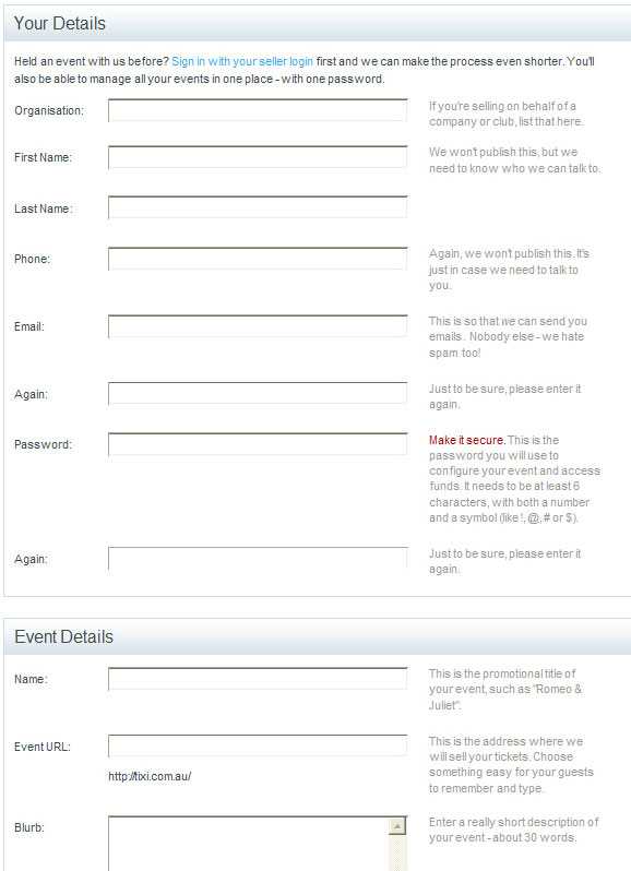
Figure: Good example - Use FieldSet for grouping Here's an example of how FieldSet works:
<fieldset>
  <legend>Your Details</legend>
  <p>
    <label for="FirstName">First Name: </label>
    <input id="FirstName" type="text" /><br />
    <label for="LastName">Last Name: </label>
    <input id="LastName" type="text" /><br />
    <label for="EmailAddress">Email Address: </label>
    <input id="EmailAddress" type="text" />
  </p>
</fieldset>
Figure: Example code of FieldSet
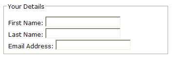
Figure: How that code will look on the browser Things to remember:
- Wrap logical control groups in a <fieldset>.
- The first child of a <fieldset> should be a <legend>, so the user knows what to expect in that section.
Rule 1: Whenever you have a data entry page you should always use the HTML
maxlengthattribute to limit number of characters to the length of the field in the table (except for numbers).Rule 2: Whenever you have a situation where you are using the HTML
textarea(does not have themaxlengthproperty).Then you need to:
- Add the JavaScript function. E.g.
ValidateLength(control) - Add 2 properties to every data control. E.g.
dataType="char" onkeyup="validateLength(this)"
- Add the JavaScript function. E.g.
When adding input boxes to collect data, please always have a <label> tag associated with your <input> tag to link the labels with their respective edit controls. This improves accessibility and gives nice focusing stuff (when you click the label).
<p>
  <label for="EmailAddress">Email Address</label>
  <input id="EmailAddress" type="text" />
</p>
Tip: To do this in ASP.NET use the AssociatedControlID parameter on your <asp:Label />; controls.
<p>
  <asp:Label
    ID="EmailLabel"
    runat="server"
    Text="Email Address"
    AssociatedControlID="EmailAddress"
  />
  <asp:TextBox ID="EmailAddress" runat="server" />
</p>
Tip: For a nicer user experience, consider using adaptive labels and inputs with a UI Library like Material UI.
In Outlook the Street Address is stored as 1 Multi-Line field (with an intelligent Address Checker - nice but not essential), yet in Microsoft CRM the Street Address is split out across 3 separate single line text fields, they should be consistent.
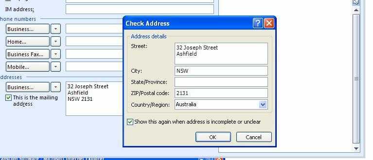
Figure: Street Address in Outlook. 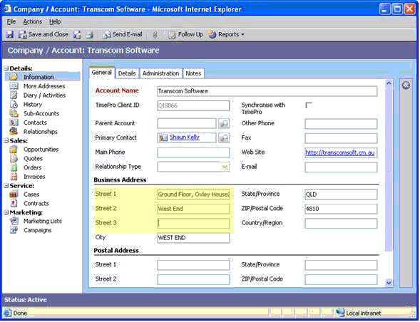
Figure: Street Address in CRM. We consider Outlook is friendlier, because:
- The wrong data is entered often when you have Street 1, Street 2, Street 3.
- Often Street 2 and Street 3 is not needed so it is extra clutter for no reason.
- What do you do when you have Street 4.
- It is the same as http://local.live.com/
Of course, we might be wrong, because:
- Basically, it's not worth the effort - because it goes across multiple places in CRM like Leads and Opportunity (see test results from Adrian).
- Printing labels might be simpler - sizes would be fixed.
We have a suggestion for CRM about this at CRM and Outlook should be consistent with regards to Addresses.
Consistency is a key factor of software development, designing applications that minimise the learning curve through consistent use of componentry and functionality. If buttons with similar functionality are named inconsistently across a web application, it can cause a confusing experience for its users. For example, the buttons used to close a form should be named consistently across your application.
Additionally, buttons should have clear names so the user knows what to expect. For example, it is unclear if a button named Close will save (or not save) when closing, so Cancel would be clearer.
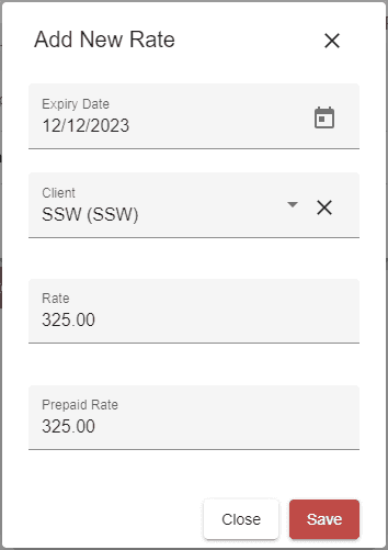
Figure: Bad example - Unclear labels on the buttons - Save button alone is not explicit about the following action for the form (It could close or remain open)
- Close could save the fields, then close the form, when the Cancel button may be more appropriate
We recommend the web standards of:
- Save - Save data without closing the form
- Save and Close - Close the form and save any changed data
- Cancel - Close the form without saving
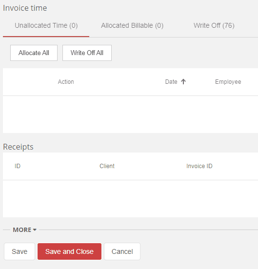
Figure: Good example - This form uses the standard button naming standards (and has the Default buttons set!) Regular users or data entry personnel should be able to use your data entry form with ease. The form should follow a logical sequence of steps that matches the expectations they have based on their past experiences. This user experience will help to maximise their efficiency and satisfaction.
Video: Mastering Web-Based Data Entry: A UX Handbook | Toby Churches | SSW Rules (6 min)
Use descriptive button labels
Forms should clearly indicate how a button will affect the page's state. For instance, a "close" button alone can be ambiguous; it's unclear whether it will apply or discard changes.
To avoid confusion, provide buttons for every possible state change and make "cancel" less obvious. For example, include 3 buttons:
- "Save" - Saves the form without closing it
- "Save and close" - Saves and closes the form
- "Cancel" - Closes the form without saving
Furthermore, ensure state-based actions are labelled consistently across the application so that users always know what to expect.
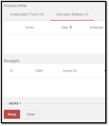
Figure: Bad example - Ambiguous controls 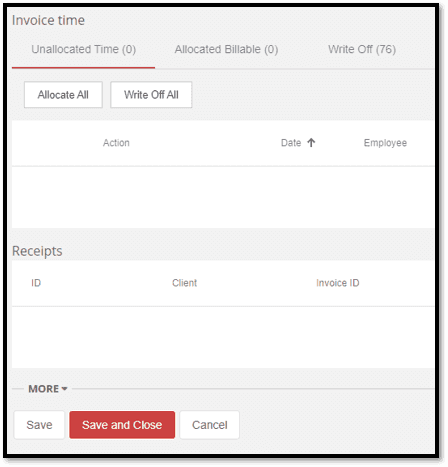
Figure: Good example - Well defined controls and associated actions Test UI responsiveness
With the diversity of modern devices used to access web-based applications, responsive design is an essential part of form development, ensuring that the fields can be accessed. Generally, the size of the form field should also be indicative of the amount of data it should possess.
Consider the following questions:
- Is the form resizable?
- What happens if the user resizes and/or maximizes the form?
- What if the user is using their mobile phone or tablet?
For more information, read about making webpages work on mobiles and tablets and providing alternate sizings for Bootstrap columns.
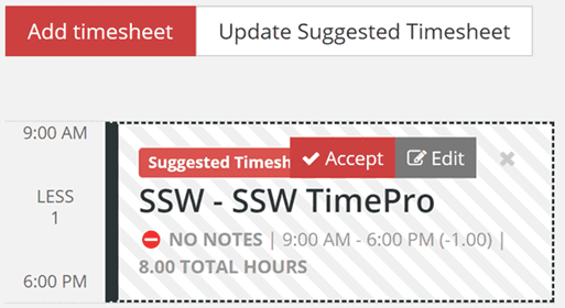
Figure: Bad example - Design fails on smaller views 
Figure: Good example - Responsive design for smaller views Field formatting
Field formatting is essential for a good UX. Ensure that the data is displayed in a logical manner based on the datatype of the input. always consider the usecase of the data being conveyed, but here are some guidelines to get you started:
- The size of the field should be similar to the expected size of the data
-
Numerical values contain the least amount of decimal places to convey the information required
- For example: On an invoice you need to provide very precise figures, so you would need to use 2 decimal places. However, on a sales report you may not use any decimal places as it is just to convey the general trend of dollars to management.
- The frontend converts the database format into a human readable format e.g. 2 decimal places
- Numerical values have right-alignment
- Currency and Percentage fields contain relevant numerical symbols i.e. '$' or '%'
Note: This format conversion can be difficult for data-bound fields. Luckily, many frameworks such as Angular provide convenient methods for handling such situations. In the following code extract, an example of Angular pipes can be seen to format the currency and percentage fields.
<div>
  <!-- When amount = 10 , output = '$ 10.00' -->
  <p>Currency: {{ amount | currency}}</p>

  <!-- When percentage = 0.1 , output = '10.00 %' -->
  <p>Percentage: {{ percentage | percent: '1.2-5'}}</p>
</div>
Figure: Code - Angular Pipes for formatting data
Alternatively, this could be done by triggering a transformation method in the TypeScript file with event binding. This would ensure that the input field would be reformatted when modified.
See more on arranging forms and aligning form labels.
Figure: Bad example - This form has left alignment and non-decimal values 
Figure: Good example - These fields have appropriate width for the data Use auto-populated fields when possible
Populating fields with default values, such as pulling data from system time, enhances data entry efficiency and user satisfaction by reducing trivial and repetitive data entry. However, when opening a new form, only prepopulate fields unlikely to change, such as sales tax. If you want the user to consider a field, don't prepopulate it by default.
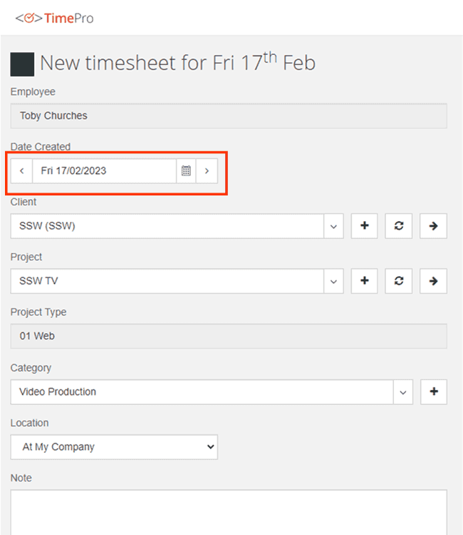
Figure: Good example - This form contains the date as that can be safely prepopulated Use validation
Validation is essential for any form development, with the majority of fields requiring validation of some description. The 3 main categories of validation include:
- Required - The field should be filled in
- Formatting - The field must be in the correct format. E.g. currency or date
- Logical - The field needs to pass some validation tests in the business layer
Tip for long forms: the desired behaviour for when a validation error occurs is to take the user back to the improper field via a scrolling motion. This is particularly important for mobile devices where the responsive layout may cause the form to be extended, requiring further effort to identify the issue.
Figure: Good example - A scrolling effect added to the validation Show "created by" and "updated by" fields
For the purposes of logging and change history, it is highly recommended that the following information is maintained:
- Date Created - The date on which the record was created
- Employee Created - The employee responsible for its creation
- Date Updated - The date on which the record was last updated
- Employee Updated - The employee that last updated the record
This will assist with accountability, allowing users to quickly see information about recent changes.
Additionally, these fields of the form should remain "Read only" ensuring that the data is accurate and reliable.
Figure: Bad example - This form does not contain Created by/Updated by fields 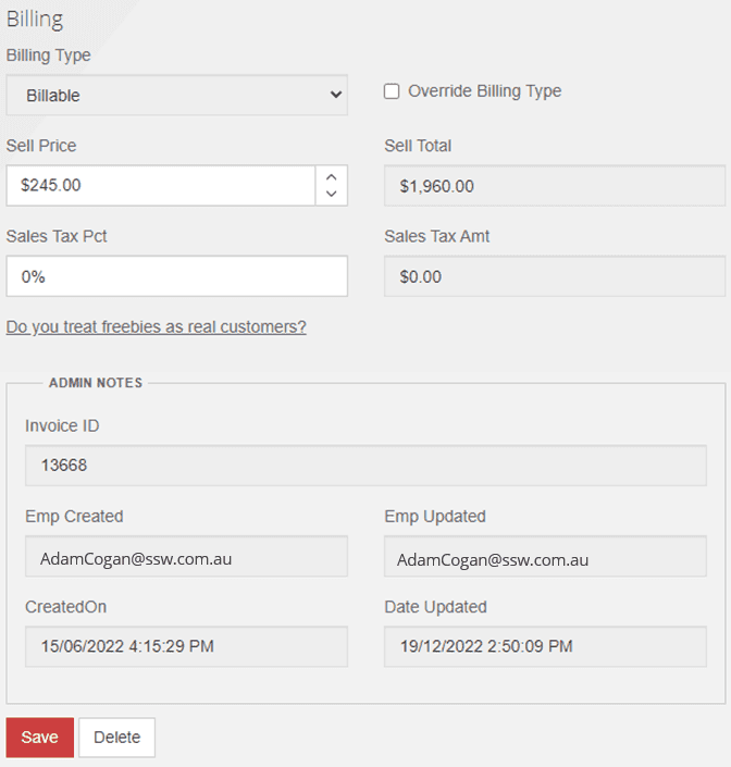
Figure: Good example - This form contains Created by/Updated by fields Avoid "Delete" button for item lists
For a list of items that is used for searching for individual records, the user shouldn't be given the option to delete from the grid. Instead, they should have to open the individual record to be presented with the option to "Delete" the data. This forces the user to examine all of the information before deleting.
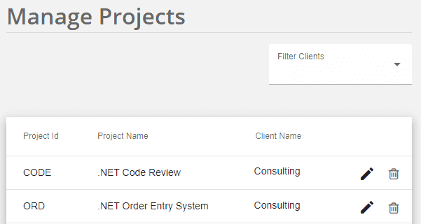
Figure: Bad example - Delete buttons shown 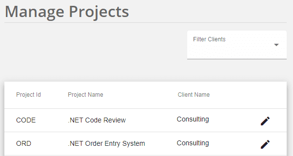
Figure: Good example - This grid contains no delete button, requiring the user to examine the entire record via "Edit" before deletion However, this rule is contextual. For instances where the importance of the data is trivial or all of the necessary information is immediately presented within the grid, it would be acceptable to include a "Delete" button on the grid.
Figure: Exception - This grid contains delete button because all of the required information can be seen from the main form When designing date selectors in your UI/UX, it's important to include the weekday next to the standard date format
dd/mm/yyyy. This small addition adds context, reduces user error, and speeds up decision-making—especially for bookings, scheduling, or deadline-driven interfaces.To keep things clean and consistent, use the abbreviated weekday format (e.g., Mon, Tue, Wed). This provides clarity without cluttering the interface.

Figure: Bad example - Missing weekday 
Figure: Good example - Abbreviated weekday How to do this in SharePoint
You can format dates to include weekdays using calculated columns and formulas in SharePoint.
By default, the date type column only have two format options in SharePoint.

Figure: SharePoint date format option 1 
Figure: SharePoint date format option 2 To add the weekday (E.g. Wed) you need to:
- Select List Settings | Columns | Create column | Calculated (calculation based on other columns)
- See the columns of this list in the "Insert Column", add the column you want to change format, and custom the code in "Formula" like below:
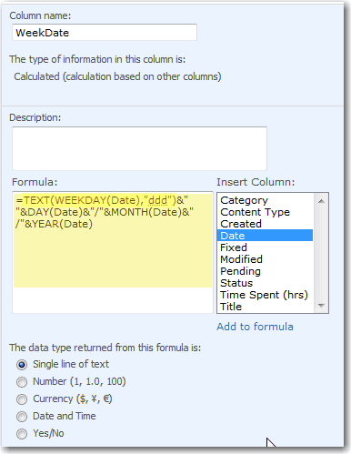
Figure: Calculated column with Formula code - Change the views of the list to use the new calculated column
WeekDateinstead of the original date columnDate:
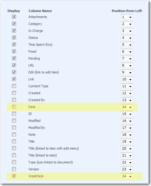
Figure: Replace the old Date column (Date) with new calculated column (WeekDate) Text boxes are often limited in size. When the user have a large ammount of text, the field should grow bigger to show the whole query.
Figure: Bad example - Can't see the whole query 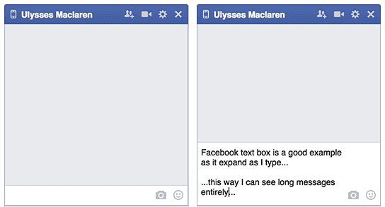
Figure: Good example - Text area expands showing the entire message as it is typed More info:
If you have form fields that require some further information, you can provide a hints column next to the fields so users know what the purpose of the data is.
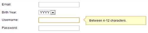
Figure: Good example - Field hints can make the user more comfortable Too often error messages are a summary at the top or the bottom of the page. Instead please provide an error message per validation error, next to the field (and in red!).
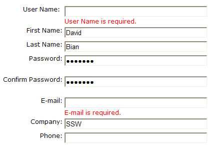
Figure: Good example - Provide red errors next to the field Mobile keyboards, autocomplete, and even copy-paste behavior often introduce leading or trailing whitespace into input fields. This causes validation to fail, even when the actual content is correct—like a GitHub URL ending in a space. That’s a frustrating experience for users, and it’s easily avoidable.
When input validation fails because of a whitespace character the user can’t see, it feels like the form is broken. Trimming whitespace is a simple fix that drastically improves UX.
Always trim inputs before validating
For nearly all form fields (email addresses, URLs, usernames, etc.) it is best practice to automatically remove any leading and trailing whitespace before performing validation or submitting data.

Figure: Bad example - Keyboard autocomplete added a trailing space, causing the GitHub URL validation to fail with an error message Code trims the input to remove whitespace:
const trimmedValue = input.trim();Input validation passes: “github.com/0xharkirat” is accepted
Figure: Good example – Automatically trimming input before validation makes the form behave as expected
Exceptions and notes
There are rare cases (e.g. password fields or intentionally space-padded inputs) where trimming might be inappropriate. In such cases, make this behavior explicit in the UI, or better yet, avoid such patterns altogether.
For most user inputs, trimming is safe, helpful, and expected.
How to implement
Most platforms and frameworks make this easy:
- JavaScript/TypeScript:
value.trim() - C#:
input.Trim() - Python:
input.strip() - SQL:
TRIM(column) - HTML Input Events: Consider trimming on
onBluroronChangebefore submitting the form.
This small usability improvement makes a big difference - users don’t notice when it works, but they definitely notice when it doesn’t work.
- JavaScript/TypeScript:
Users should be able to navigate around your application without having to return to the main menu to open a related form.
Think about a summary report - users should always be able to "drill-down" to track a transaction to its original source.Think about a data entry form - users should always be able to "drill-down" to the look up table
There are four ways to provide drill-downs:
- Preferred - Use buttons to navigate around the application
Figure: Use named buttons to navigate around the application (Preferred) - Double click the control
- Use buttons with three dots - an ellipsis (...) character
Figure: Good Example - Use ellipses to navigate around the application - Use hyperlinks
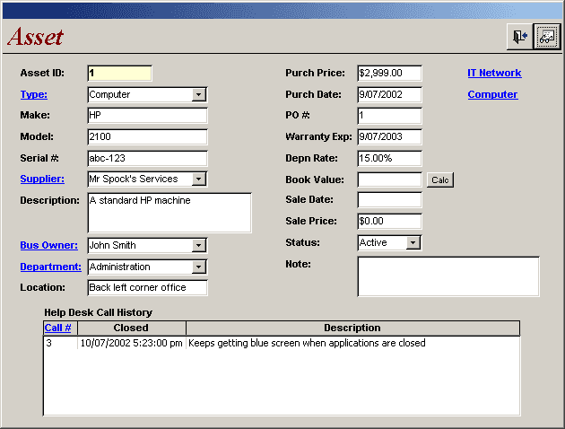
Figure: Drill-downs implemented as links (an interesting alternative but a bit too much of a visual impact) Another handy thing to add for users is "drill-around". This is implemented by using a right mouse-click to activate context-sensitive links between related screens.
Below is a report screen that is fairly common that developers create, they will make it so every time the page is loaded the user will have to reselect their options. To make it simpler the options should be stored in a cookie or database and be already pre-selected once the page is reloaded, as it is likely they will want to use the same or slightly modified query. If they don't then they can simply select what they are after anyway.

Figure: Bad Example - This is suitable for first view, but not for a return view 
Figure: Good Example - Instead, save the users last selection Your form should prompt to save the record when the user leaves a page that has been modified. Alternatively, you can prompt the user when they log back on that they have drafts. E.g. mail.google.com