
Rules to Better Interfaces (Popups and Messages) - 15 Rules
Since 1990, SSW has supported the developer community by publishing all our best practices and rules for everyone to see.
If you still need help, visit Website Design and User Experience and book in a consultant.
Popups are intrusive and ugly.
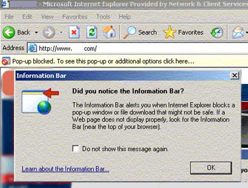
Figure: All popups are evil but this may be the most annoying one in history. How ironic that the popup is informing you that IE has blocked a popup. 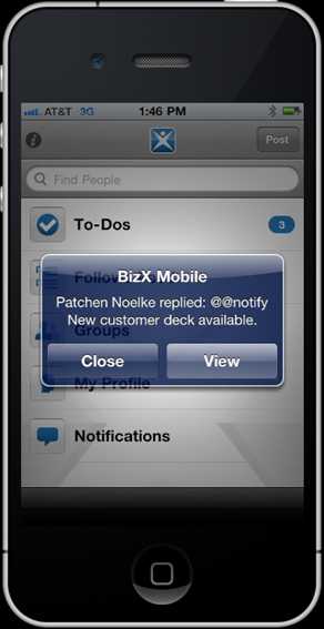
Figure: Bad Example – Even popups are bad on the iPhone. In iOS5 this style of alerts have been banned (or at least, made optional) JavaScript alerts are evil. Not only are they ugly, they look unprofessional...
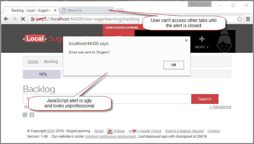
Bad example: A JavaScript alert showing a message to the user
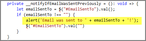
Bad example: The alert(".....") is the evil code
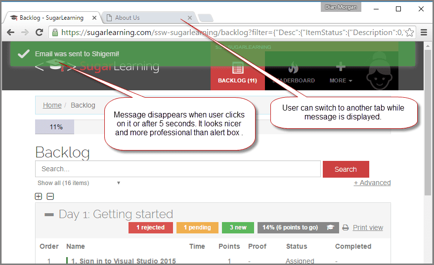
Good example: The message in green is rendered as Html
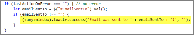
Good example: In this example, Toasteris used
Some people like popup forms. Some do not.
Popup modal forms are no good:
- as you can't read or edit something else in a window behind
- as they take a lot of time to load in a browser (ask any CRM 4 user)
Popup forms are good:
- as it is obvious you have an action step to perform before continuing
- as they simplify a form that has lots of fields
- if they can't get lost behind another window
- if you make them clear by dimming the background (see below)
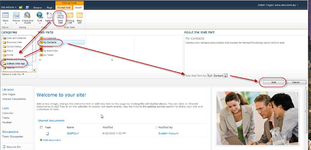
Figure: Bad example - if this was a popup form it would be easier to focus on where to look (as a minimum you would be looking at half the screen) 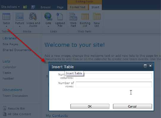
Figure: Good example - the popup with the dimmed background is much more intuitive For example, adding a webpart in SharePoint 2010 should use a popup form. See our suggestion to Microsoft.
Question: What is wrong with this Picture?

Figure: Can you tell what is wrong with this Picture? Answer: The 2 SSW SQL Auditor windows are bad, because one is just a modal form.
Note: We don't check for this in Code Auditor because making a form display as popup, is done at runtime via the ShowDialog method.
Dim frm as new frmCustomer frm.ShowDialogFigure: Bad Code
If your form is designed to be used modally (and thus be called using ShowDialog) then ShowInTaskbar should be set to false in the form designer.
Dim frm as new frmCustomer frm.ShowInTaskBar = False frm.ShowDialogFigure: Bad Code (because this should be set in the form designer)
Dim frm as new frmCustomer frm.ShowDialogFigure: Good Code (ShowInTaskbar is set in the form's InitializeComponents method instead)
Now, if you can't get rid of message boxes; try again.
There is nothing quite as annoying as persistent pop up message boxes, demanding your attention. Imagine you are working on a train, you are in between two fat people and your elbows are tucked in. Not only that the trackpad barely works and the user does not know that [spacebar] works on a message box.
Now think of that scenario every time you give a user a message box.
Exception: Only use them in the following scenarios:
- Confirming the deletion of a record
- Kicking off a long running process that cannot be cancelled
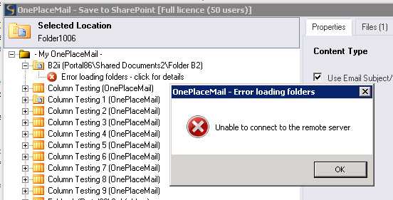
Figure: Bad example - could the information in this message box be moved into the panel on the right 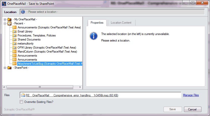
Figure: Good example - An error message that does not pop up and block your user If you do a search and no matches are found, display a message indicating zero results were returned rather than an error message.
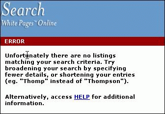
Figure: Bad Example - No matches found on searching is not an "Error" However, a user thinks that either:
- They have done something wrong (i.e. they are incompetent) OR
- The software is broken (i.e. your application is incompetent)
Forcing the user into this opinion is a good way to make them avoid using your software in the future.
Instead, use the term "Information" when validation is required.
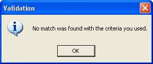
Figure: Good Example - Only use "Error" when appropriate Don't use "OK" if the button does one clear action. The button name must reflect the action that is going to happen by clicking the button. Examples of button names that are better than "OK" are:
- Save
- Move
- Rename
- Open
- Select
- Insert
- Process
- Login
Figure: Save button in action However, there is an exception when there are multiple settings being changed. Typical examples are Properties and the Tools - Options dialog. There are often many tabs with many options. It would make no sense to have "Save Settings" or "Save". This is where the "OK" "Apply" "Cancel" convention really applies.
Message boxes should have consistent and informative titles and descriptions, and icons should be used appropriately.
Title
The title should contain the application name, so the user knows what application generated the warning/error. This is especially important when developing add-ins (e.g. Outlook add-ins or Smart Tags) as it can be difficult to know what caused the message box to pop up. Application.ProductName and Application.ProductVersion should be used to retrieve the data from AssemblyInfo. There is no need for the title to contain a brief description of the error because that information is readily available in the message box itself.
Figure: Bad Example - Title contains brief description of error, which is already contained in the message box 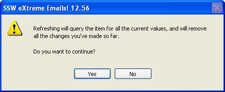
Figure: Good Example - Title contains Product Name ("SSW eXtreme Emails!") and Product Version ("12.56") We have a program called SSW Code Auditor to check for this rule.
Note : The Version Number in the title should only contain the Major and the Minor version numbers (e.g. 11.28) and not the complete Major.Minor.Revision.Build Numbers (e.g. 11.28.92.1198)
Description
The description should explain what the error was, followed by the why it occurred. Information that is useful for debugging should be included with errors where possible in a "Details" section. You should also avoid making the text unnecessarily wide. e.g.
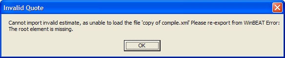
Figure: Bad Example - A message box that does not intuitively alert the user - This is confusing, because it uses different terminology to the title ("estimate" instead of "quote")
- There is no punctuation
- The word "Error" is meaningless
- Line breaks are not present, so the message box is too wide and the text may wrap in the wrong spot
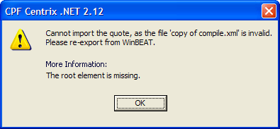
Figure: Good Example - A message box that is clear, consistent and intuitive - Terminology is consistent
- Punctuation is present
- "Details" indicates that this information is useful for debugging
- The text is split across three lines, and the technical information after Details is separated from the description of the error
Icon
Including an icon is important because not only does it give the user a visual indication of the type of message, but without it only the Default beep sound is used. The icon should reflect the type of information being presented:
Icon Name When to use 
info MessageBoxIcon.Information Non-error information, e.g. Database connection test completed successfully 
Warning MessageBoxIcon.Warning A non-critical error, e.g. The input was invalid 
error MessageBoxIcon.Error Critical error in the program, e.g. Program file was not found 
MessageBoxIcon.Question NEVER use this. According to Microsoft, the Question mark is being phased out, as any of the other three: Error, Warning or Information can easily be reworded into a Question, and Question does not show the user the severity of the issue that has just occurred.E.g. If you want to ask the user whether they want to save a file before closing, you should use the Warning Icon. |
We have a program called SSW CodeAuditorto check for this rule.
When a user looks at a test result, they want to be quickly informed. Therefore, you must make it clear weather the test has passed or failed, or is there any warning.
- For a pass, the message should be green in color, and a tick next to the message.

- For a fail, the message should be red in color, and a cross next to the message.

- For a warning, the message should be yellow/orange in color, and an exclamation mark next to the message.

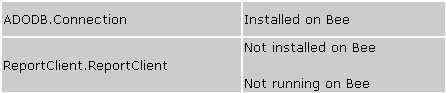
Figure: Bad Example - Pass and fail are not clear 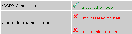
Figure: Green text and tick for pass, red text and cross for fail (Better) 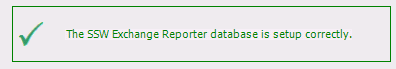
Figure: Good Example - Status on windows forms 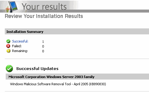
Figure: Good Example - Microsoft Update uses 3 icons to indicate different status, and good quality of Images too - For a pass, the message should be green in color, and a tick next to the message.
It is very important to use a clear information icon to show the current status. The icon should be consistent with the actual status.
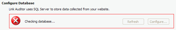
Figure: Bad Example - The icon is not consistent with the actual status 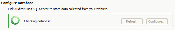
Figure: Good Example - Use spinning icon to show the checking status 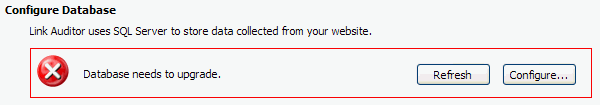
Figure: Good Example - Use red cross icon to show the wrong status 
Figure: Good Example - Use green tick icon to show the correct status It is important to use terminology that your users will understand. Do not to use technical terms that may confuse your users. Use consistent words and phrasing for similar situations. For example, the following phrases have the same meaning which is the best one?
- Not enough memory.
- There is not enough memory.
- There is not enough free memory.
- Insufficient memory.
- No memory was available.
- Your computer does not have sufficient memory.
- Memory resource is not enough.
- Ran out of memory.
- You may be out of memory.
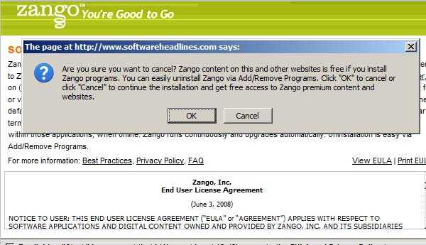
Figure: Bad Example - Is it OK to Cancel? Microsoft uses this one:
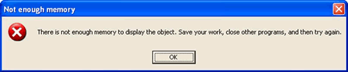
Figure: Good Example - Microsoft error message is concise Some other message types that Microsoft uses are:
Message type Sample message Not enough disk space There is not enough disk space to complete the operation. Delete some unneeded files on your hard disk, and then try again File not found The program cannot find the file filename Re-running setup The filename file is missing. Run Setup again to reinstall the missing file. For more information about running Setup, press F1. Consider using or adapting them in your application in similar scenarios. Only include the information that the user needs and will understand.
This also applies to general design principles, read our rule on Less is more: do you know people scan, not read?
When a user looks at a search result, they expect to see a list of items to look into. If there are no results, don't give them noisy text because it can be taken as a search result. An icon also can be understood as a broken page. Your "no results" page should be clean.
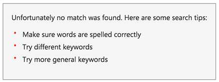
Figure: Bad example - The list of "suggestions" is just noise and can confuse the user 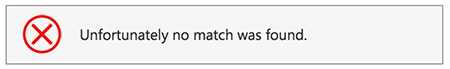
Figure: Bad example - Having an icon implies that an error happened which is not the case 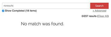
Figure: Good example - Plain and clean screen 
Figure: Good example - Plain and clean screen on mobile Note: In case the message you're showing is a "pass" or "fail, it is recommended to use an icon as per Do you use icons to enforce the text meaning?
Every message box should contain a link to a wiki or KB with more details about the message. In the example of the below error message:
Figure - Bad Example: User now has to Google to find out how to fix this error 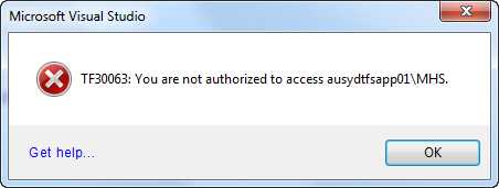
Figure - Good Example: If you click on the "Get Help..." link on the bottom of the form it will take you to a wiki page with common issues and resolutions