Rules to Better Websites - Layout and Formatting - 66 Rules
If you want users to take action on the web page content, add a "banana" - something that makes it obvious what the user is supposed to do.
For example, if your page is selling software, make it easy for your users to make a purchase. People don't have a lot of time to read your entire page and find the right link, so it is important to grab their attention by using a "banana".
Why do we call it "banana rule"?
How would you get a monkey pay attention to something? You could lure them by tempting him with a banana. Once we have the monkeys attention focused on the banana, they will try to get their hands on it regardless of the barriers on the way.

Figure: If the monkey can see the banana, they will do whatever it takes to get it This is how the "banana rule" should be applied:

Figure: Bad example – The "Points+Pay" red button takes the attention over the red "Go" button, which should be the "banana" So, remember most pages need a "banana" to get them to where you want them. "Bananas" are big, simple and stand out from the rest of the page.

Figure: Good example - SSW always have a good "banana" When resources are limited, companies often blur the lines between design and development roles in an attempt to maximize efficiency. However, maintaining a clear distinction between disciplines is crucial for creating cohesive and effective user experiences.
For many developers, especially those early in their careers, the risk of making design decisions that negatively affect the overall user experience is high. When Product Owners delegate design work to developers, they may unintentionally accumulate significant UX debt. UX debt, like tech debt, accumulates when design shortcuts are taken, leading to user experience issues that need to be fixed later—often at a greater cost.

Figure: Bad design can be dangerous! While flexibility is important, particularly when dealing with a low designer-to-developer ratio, it's still wise to keep design work primarily in the hands of designers to maintain consistency and quality.
Streamlining design decisions
Design is an inherently subjective field, and even experienced designers don't always agree on every decision.
In addition, effective design demands a holistic approach, where layout, typography, color, UX, and other essential elements work together to create cohesion. When non-designers, especially those without a strong grasp of these principles, get involved, the result is often disjointed and inconsistent, leading to a fragmented user experience.
This situation is analogous to designers writing code. Many designers may know basic HTML or CSS, or use tools like ChatGPT to generate code. However, without a developer to review and refine it, there’s a higher risk of introducing poor-quality code, which can lead to tech debt. This often results in long-term maintenance challenges and system inefficiencies. Even if a developer steps in to review, it adds unnecessary workload and distracts them from their primary responsibilities.
Note: While developers and designers should focus on their expertise, multidisciplinary Scrum teams offer valuable opportunities for collaboration. By working closely together, they can learn from each other, enhancing teamwork and problem-solving. Ideally, developers should only take on design tasks when training to transition into design roles, or vice versa, as part of structured learning. Otherwise, it's best for designers to handle design and developers to focus on development to ensure quality through specialized expertise.
Mobile keyboards, autocomplete, and even copy-paste behavior often introduce leading or trailing whitespace into input fields. This causes validation to fail, even when the actual content is correct—like a GitHub URL ending in a space. That’s a frustrating experience for users, and it’s easily avoidable.
When input validation fails because of a whitespace character the user can’t see, it feels like the form is broken. Trimming whitespace is a simple fix that drastically improves UX.
Always trim inputs before validating
For nearly all form fields (email addresses, URLs, usernames, etc.) it is best practice to automatically remove any leading and trailing whitespace before performing validation or submitting data.

Figure: Bad example - Keyboard autocomplete added a trailing space, causing the GitHub URL validation to fail with an error message Code trims the input to remove whitespace:
const trimmedValue = input.trim();Input validation passes: “github.com/0xharkirat” is accepted
Figure: Good example – Automatically trimming input before validation makes the form behave as expected
Exceptions and notes
There are rare cases (e.g. password fields or intentionally space-padded inputs) where trimming might be inappropriate. In such cases, make this behavior explicit in the UI, or better yet, avoid such patterns altogether.
For most user inputs, trimming is safe, helpful, and expected.
How to implement
Most platforms and frameworks make this easy:
- JavaScript/TypeScript:
value.trim() - C#:
input.Trim() - Python:
input.strip() - SQL:
TRIM(column) - HTML Input Events: Consider trimming on
onBluroronChangebefore submitting the form.
This small usability improvement makes a big difference - users don’t notice when it works, but they definitely notice when it doesn’t work.
- JavaScript/TypeScript:
Always indicate which fields are required. Users get frustrated when they experience a wasted trip to the server, just because they did not get an obvious indication of what was required first time around.
Figure: Bad example - No visual indication for required fields when a user first sees the form A designer will know the best way to indicate required field depending on the layout. However if you are in doubt and don’t have a designer around, a red asterisk is definitely the best option.
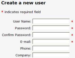
Figure: Good Example - A visual indication of what fields are required (use a red asterisk if you are not a designer) More information on ASP.NET implementation
You should combine these visual indicators with appropriate client and server side validators to make sure that your data conforms to business requirements. Adding a RequiredFieldValidator to the above textboxes gives you data validity check with minimal coding.
<asp:Textbox runat="Server" ID="email" />Figure: Bad example - No validator used, so the user won't know the email is required
<asp:Textbox runat="Server" ID="email"/>

<asp:RequiredFieldValidator runat="Server" ControlToValidate="email" ErrorMessage="Please enter an email address"

ID="emailReqValidator" />
Figure: Good example - An ASP.NET validator in use, to indicate the fields required
Note: For ASP.NET Dynamic Data although validation is done differently (under the covers it is using a field template + the ASP.NET validator).
It seems nearly all web developers are confused whether they should use hyperlinks or buttons on forms. The recommendation is that whenever data is being submitted (e.g. Save, Cancel, Apply) you should use a button, otherwise use a link.
This is because hyperlinks indicate navigation - "If I click this link, I'll be taken somewhere else".
Whereas a button indicates that something is being processed - "When I click this, I'm agreeing that something is being submitted"
Note: If you are using an automated link checker
It is important you use buttons for updating or deleting data on your website. The main reason is problems will occur when you run a link checker (e.g. SSW CodeAuditor), and you have data driven pages with "Update" or "Delete" hyperlinks. The link checker will try to go to all associated links and potentially delete a lot of data from your website database.
But you say "My Delete links have JavaScript protection e.g. Are you sure you want to delete?". It is still no good because link checkers ignore all JavaScript validation.
Thus, we must have:
- Password protected areas on the website when we can update the database records via the web
- All update ability must be via buttons, not hyperlinks (as buttons are known on the web to submit a form).
That being said, there are a couple of exceptions to this rule.
- If you want the user to be able to right click and "Open in New Window"
- If you want a consistent design feel (and there is no confusion that the link is accepting data)
Figure: An exception to the rule - an "Update" button inside the datagrid would look inconsistent 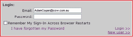
Figure: Bad example - The "sign in" hyperlink should be a button 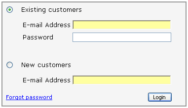
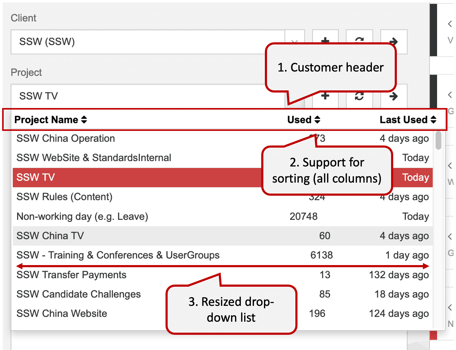
Figure: Good example - This is a perfect example of how a good sign in screen should look When designing your form, you should try to help your user whenever it's possible. So it's a good idea to include the number of results in ComboBoxes.

Figure: Good example – combo-box with multiple columns When designing your form, you should try to help your user whenever it's possible. So it's a good idea to create a combo-box that has a custom template.
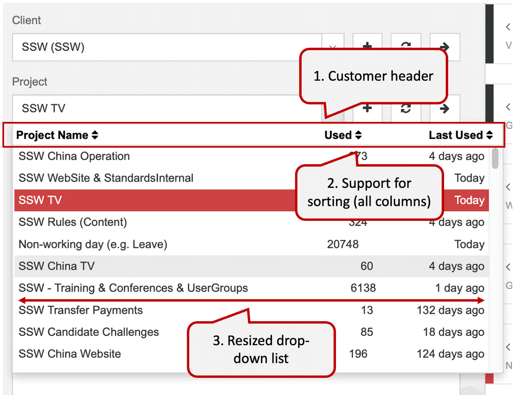
Figure: Good example – Combo-box with custom template Feel free to use our sample:
- Download and install Kendo UI Controls from Kendo UI
- HTML (Razor) - Create a combo-box that has a custom template. Use a code bellow as an example:
@(Html.Kendo().ComboBoxFor(x => x.EmpTime.ProjectID) .AutoBind(true) .Suggest(true) .Delay(300) .DataSource(source => source.Read(read => read.Action("ProjectNameAjaxBind", "Ajax") .Data("function() { return {clientId : getClientId()}; }") .Type(HttpVerbs.Post))) .Height(450) .DataTextField("DisplayText") .DataValueField("Value") .Filter(FilterType.Contains) .Template(@" <table class="comboBox-Projects"> <tr> <td class="projectName">${data.DisplayText}</td> <td class="projectTotalCount">${data.UsedCount}</td> <td class="projectLastUsed">${data.LastUsedText}</td> </tr> </table> ") .HighlightFirst(false) .IgnoreCase(true) .Events(e => e.Change("projectChanged").Open("onProjectOpened")) )- CSS - Customize the look & feel to suit your needs. Example:
#projectsTableBorder { border-bottom: 1px solid rgb(217, 217, 217); margin: 0 -2px; } .comboBox-Projects#projectsHeader { color: black; font-weight: bold; margin: 4px 16px 4px 4px; } .comboBox-Projects td.projectName { width: 400px; text-align: left; } .comboBox-Projects td.projectTotalCount { width: 70px; text-align: right; padding-right: 16px; } .comboBox-Projects td.projectLastUsed { text-align: left; } #projectNameHeader:hover, #projectTotalCountHeader:hover, #projectLastUsedHeader:hover { cursor: pointer; text-decoration: underline; }- JavaScript - Use JavaScript to change the combo-box's behavior. Example:
// resize the drop-down list function resizeComboBoxList(comboBoxListId, width) { var list = $(comboBoxListId); list.width(width); var height = list.height(); list.children("ul").height(height - 25); } function onProjectOpened() { resizeComboBoxList("#EmpTime_ProjectID-list", 600); } // execute sorting when a header column is clicked function onClick_ColumnHeader(senderId, comboBoxId, fieldName) { var column = $(senderId); column.unbind('click'); column.click(function() { sortComboBoxBy(comboBoxId, fieldName); }); } // sort any combo-box based on a field name function sortComboBoxBy(comboBoxId, fieldName) { var comboBox = $(comboBoxId).data("kendoComboBox"); var sortDescriptors = comboBox.dataSource._sort; var direction = "asc"; if (typeof(sortDescriptors) != "undefined") { var sortDescriptor = sortDescriptors[0]; if (typeof(sortDescriptor) != "undefined") { if (sortDescriptor["field"] == fieldName) { if (sortDescriptor["dir"] == "asc") { direction = "desc"; } } } } comboBox.dataSource.sort({ field: fieldName, dir: direction, }); } // prepare $(document).ready(function() { var projectsId = "#EmpTime_ProjectID"; var projectsListId = projectsId + '-list'; // prepend header to combo-box list. By default you only get <ul> $(" Project Name</td>" + "<td id='projectTotalCountHeader' class='projectTotalCount'>Used</td>" + "<td id='projectLastUsedHeader' class='projectLastUsed'>Last Used</td>" + "</tr></table>" + "</div>") .prependTo(projectsListId); // register click events for each column onClick_ColumnHeader('#projectNameHeader', projectsId, "DisplayText"); onClick_ColumnHeader('#projectTotalCountHeader', projectsId, "UsedCount"); onClick_ColumnHeader('#projectLastUsedHeader', projectsId, "LastUsedValue"); }); });"An image is worth a thousand words" is a timeless saying that underscores the power of visual communication. Images can convey complex ideas, emotions, and information more efficiently and effectively than text alone. They capture attention, enhance understanding, and improve retention.
Therefore, whenever possible, replace text with images to create more engaging and impactful content. By doing so, you can simplify your message, appeal to visual learners, and make your communication more memorable.
You then have this pretty white flower with a green stem standing on a water pond. It is beautiful.
Figure: Bad example - A text describing a flower

Figure: Good example - A picture of a flower is way better What else can you do?
- Use good captions - See Do you add useful and bold figure text (aka a caption) to avoid a lot of text over images?
- Use good markup - See Do you use the right HTML/CSS code to add the useful figure/caption?
When you add images/videos to websites/applications, it is helpful to add a caption underneath them, describing and including extra information to users.
It's a convenient way of catching users' attention to your content. When people are scanning a newspaper, they often check out the pictures first, then read the accompanying description, and if it sounds interesting, they'll go back and read the article. Users read websites in a similar fashion.
To catch readers' attention, include a useful description - don't just describe what the image is... say what it's used for in the context of the document.
It is especially important that images and captions serve a purpose, as opposed to graphics which are there solely for design.
Tip #1: Use prefixes
Prefix your caption with "Figure: ", "Video: ", "Code: ", or "GIF: "
If it is a good/ok/bad example (see the next tip), then the prefix should be something like: "Figure: Good/Bad/OK example - ", "Video: Good/Bad/OK example - ", or "Code: Good/Bad/OK example - ".
Note: The first word after the dash should be capitalized, and the caption should not include a full stop at the end.
E.g. Figure: Good example - This is a caption
Tip #2: Give bad and good examples
When possible, use "bad" and "good" examples to clearly explain Dos and don'ts.
At SSW we always show the bad example first, then the good example. You will see samples of this in the next tips below.
Tip #3: Bold your captions
{{ IMAGE }}
{{ CAPTION }}Figure: Bad example - Caption not bolded can be mixed up with regular content
{{ IMAGE }}
{{ CAPTION }}Figure: Good example - Caption stands out when bolded
Tip #4: Describe the actions in your captions
Especially for screenshots, it is a good idea to have your figure describe the action the user would take:
{{ IMAGE }}
Figure: This is the screenFigure: Bad example - Vague caption description
{{ IMAGE }}
Figure: On the screen, choose the execution methodFigure: Good example - Clear caption description
Tip #5: Video captions should be the title + length
When embedding videos, include a caption with the video title + video length in brackets.
Note: As per Tip #1, you should also prefix with "Video: " instead of "Figure: ".
{{ VIDEO }}
Figure: Scrum videoFigure: Bad example - Using "Figure:" for a video caption + a vague text
{{ VIDEO }}
Video: Intro to Scrum in Under 10 Minutes (9 min)Figure: Good example - Video caption following the standard "Video: {{ VIDEO TITLE }} ({{ VIDEO LENGTH}})"
This helps:
- Giving a brief text summary of the video
- Getting some extra Google Juice
- Letting users know what to expect in terms of time required to watch
- Serving as a reminder in case that video ever gets removed by its owner
Note: The exception is for promotional videos where the caption may undesirably impact the look and feel of your page. If you don't include the video title in the caption, consider adding it above the video as regular content, so it's searchable.
Tip #6: AI images - include your prompt
If you're sharing an AI generated image, show others how you made it.
{{ IMAGE }}
Figure: An AI image of baseball player slidingFigure: Bad example - Doesn't educate others about AI images
{{ IMAGE }}
Figure: An AI image of baseball player sliding. Prompt: A realistic image of a baseball player sliding. The uniform is white and the crowd is cheering.Figure: Good example - Readers understand how you made the image, and they improve their own AI image skills by learning from your caption
Tip #7: Link people's names to their profiles
When you have someone's name in your caption, link the name to their profiles (e.g. SSW People profile).
{{ VIDEO }}
Video: In this video, Bob talks about OutlookFigure: Bad example - A vague text with no link to Bob's profile. Also missing the video length
{{ VIDEO }}
Video: How to search on Outlook by Bob (2 min)Figure: Good example - A descriptive caption using the video title + profile link + video length at the end
Tip #8: GIFs - Label accordingly
Using a GIF instead of a static image can be beneficial for illustrating multiple steps, as it saves page space. Be sure to specify that it is a GIF in the caption to distinguish it from a static image
{{ GIF }}
Figure: Users | Summary | User Information | LinkedIn URLFigure: Bad example - Does not specificy that it is a GIF
{{ GIF }}
Figure: Animated GIF - Users | Summary | User Information | LinkedIn URLFigure: Good example - Specificies that it is a GIF
The best way to emphasize your point is to show the pain first, and then the solution. Use "Bad example" and "Good example" with crosses and ticks, respectively, in captions.
This structure can be used with images, videos, pieces of code, or text in boxes. Just make sure to include the appropriate caption for each element.
Giving the bad example first will raise users' expectation...

Figure: Bad example - Kid not in his seat Then showing the solution by giving a good example as the result, will make them feel released.

Figure: Good example - Kid in his seat Usually, further information on how to achive the good example is added after the examples. E.g. Add a heading "More information" with extra details.
You may also use "OK" examples for things that are acceptable but can be done better.
When making or editing CSS or HTML content it is important to avoid adding classes and ID's unnecessarily.
It can be tempting to add classes on elements, as it is often the most obvious solution to CSS problems... but doing so will lead to overly cluttered code and a host of overly specific solutions. When working on CSS it is almost always better to reuse rather than adding additional classes.
You should use a front-end framework, like Bootstrap or Tailwind. The best front-end frameworks will include most of the clases you will need on a project. Basically you will only need new classes for very specific layout elements.
HTML:
<a
  class="view-all-link"
  href="https://www.youtube.com/playlist?list=PLIzW_0dAIKv3mjBeK8eyJbe1bOGWJX_UV"
  >View All</a
>
CSS:
.view-all-link {
  margin-top: 0;
}
Figure: Bad example - The "view-all-link" class was added unnecessarily
HTML:
<a
  class="mt-0"
  href="https://www.youtube.com/playlist?list=PLIzW_0dAIKv3mjBeK8eyJbe1bOGWJX_UV"
  >View All</a
>
Figure: Good example - Using Bootstrap's class "mt-0" has the same affect without adding any class
Efficient programmers do not re-invent the wheel. That's why we use the best Web UI libraries.
Bootstrap is a NuGet Package that provides a jump-start for HTML based projects. It includes the HTML, CSS and JavaScript framework used to build the Twitter site.
Building your site on top of Bootstrap makes it much easier to have your website look great on devices of all sizes, across many different browsers.
Read our Rules to Better UI (Bootstrap).
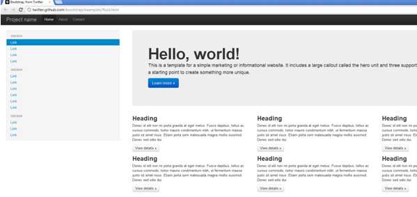
Figure: This website template, along with many others is available as a starting point for building Bootstrap-based sites 
Figure: Bad example - Many websites built by using tables for positioning would render poorly on smaller devices, and be hard to use 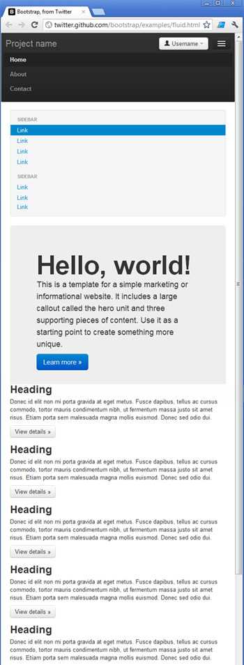
Figure: Good example - Bootstrap uses many techniques to help make your site look great on different browsers, on all devices Documentation
Framework integrations
One of the benefits of using Bootstrap over a library such as Shadcn is that it's widely supported across a large number of Front end frameworks. Take a look at the following Bootstrap integrations for example:
While you can use Bootstrap without any framework specific integrations, using one of the libraries can save you a lot of time managing your css classes and writing boilerplate code while building your Interface. The front end frameworks listed above are ultimately just wrappers for using Bootstrap, which is little more than a CSS library. This means that you can use Bootstrap with any front end framework of your choosing. You can even use it for static html pages provided that you include links to the required JavaScript and CSS files in your pages. This can be achieved by adding a link to bootstrap's CDN in your pages.
Tailwind
Alternatively, TailwindCSS is also acceptable. The difference between the Tailwind and Bootstrap is a matter of how comfortable you are with CSS.
Out of the box, Tailwind is lightweight and will get the job done simply; you can build a website without ever having to look at CSS.
Bootstrap requires theme customization, but it’s more robust and solid once done. Read more about these differences.
Making CSS changes can range from straightforward tweaks to complex adjustments that impact multiple elements or pages. Knowing when to handle changes yourself and when to seek a developer's input can save time and reduce risks.
When to make CSS changes yourself
For small or simple adjustments, it’s often faster and more efficient to handle the change yourself. This applies when:
- The change is isolated: Adjustments affect only a specific element or page
- Minimal complexity: Minor visual changes, such as color or spacing tweaks
- No significant dependencies: No impact on other components or functionalities
- Low testing requirements: The changes don’t need to be tested across multiple browsers or devices
.button {
  font-size: 1rem;
}
Figure: Good example – A simple CSS change handled without involving a developer
Making the changes yourself still require someone else to check your work (e.g. over the shoulder)
When to involve a front-end developer
More extensive or unfamiliar CSS changes require careful handling to avoid unintended side effects. In these cases, seeking help from a developer is advisable:
- Scope: The change spans multiple pages or templates
- Complexity: It involves restructuring layouts or adding new functionality
- Dependencies: Modifying elements tied to JavaScript or backend code
- Testing requirements: Requires thorough cross-browser testing
- High impact: Changes that affect core UI components or interactions
/* Original CSS: Grid-based dashboard layout */
.dashboard-container {
  display: grid;
  grid-template-columns: 1fr 3fr;
  grid-gap: 20px;
  height: 100vh;
}

.sidebar {
  background-color: #2d2d2d;
  color: white;
  padding: 20px;
}

.main-content {
  background-color: #f5f5f5;
  overflow: auto;
  padding: 30px;
}

/* Attempted Complex Change: Altering layout to flex without checking dependencies */
.dashboard-container {
  display: flex; /* Switch from grid to flex */
  flex-direction: column;
}

.sidebar {
  width: 100%; /* Full width sidebar */
  height: 50px; /* Introduced height constraint */
}

.main-content {
  flex: 1; /* Fill remaining space */
  overflow: visible; /* Removing critical overflow control */
}
Figure: Bad example – A complex layout change attempted without consulting a developer, risking broken functionality
Key Factors
When determining whether to proceed independently or engage a developer, consider:
- Scope – How many components/pages will be affected?
- Complexity – Are structural elements or media queries involved?
- Impact – Will the change affect other functionalities?
- Familiarity – Do you understand the CSS framework or codebase?
- Time – How much time will it take?
- Testing – Does the change need cross-browser/device testing?
- Dependencies – Will this change break other components?
- Stakeholders – Do significant changes require input from designers or project managers?
By evaluating these factors, you can balance efficiency with caution, ensuring smooth updates without compromising quality. When in doubt, consulting a front-end developer who is familiar with the project is always the best approach.
Figure: Working with CSS Most developers put the image and the caption in a DIV tag, where the figure is just a paragraph - this is not correct.
<div>
    <img alt="" />
  <p>Figure: Caption</p>
</div>
Figure: Bad example
Instead, you should use <figure> and <figcaption> as per https://www.w3schools.com/TAGS/tag_figcaption.asp. This structure gives semantic meaning to the image and figure:
<figure>
  <img src="image.jpg" alt="image"></img src="image.jpg" alt="image">
  <figcaption>Figure: Caption</figcaption>
</figure>
Figure: Good example
The old way
For some internal sites, we still use the old way to place images: Using <dl> , <dt> (which is the item in the list – in our case an image), and <dd> for a caption.
<dl class="badImage">
  OR
  <dl class="goodImage">
    <dt><img src="image.jpg" alt="Image" /></dt>
    <dd>Figure: Caption</dd>
  </dl>
</dl>
Figure: Old way example
Note: <dl> stands for "definition list"; <dt> for "definition term"; and <dd> for "definition description".
Why do so many interesting pages have no owner? There are countless articles on the web that have left the reader wondering: "Who wrote this? What is their background?
Sometimes, the only available link is author’s email, which doesn't say anything about them. Sure, contact info is often a good part of the biography, but it should not be the primary or only piece of data about the author.
Different article layouts can be:
- Articles with a column and no authors listed - Very Bad
- Articles with authors but no link to their biographies - Bad
- Articles with authors but only a "mailto:" link for direct email - Average
- Articles with an acknowledgements section and a link to the biographies - Good
Users often want to know the people behind information. Biographies and photographs of the authors help make the web a less impersonal place and increase trust. Personality and point-of-view always win over anonymity.
So every web page or document should have an owner and include a link with more information about the author.
As we know portable devices like tablets and mobile phones are being more and more used as reading devices, however printing web pages is still often necessary. In general web designers don't think about printing when putting a website up, meaning we're left with web pages that frustratingly don't properly print on to paper.
A print.css file works in the same way as a regular stylesheet, except it only gets called up when the page is printed, by setting the command media to be "print", as per below:
<link rel="stylesheet" href="print.css" type="text/css" media="print" />The print.css file should have 100% width and is used to hide elements that you don't want to appear when printing a web page, such as advertising, background, menus, animations etc.
An oversized image or table on your page can greatly reduce your page's readability and disrupt its layout. It affects page loading and can also cause problems in printing, wasting natural resources.
That's why you should limit all your images and tables to a maximum of 800 pixels wide.
Some have said 800 pixels is too small, if you resized a large image you can't read the text - we think if you have an image that is large, then there must be reasons.
- If we are trying to show an overall layout, then it is OK for the text to be too small to see.
- If we are trying to show specific details - either a feature or a problem, then it is OK to crop the image so that they fit the size.
Also, if you are resizing in Photoshop you can easily resize the image and yet put the zoom out on a part that you want the reader to read (combining both options).
Ensure your websites and apps are responsive (mobile-friendly). While you might have a high-resolution monitor at your workstation or home, it's important to remember that many users access content through their mobile phones or tablets.
Your goal should be to create designs that seamlessly adapt to various screen sizes, from small mobile displays to large desktop monitors.
The proportion of web users on mobile devices compared to desktop varies by region and demographic, but mobile web usage generally outpaces desktop.
Responsive design remains crucial in today's digital landscape. It enables websites and apps to dynamically adjust their layout and content presentation based on the user's device, ensuring a consistent and optimal viewing experience across all platforms.
However, responsive design is just the beginning. To truly cater to mobile users, it's essential to consider factors beyond mere adaptability. This includes optimizing for touch interaction, prioritizing fast page load speeds, and crafting concise and easily digestible content on smaller screens.
The 10 essential mobile user experience (UX) elements
When designing for mobile web, several factors are particularly relevant for ensuring a smooth UX. Here are the most important ones:
- Responsive Design: Ensure your website layout is responsive and adjusts seamlessly to various screen sizes, resolutions, and orientations, providing a consistent experience across devices
- Fast Loading Speed: Mobile users expect quick access to content. Optimize your website for fast loading times by minimizing file sizes, leveraging browser caching, and optimizing images
- Thumb-Friendly Navigation: Design navigation menus and interactive elements to be easily accessible and operable with the thumb, considering the natural reach of users holding their devices in one hand
- Clear Call-to-Actions (CTAs): Use clear and prominent CTAs that are easily tappable on mobile screens. Ensure they stand out from surrounding content and provide concise instructions for users
- Optimized Content: Tailor content for mobile by using concise and scannable text, high-quality images optimized for mobile viewing, and prioritizing relevant information above the fold
- Gesture Support: Incorporate intuitive touch gestures (such as swiping, pinching, and tapping) to enhance user interactions and provide intuitive navigation within your website
- Cross-Device Compatibility: Test your website across various mobile devices and browsers to ensure compatibility and consistent performance
- Mobile-Friendly Forms: Simplify input forms by minimizing the number of fields, using mobile-friendly input controls, and implementing features like auto-fill and input validation to enhance the user experience
- Page Layout and Content Hierarchy: Optimize your website's layout and content hierarchy for mobile screens, ensuring that key information is prominently displayed and easily accessible without excessive scrolling or zooming
- Accessibility: Prioritize accessibility features such as resizable text, high contrast modes, and screen reader compatibility to ensure that all users, including those with disabilities, can access and interact with your website effectively
Including a responsiveness check in your Definition of Done (DoD) is a valuable step. It helps ensure your project meets the needs of all users, providing a consistent and accessible experience.
Tip: Google PageSpeed Insights is a valuable tool for optimizing your website's performance, including its mobile user experience.
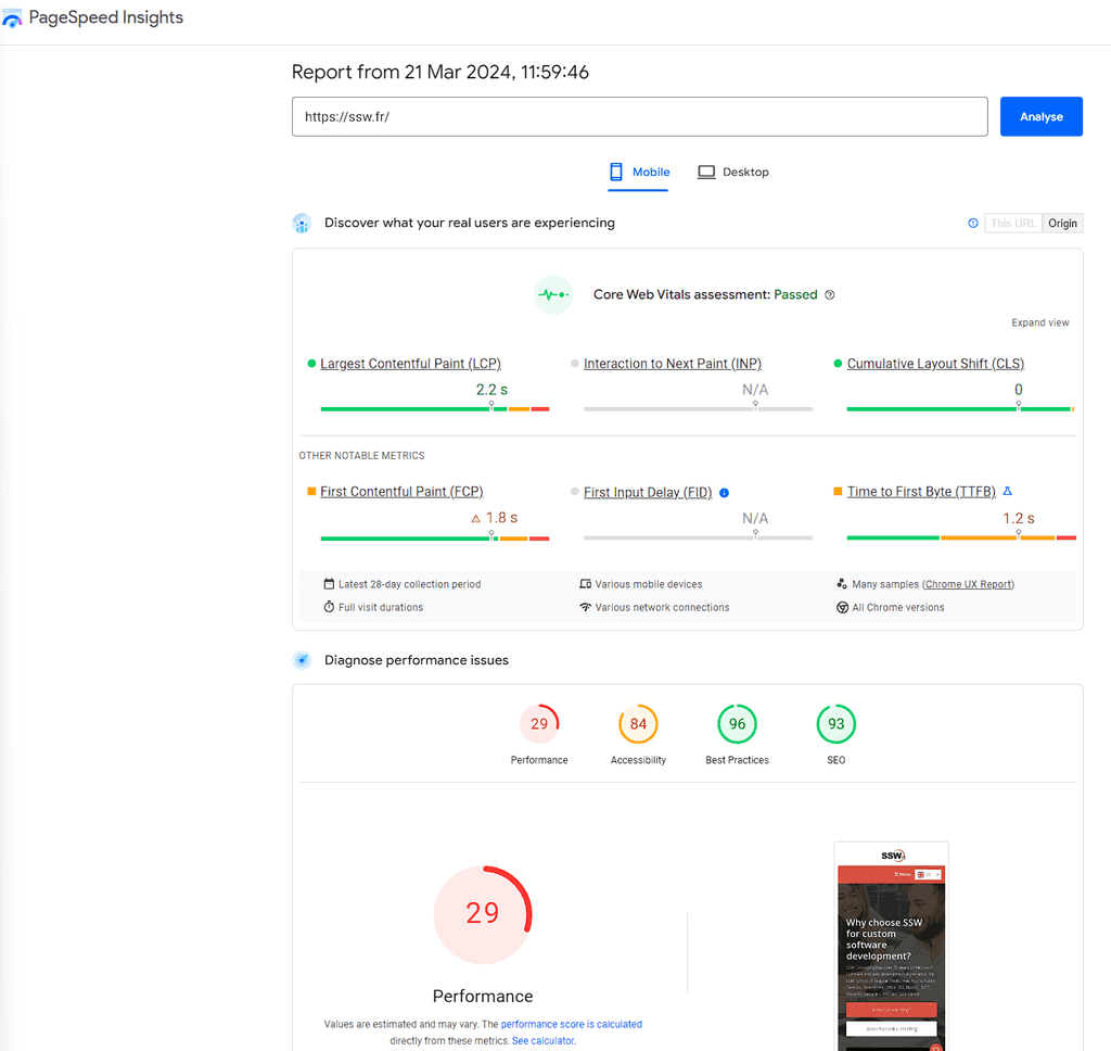
Figure: Google PageSpeed Insights provides both lab and field data about your site's loading speed on mobile devices, along with actionable recommendations to improve performance For a website that expects a lot of first-time visitors, it is wise to put the user registration form on the same page as the sign in dialog. This saves having the user click on another link to enter their details.
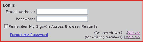
Figure: Bad example - non-friendly sign in screen The image is a bad example of a dialog box because:
- You can easily enter the correct data and click the wrong hyperlink (i.e. Join or sign in)
- By well-established convention, buttons should be used whenever form data is to be submitted back to the server
- The "Forgot my Password" link is ambiguous - Does it take me to a new page or do I have to enter the email address field first?
- A button, not a link, should be used for submitting data, as links don't allow the user to hit "enter"
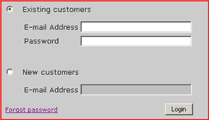
Figure: Good example - friendly sign in screen for many new visitors For a website that expects few first-time visitors, this is a good sign in screen, as it is clean and concise:
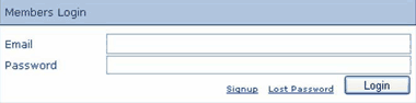
Figure: Good example - friendly sign in screen for few new visitors Note: Generally, the action buttons should be aligned to the right.
It is easier for users to remember their frequently accessed email address more so than one of their many usernames. For this reason, it is best to use email address instead of username for the sign in page.
"I do recommend letting users enter their email address instead of a user ID: It's guaranteed to be unique and it is easy to remember."
Jakob Nielsen , Ph.D. and Principal at Nielsen Norman Group
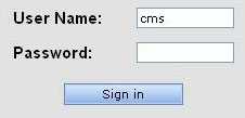
Figure: Bad example - users have to remember which username applies to this particular website 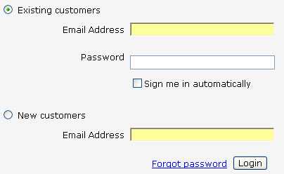
Figure: Good example - users will always remember their primary email address It's easy and common for users to forget their passwords, the vital key which grants them access to the services they are eligible for.To cater for this instance, it is important to have a 'Forgot my password' link on the sign in page.
Figure: Bad example - what will happen for the poor user that forgot their password? 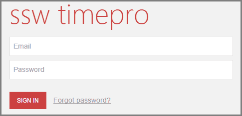
Figure: Good example - users have an option if they forget their password 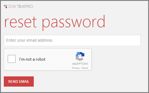
Figure: Good example - users can enter their email to get a new password Do you avoid a username enumeration attack?
This practice also opens up the risk of "username enumeration" where an entire collection of usernames or email addresses can be validated for existence on the website simply by batching requests and looking at the responses.You can read more on Troy Hunt's blog post. You should always aim to not disclose if a user is registered with your site or not.
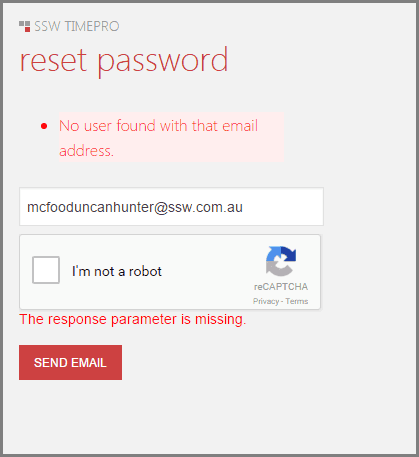
Figure: Bad example - Displaying information that a user does not exist? 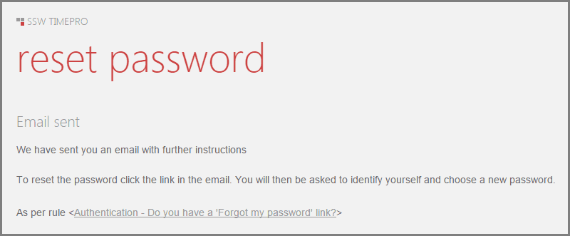
Good example - You should always aim to not disclose if a user is registered with your site or not It is always good to provide the user with an option to have their username and password remembered. Doing so means they don't have to type them again.
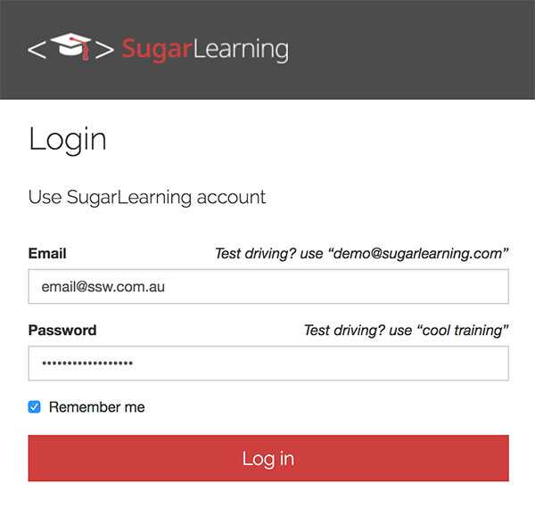
Figure: 'Remember me' checkbox in a Web Form When you present visitors to your site with an opportunity to sign in, you should always include an option to have that person signed in automatically.
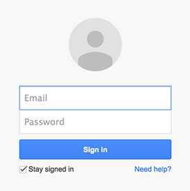
Figure: 'Stay signed in' checkbox is available This should be implemented simply by using a checkbox. A cookie should be stored on the user's computer so that next time they visit your site the sign in process is automatic.
Although most of the sites have a 'Log off' submenu, we recommend adding a short cut next to the username, this will make the 'log Off' operation more convenient.
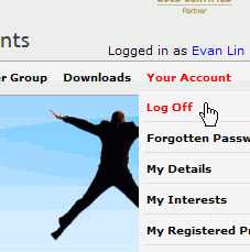
Figure: Bad example - Only has a 'Log Off' operation in the submenu 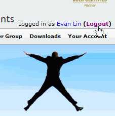
Figure: Good example - Has a 'Logout' short cut next to the username The table tag selector “width” is considered an inline styling, which should be avoided. In the cases you really need to specify the table width you should do it via the CSS file. 
Since HTML5, DOCTYPE no longer requires a reference to a DTD. Back in HTML 4.01, The DTD links were used in to specify the rules for the markup language (Transitional, Strict, Frameset etc) so that the browsers render the content correctly. It's no longer necessary.
<!DOCTYPE html PUBLIC "-//W3C//DTD HTML 4.01//EN" "https://www.w3.org/TR/html4/strict.dtd">Figure: Bad example – Old reference in DOCTYPE
<!DOCTYPE html>Figure: Good example – HTML 5 DOCTYPE declaration
For more information, see HTML !DOCTYPE Declaration on w3schools.com.
When designing your website, it's a good idea to help your users where possible. When you use a combo box, it's very helpful to be able to see at a glance how many results can be expected.
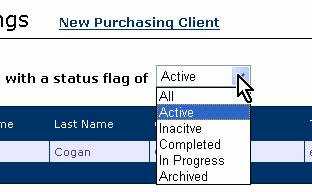
Figure: Bad Example - You can't tell the number of results 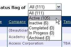
Figure: Good Example - The number of results is clearly displayed According to Design Specifications and Guidelines - User Assistance, the commands for navigating through a wizard should be "< Back" and "Next >".
When your site needs a link to iterate backward through records we recommend that you use "< Back" instead of "< Previous".
There are a few reasons for this:
- This is the standard used in Microsoft Installation files. MSIs are the most widely used installation package available today.
- Internet Explorer and several other lesser-known browsers use a Back button to iterate back through webpages, so your visitors will automatically know what your "< Back" link does.
- It is important to keep consistency on your pages.
Below is an example of a Good "< Back" link versus some Bad variations.
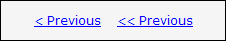
Figure: This is Bad because it says "Previous" instead of "Back" 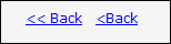
Figure: This is bad because it has too many "<"s or it has no space between the "<" and the "Back" 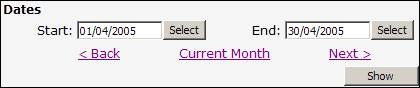
Figure: A Good example of a "< Back" link When getting users to choose data from a medium-long list, or to enter data that has been predefined (such as Country names), it is a good idea to use a predictive-text combo rather than a normal combo or text boxes. A good implementation of predictive-text combos will also perform a type-ahead effect, providing the user with a richer experience.
Also, predictive text boxes can be used with validation, or without. In instances where you don't mind if users add data to your collection you can turn validation off; however, to keep your collection clean, it is recommended to use validation.
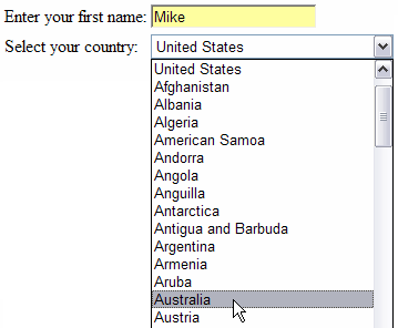
Figure: Bad Example - Using a Textbox and Combo to enter list data 
Figure: Good Example - Predictive-Text combo with Type Ahead 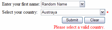
Figure: Good Example - Predictive-Text combo with and without validation 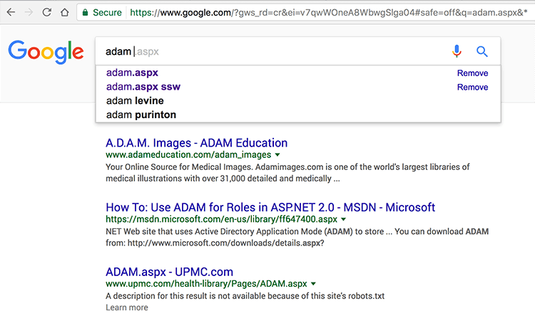
Figure: Best Example - Google search HTML 5 introduced a whole slew of new type properties for forms. Gone are the days of just using
type="text"for every field in a form (barring buttons and checkboxes).Although most of these don't do anything on desktop, on mobile devices they bring up the correct keyboard. As we move into a more mobile digital age, small things like the proper numerical keyboard or a keyboard with a quick ".com" becomes increasingly important.
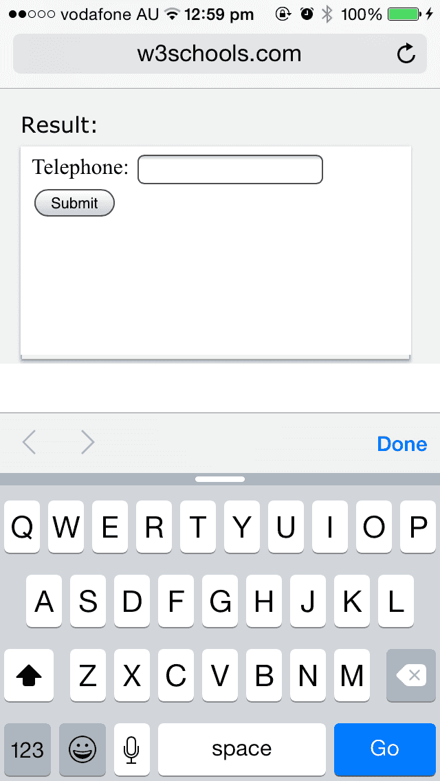
<label for="phone">Phone</label>:
<input type="text" name="phone" />
Figure: Bad example – This field is using a text type and shows a standard keyboard on mobile
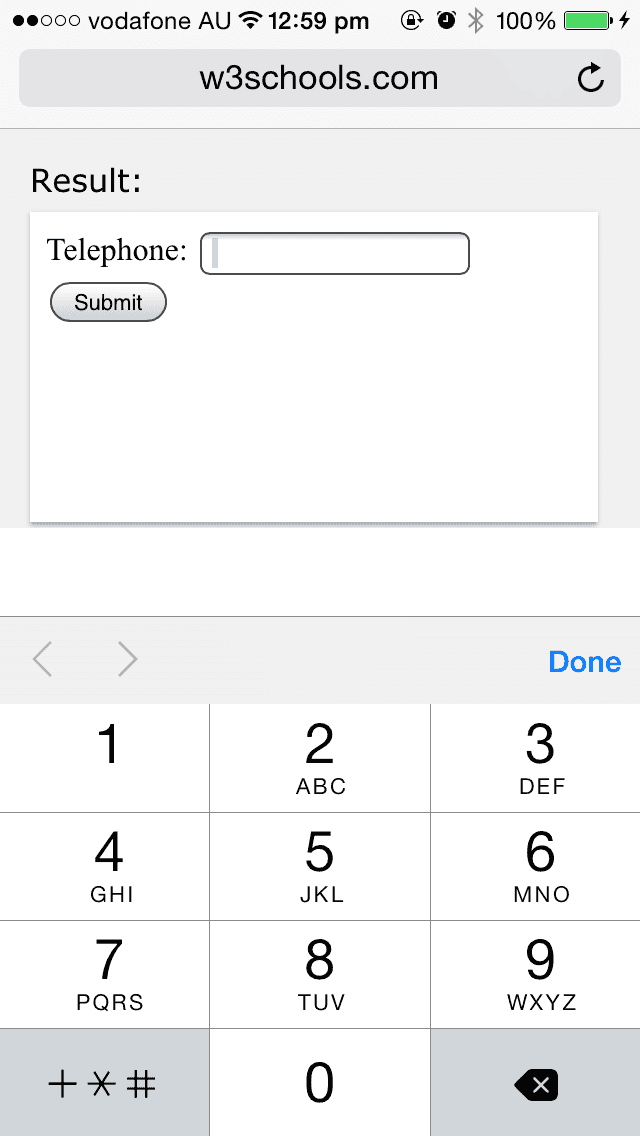
<label for="phone">Phone</label>:
<input type="tel" name="phone" />
Figure: Good example – This field is using the correct field type and shows the keypad on mobile
Here is a table of some useful input types and what they do:
Type What Color This is a color picker. This is not supported on mobile or in all browsers. Date This brings up the date picker on mobile Datetime-local This brings up a date-time picker on mobile Email This adds ".com" and "@" to the keyboard on mobile File Use then when you want a button to upload files. This will also allow users to upload from their mobile device’s photo library. Month This brings up a month and year picker on mobile Number This displays as a number selector on desktop and can be set with upper and lower limits. However, it does not work on mobile yet. Password This masks the characters and should be used for any privacy sensitive information Range This will show a slider control and works on mobile Search This should be used to define search fields Tel This brings up the number pad on mobile Time This brings up the time picker on mobile URL This adds ".com" to the keyboard on mobile The <font> tag is supported in all major browsers, however it is deprecated since HTML 4... so it should not be used. Learn more at w3schools.com.
<font>Some text</font>
Figure: Bad example - Using deprecated HTML <font> tag
<p>My brother has <span style="color:blue">blue</span> eyes.</p>
Figure: Good example - Using <p> for texts and <span> for texts' variations
Tip: The best practice is to CSS classes to define the font family, size, and color.
We have a program called SSW CodeAuditor to check for this rule.
In some cases you may need to display text content on your page with a specific font. Unfortunately web browsers don't provide an easy way to deliver rich typography without sacrificing some functionality. Common approaches include:
- Display the text as an image
- sIFR
- Font stacking
- Google Fonts
- Self-hosting
- Webfont services
Each method mentioned above has their disadvantages. We discourage #1 - Images are bad for Google juice and cannot be selected; and #2 - sFIR uses old technology based on nearly dead Flash.
For more information on the differences between the other methods read: The best way to serve fonts to your website.
If your styles are going to be different, then make it obvious that they are different. Don't be timid about it! This is a great time to be daring!
"Different" can mean many things: different font family, different style, different size, and different color. But the most important thing is to make it obvious that they are different.
Partial differences make people get confused and start asking things like "this looks a bit strange, but I don't know why. Is that intentional?"
Compare the follow two examples:

Figure: Bad Example - The heading and body text is very simlar, only 2px font-size difference. 
Figure: Good Example - The heading as been bolded and the content font size decreased to make it more obvious that the two are different styles. Picking your fonts carefully applies to all forms of design where text is involved. Unfortunately, deciding what sort of differences look good and what doesn't is extremely subjective and is a skill that gets developed overtime.
Why do web pages have "Reset" buttons? I have been entering forms on the web for more years than I care to remember, but have never needed to click this button. The worst thing is I have accidentally hit it a few times after - I have a habit of doing 3 things at once - it happens just after I have finished entering everything and click the first button.
More detailed information about this rule can be found in this article: Reset and Cancel Buttons.
Figure: The "Reset" button isn't useful at all We have a program called SSW CodeAuditor to check for this rule.
We have a program called SSW LinkAuditor to check for this rule.
People may not pay attention to some important words in your interface. Adding a simple and clear icon beside the words will make the difference.
For emails and web content, using an simple emoji is an easy and friendly way to achieve the same result 🙂.
Using icons
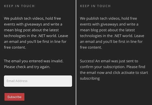
Figure: Bad example - No icons to indicate the status 
Figure: Good example - Green tick and red cross help the user to know what's going on Using emojis
I join a lot of Sprint Reviews, and there is a consistent problem I see among Scrum teams. The PBIs have limited or missing information. Usually, this is due to unclear requirements...
Figure: Bad example - No emojis to enforce the meaning
I join a lot of Sprint Reviews, and there is a consistent problem I see among Scrum teams. The PBIs have limited or missing information 😥. Usually, this is due to unclear requirements...
Figure: Good example - The emoji gives extra focus on what is important
See this rule being used on different scenarios:
- Adding a green tick for successful messages or a red cross for error messages (before the text)
- Adding the type of file next to download links (before the text)
- Adding an icon to external links (after the text)
When a user downloads a file from your site, they should see a progress bar along with the total size and estimated time, this way they will see the size of the download increasing and will knowing when it will finish.
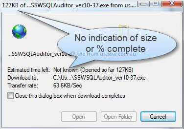
Figure: Bad example - there is no indication of the total size of the download or the percent complete, thus no estimate of how long left 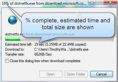
Figure: Good example - percent complete, time left, total size and a progress bar are all shown When you ring up a company and ask “do you sell boxes?” it is not expected to hear them say “no” and hang up. They should answer the question and suggestion something, for example: “No, but we sell plastic containers, would you like that instead?”
Websites should do the same by giving more information instead of just say “404 – page not found” or “your search did not match anything”. It can be a simple “Try one of these instead” giving a number of links.
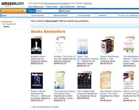
Figure: Good example - If you don’t match anything on Amazon, it gives you some other choices to click on You should avoid any extra style tags in your heading text, because it is unnecessary and generates inconsistency.

Figure: Bad example – bold tags being used within header tags. 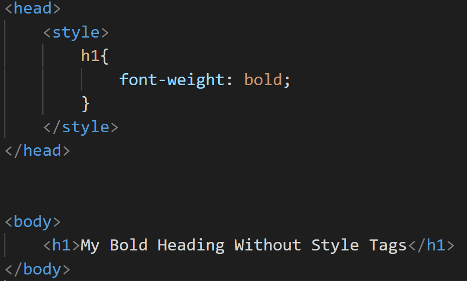
Figure: Good example – all styling is being done through CSS. Tip: You can do all the styling via CSS.
One of the most annoying things when you're surfing a site is to have to use a horizontal scroll bar to view all of the information. Not being able to view all the information from left to right of screen, makes the web page harder and slower to read. The Reader should find the web page easy to navigate, to make viewing the website an enjoyable experience.
Therefore it is bad web design to use a horizontal scroll bar. When designing your site, the page text should respect the user's desire to resize the browser window and have text wrap correctly. Also, you should take into consideration the effect that different screen resolutions will have on how much can fit onto the screen.
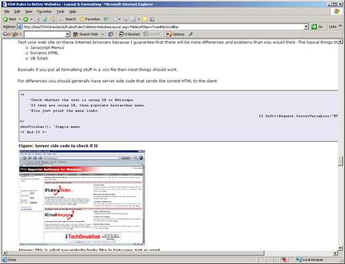
Figure: Bad Example - Using pre code tags and having lines exceed screen size 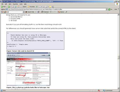
Figure: Good Example - Using pre code tags and having lines not exceed screen size Ever looked at a date on a website and had to stop and think, "Wait, when was that?"
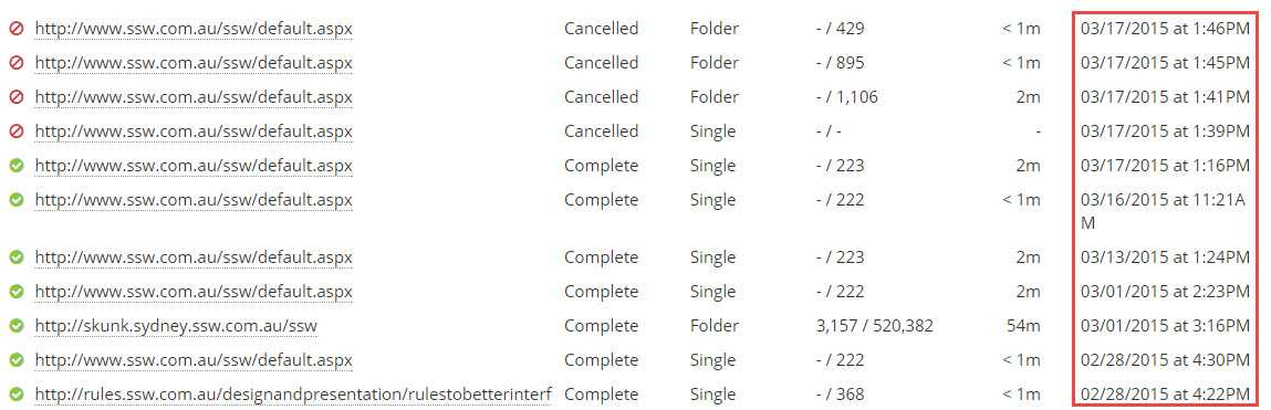
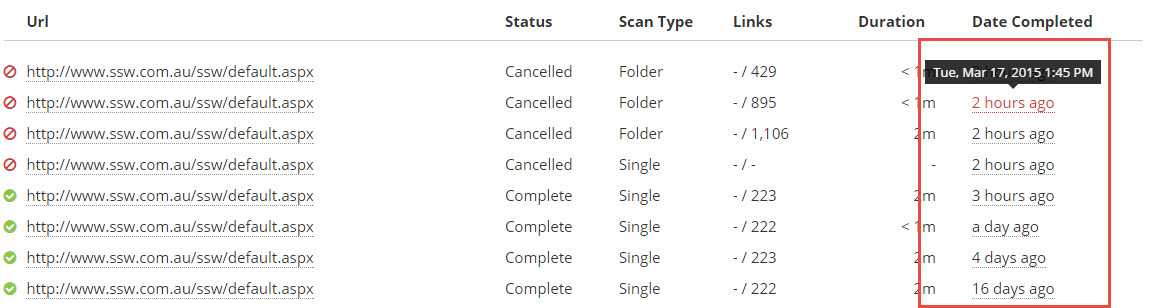
Instead of displaying a rigid date like "2025-03-10 14:30", a more human-friendly format—like "last Sunday" or "3 weeks ago" makes it much easier to grasp at a glance. This is especially useful for past dates, helping users quickly understand when something happened without doing mental math.
Figure: Bad example - Detailed date formatting is difficult to read 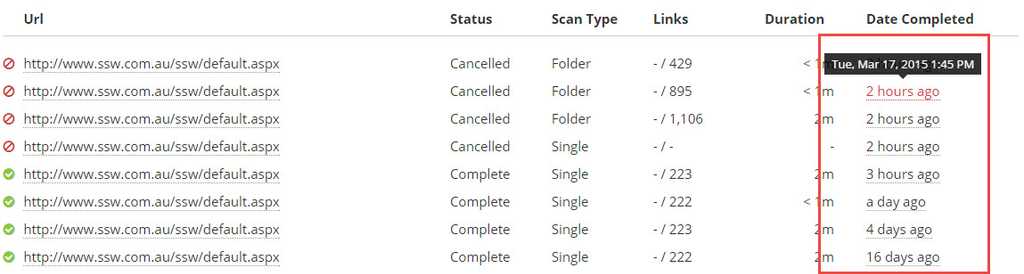
Figure: Good example - Humanized date formatting is easy to read Note: As per the good example, it's a good idea to include a tooltip with extra information about the date, in case the user needs them.
Use a consistent format when writing addresses.
The structure should follow: Number, Street Name, City, State (abbreviation) Postal Code, Country
- Beware of the commas positioning (inexisting between State and Postal Code)
- Don't use dashes, slashes, or bars to separate the elements (OK if it is in the Street Name part)
- Country is not always necessary depending on the audience
- If you have enough space, it is OK to write it in 2 lines
- We're in Australia and this should work for most countries' addresses, but some specific locations might have different address structures that won't allow following this rule
Level 1, 81 - 91 Military Road | Neutral Bay - NSW, 2089 AUS
Figure: Bad example - SSW main office address not following the standard address formatting
Level 1/81-91 Military Rd, Neutral Bay, NSW 2089, Australia
Figure: Good example - SSW main office address following the standard address formatting
Most developers seem to validate a URL and tell the user what they have done wrong only after the error happens. URL fields should show how the users must enter it.
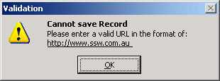
Figure: Bad example - Using a validation message to tell the user to enter a correct URL The better way is to have the user avoid the error with a good default.
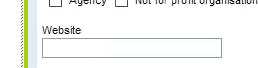
Figure: Bad example - The user has a good chance of entering the URL in the incorrect format 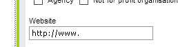
Figure: Good example - User immediately knows the format expected Do you know how to form HTML/XML tags on webpages?We need to make sure that all HTML/XML tags which open once, must be closed properly.
<div>
<p>Hello HTML</p>
</div>Figure: Good Example
<breakfast_menu>
<food>
<name>Homestyle Breakfast</name>
<price>$6.95</price>
<description>two eggs</description>
<calories>950</calories>
</food>
</breakfast_menu>
Figure: Good Example
<div>
<p>Hello HTML
</div>
Figure: Bad Example
<breakfast_menu>
<food>
<name>Homestyle Breakfast
<price>$6.95
<description>two eggs
<calories>950
</food>
</breakfast_menu>
Figure: Bad Example
There are many scenarios where you need some extra space in a web page (HTML or Markdown). No matter which one you are at, CSS is the answer.
Sometimes the first thing that comes to the developer mind is to use the "break line" tag
<br />, or the ASCII character codes for "space" / to create these extra spaces. It's wrong!CSS is the way to go. You can use both "margin" or "padding" CSS properties to get the result you want.
<ul> <li>   List item</li> </ul>Figure: Bad example - Using the "space" ASCII character to create a padding on that list
<ul>
  <li>List item</li>
</ul>
<br />
<br />
<br />
Figure: Bad example - Using the
<br />tag to create a space at the bottom of that listNote: If you cannot use CSS to create some breathing space, using
<br />maybe acceptable as last resort for better readability.ul { margin-bottom: 15px; } ul li { padding-left: 10px; }Figure: Good example - Using CSS to add a margin at the bottom of the list a the padding on the left side of each list item
Tip: You might be not familiar with editing a CSS file... In this case, contact a designer, they will be more than happy to help you.
You should design a website to look good when being viewed in Google Chrome, Mozilla Firefox, the latest version of Edge and Safari unless the client specifically requests otherwise.
There are a lot of other browsers available, but it is important to consider that most other browsers are based on the most used browser nowadays.
Note that readable is not perfect. There may be some page elements that are less than perfect, but it's just not worth of time to fix small bugs in every single browser, except for Google Chrome.
You must test your website on the major browsers, though, because that there will be more differences and problems than you would think. The typical things that you will need to fix are:
- Menus
- Dynamic HTML
- VB Script
You should be able to fix all formatting and layout bugs by editing the CSS file.
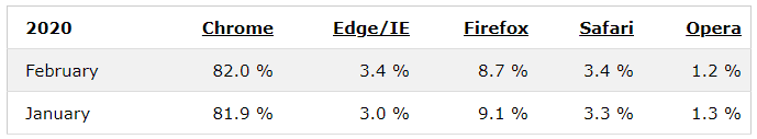
Figure: Browsers statistics in 2020 – Know more in W3C Browser Stats Note: If a browser represents less than 2% of your website views in Analytics, then you shouldn't bother.
E.g. Google archived this link - https://code.google.com/archive/p/html5-js/ - which was used as an HTML5 shim and Respond.js for IE8 support of HTML5 elements and media queries. Since IE represents a small percentage of views it can be removed instead of updated to a new working shim.
When a user looks at a search result, they expect to see a list of items to look into. If there are no results, don't give them noisy text because it can be taken as a search result. An icon also can be understood as a broken page. Your "no results" page should be clean.
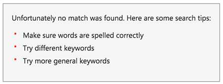
Figure: Bad example - The list of "suggestions" is just noise and can confuse the user 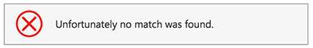
Figure: Bad example - Having an icon implies that an error happened which is not the case 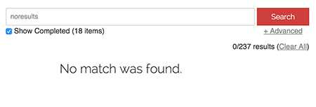
Figure: Good example - Plain and clean screen 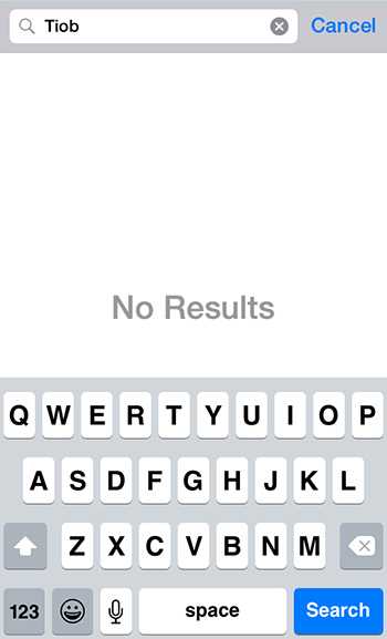
Figure: Good example - Plain and clean screen on mobile Note: In case the message you're showing is a "pass" or "fail, it is recommended to use an icon as per Do you use icons to enforce the text meaning?
There are two ways of arranging labels and inputs on an html form, but each should be used in a specific scenario.
When arranging labels and inputs on your html form, align labels next to the inputs on medium and large displays.
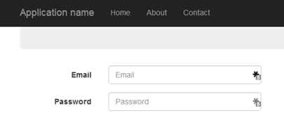
Figure: Labels besides their respective inputs on regular displays When arranging labels and inputs on your html form, align labels above inputs on small and extra-small displays.
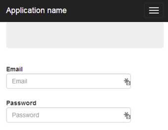
Figure: Labels above their respective input on smaller displays Bootstrap makes this easy. Read Do you use the css class "form horizontal" to arrange your fields and labels? to know more.
The HTML list tags <ul> and <ol> should be used for unordered and ordered lists only .
Tip: If your list tag (<ul> or <ol>) doesn't have a list item (<li>) inside it, then it's not a list. Consider using another HTML tag (E.g. <p>).
<ul> A normal text </ul>
Figure: Bad Example - Using the <ul> for a text
<ul><li>A list item</li></ul>
<ol><li>A list item</li></ol>
Figure: Good Example - Using the <ul> and <ol> for lists
To keep profile management simple and make it easier for users to have a consistent experience across applications, you should use Gravatar for showing profile images in your application.
Gravatar is blocked by Great Firewall of China (GFW), and clients from China can't access their profile photos successfully without a VPN. There is an alternative option for Chinese users which is Cravatar.
Your Gravatar or Cravatar is an image that follows you from site to site appearing beside your name when you do things like comment or post on a blog.
Setting up Gravatar in your application
It is simple to set up and if you are developing an MVC application, there are even several Nuget packages to make your life easier. The GravatarHelper is recommended.
@Html.GravatarImage("[email protected]", 80, new { Title = "My Gravatar", Alt = "Gravatar" })Also, check out the Gravatar API documentation for all the options available.
The below short video shows how to get up and running with Gravatar in your ASP.NET MVC application.
Setting up Cravatar in your application
Unlike Gravatar, Cravatar doesn't provide any library to generate profile image URL from email address. To solve this issue we can create custom helper class which creates profile URL for us.
public static class CravatarHelper
{
    private const int MIN_IMAGE_SIZE = 1;
    private const int MAX_IMAGE_SIZE = 2048;
    private const string WEBSITE = "https://cravatar.cn/avatar/";

    private static int ValidateImageSize(int imageSize)
    {
        imageSize = Math.Max(imageSize, MIN_IMAGE_SIZE);
        imageSize = Math.Min(imageSize, MAX_IMAGE_SIZE);
        return imageSize;
    }

    public static string GetCravatarImageUrl(string email, int imageSize, string defaultImageUrl)
    {
        if (string.IsNullOrEmpty(email))
        {
            return string.Empty;
        }

        UriBuilder uriBuilder = new UriBuilder(WEBSITE);
        email = email.Trim().ToLower();
        uriBuilder.Path += $"{email.ToMD5Hash()}";

        string queryString = "";
        if (imageSize != 0)
        {
            imageSize = ValidateImageSize(imageSize);
            queryString += $"s={imageSize}";
        }

        if (!string.IsNullOrWhiteSpace(defaultImageUrl))
        {
            queryString += $"&d={defaultImageUrl}";
        }

        if (!string.IsNullOrEmpty(queryString))
        {
            uriBuilder.Query += queryString;
        }

        return uriBuilder.Uri.ToString();
    }
}

public static class StringExtensionMethods
{
    public static string ToMD5Hash(this string str)
    {
        byte[] hashBytes = MD5.HashData(Encoding.UTF8.GetBytes(str));
        StringBuilder strBuilder = new();

        if (hashBytes != null)
        {
            for (int i = 0; i < hashBytes.Length; i++)
            {
                strBuilder.Append(hashBytes[i].ToString("x2"));
            }
        }

        return strBuilder.ToString();
    }
}
Now we can call custom helper function to create a profile URL and use it in the application.
@{
    ViewData["Title"] = "Home Page";
    string profileURL = CravatarHelper.GetCravatarImageUrl("[email protected]", 80, "mm");
}

<img src=@profileURL alt="avatar"/>
For more information, check out the Cravatar API documentation.
If possible you should always use hyperlinks to open new pages on your site instead of using JavaScript.
There are two good reasons for avoiding JavaScript-powered links:
- Copying and pasting sections of the site to an email or a document will maintain the clickable links
- There's an (ever-decreasing) chance a user won't have JavaScript enabled and won't be able to click the link
<div onclick="window.open('mynewpage.html');">Open a new page</div>Figure: Bad Example - This link can't be clicked on if you paste it into an email or if JavaScript is off
<a href="mynewpage.html">Open a new page</a>Figure: Good Example - This link can still be clicked on when pasted and when JavaScript is turned off
The best way to show the features of a product is creating a video. The information you are able to communicate in seconds of a video would take hundreds of words of text to explain.
Videos are also important for services, but for products, it should be on the homepage .

Good Example - Dropbox homepage has no text but a video that shows nicely how it works Videos are also good for SEO
By embedding videos onto your website it will help get the videos more views, which is a determinant for Google nowadays.
Providing the duration of a video helps set clear expectations for viewers, allowing them to gauge how long it will take to watch and improving overall engagement. Consistently using a standardized format for hours, minutes, and seconds ensures clarity, making it easy for audiences to quickly understand and trust the presented information.
The following table shows the right format for writing video time lengths (hours, minutes, seconds) on the web.
Duration Correct format ❌ Bad examples ✅ Good examples Less than 1 minute {{x}} sec 30s / 30secs / 30 secs 30 sec 1 to 59 minutes {{x}} min 25m / 25mins / 25 mins 25 min 1 hour {{x}} hr 60 mins / 1 hour / 1h 00m 1 hr More than 1 hour {{x}} hr {{x}} min 3h 05m / 3h5min / 3h 5m 10s / 3 hrs 5 mins 3 hr 5 min Notes:
- "1 h" is also accepted, but we prefer "1 hr"
- You should ignore seconds for anything longer than 1 minute
- Although "mins" is a commonly used abbreviation for minutes, you should be aware that it is not correct for scientific use. See when to use "mins" or "min" as an abbreviation for minutes for more information
For a real example of displaying a video time length, see this rule on being a good Product Owner.
Consistency across your similar pages (such as standards pages in this case) is very important and should be made easy to implement.
Guidelines and standards for the SSW website pages can be found at SSW Web Design References .
A stylesheet file (.CSS) should be used to dictate how the fonts, headings, tables, captions and everything else on your HTML should be displayed.
This makes your site very easy to maintain. If you ever want to change the entire look and feel you should only have to change one file.
We have a rule on using relevant words on links. How to make sure people will know which words are links and what the links are after printing a page?
As a good practice, you should use CSS to print the URL's next to each link when printing:
@media print {
  a[href]:after {
    content: " (" attr(href) ")";
  }
}
In specific cases, like on breadcrumbs and logo, you don't want these URL's, so you should override the style:
@media print {
  .breadcrumba[href]:after {
  content: none;
}
Figure: Good example - Printing links on the content but avoiding it on obvious places, like the logo and bradcrumbs When you embed a YouTube video it will increase your page size from 500kbs to 1.5Mb or more, depending on how many videos are embedded on the page.
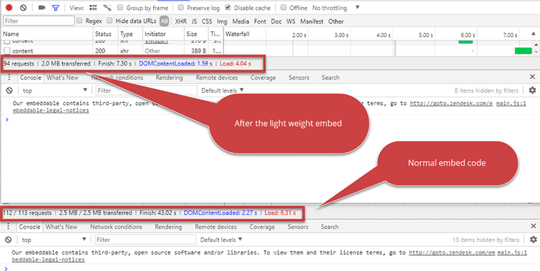
Figure: A side by side comparison – everyone wants less requests and a smaller page size 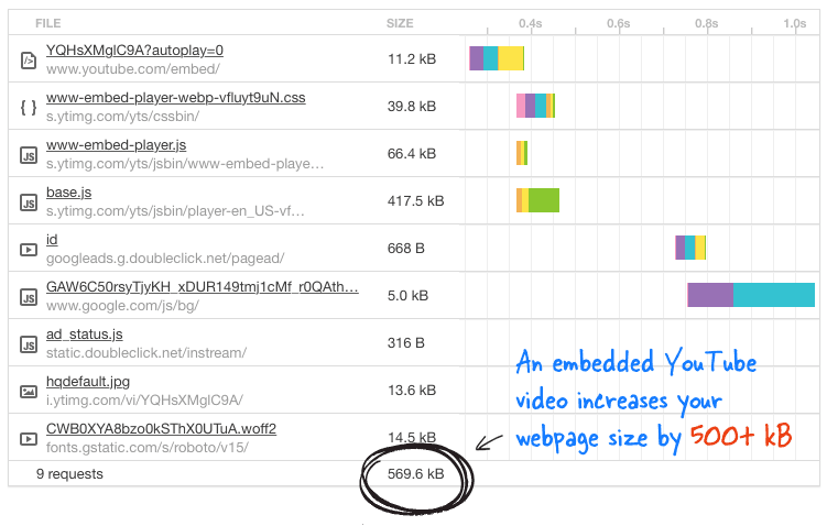
Figure: Bad example - Don’t add embed code directly from YouTube. For more details read "A Better Method for Embedding YouTube Videos on your Website" <iframe width="560" height="315" src="https://www.youtube.com/embed/eu0qhzevEXQ" frameborder="0" allowfullscreen ></iframe>Figure: Bad example – The evil HTML code
There is a clever, lightweight way to embed a YouTube video, which Google itself practices on their Google+ pages which reduce it to 15kbs.All you have to do is, whenever you need to embed a video to a page, add the below tag instead of the YouTube video embed code. (Remember to replace VIDEO_ID with actual ID of the YouTube video)
<div class="youtube-player" data-id="VIDEO_ID"></div>Figure: Good example – The good HTML code
Note: This script needs to be added at the end of the document:
<script>
  /* Light YouTube Embeds by @labnol */
  /* Web: http://labnol.org/?p=27941 */
  document.addEventListener("DOMContentLoaded", function () {
    var div,
      n,
      v = document.getElementsByClassName("youtube-player");
    for (n = 0; n < v.length; n++) {
      div = document.createElement("div");
      div.setAttribute("data-id", v[n].dataset.id);
      div.innerHTML = labnolThumb(v[n].dataset.id);
      div.onclick = labnolIframe;
      v[n].appendChild(div);
    }
  });
  function labnolThumb(id) {
    var thumb = '<img src="https://i.ytimg.com/vi/ID/hqdefault.jpg">',
      play = '<div class="play"></div>';
    return thumb.replace("ID", id) + play;
  }
  function labnolIframe() {
    var iframe = document.createElement("iframe");
    var embed = "https://www.youtube.com/embed/ID?autoplay=1";
    iframe.setAttribute("src", embed.replace("ID", this.dataset.id));
    iframe.setAttribute("frameborder", "0");
    iframe.setAttribute("allowfullscreen", "1");
    this.parentNode.replaceChild(iframe, this);
  }
</script>
..and this needs to be added in the CSS:
<style> .youtube-player { position: relative; padding-bottom: 56.23%; /* Use 75% for 4:3 videos */ height: 0; overflow: hidden; max-width: 100%; background: #000; margin: 5px; } .youtube-player iframe { position: absolute; top: 0; left: 0; width: 100%; height: 100%; z-index: 100; background: transparent; } .youtube-player img { bottom: 0; display: block; left: 0; margin: auto; max-width: 100%; width: 100%; position: absolute; right: 0; top: 0; border: none; height: auto; cursor: pointer; -webkit-transition: 0.4s all; -moz-transition: 0.4s all; transition: 0.4s all; } .youtube-player img:hover { -webkit-filter: brightness(75%); } .youtube-player .play { height: 72px; width: 72px; left: 50%; top: 50%; margin-left: -36px; margin-top: -36px; position: absolute; background: url("//i.imgur.com/TxzC70f.png") no-repeat; cursor: pointer; } </style>"Adaptive placeholders" are form labels that become into placeholders and vice-versa, depending on which fields have been filled or not. It gives your website a great UX.
It's also a nice way to save space and achieve a neat visual appearance. Using this method users can easily to tell which field has been filled in and which data has been entered.
Figure: Bad example - Having both label and placeholders can be repetitive and dull 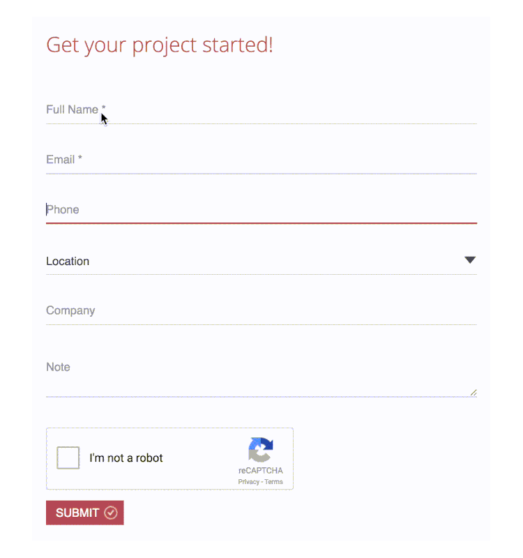
Figure: Good example - Using adaptive placeholders Checkboxes are presented as small square box in user interfaces. It has two states: checked and unchecked.
When to use checkboxes in UI design
Checkboxes are used in forms to indicate an answer to a question, apply a batch of settings or allow the user to make a multi-selection from a list. Alternatively, a single checkbox may be used for making single selections – such as Boolean True or False statements (e.g. “Do you agree with the terms and conditions? Yes or no”).
Figure: Good example - Accepting or refusing to remember accounts when login to SugarLearning (the single selection checkbox) CheckBoxes are also suitable to use for enable or disable sections and to tell the user that these sections do not need configuring for the application to run.
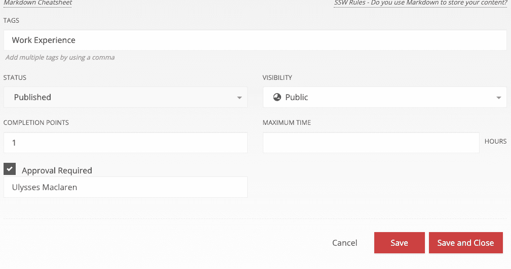
Figure: Good example - CheckBoxes are used to setup the approval workflow in SugarLearning, only need to enter the approv when the checkbox is checked Checkboxes allow the user to select one or more from a wide range of options. Applications use a series of checkbox groups to help the user filter search criteria.
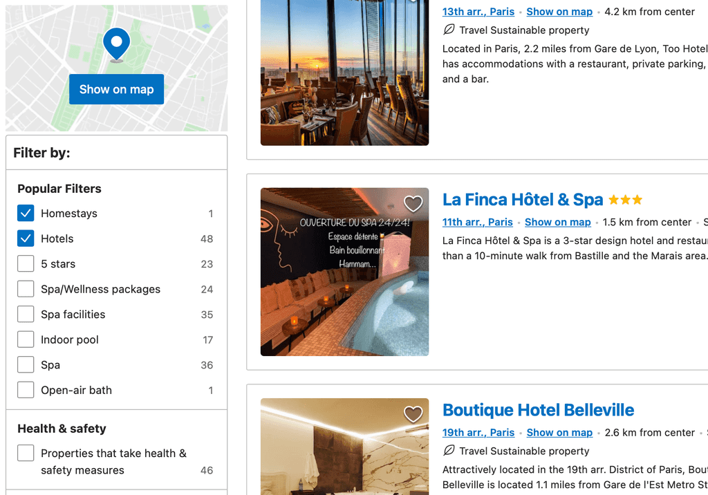
Figure: Good example - Booking.com’s users frequently use the checkbox filters when making a booking If there are only 2 options available on the form (usually a yes/no answer), the use of a checkbox is more intuitive than radio buttons. Usually, use radio buttons if there are more than 2 options; or if the labels information are more complex than a yes/no.
When to use options group Radio Buttons instead of ComboBox?
When the options are static items (not database driven) and they can fit on the screen (about 2-5 items), they should be radio buttons.
The bad thing about having a ComboBox in this scenario is the user needs 2 clicks to change the value...
- Click the little "v" button to see the available options
- Then click the option to select
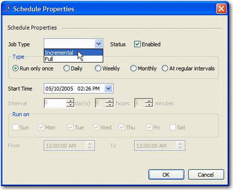
Figure: Bad example - ComboBox is used for "Job Type" where it contains only 2 options The good thing about an options group is that the user can see all the available options without clicking, and select the option with just 1 click.
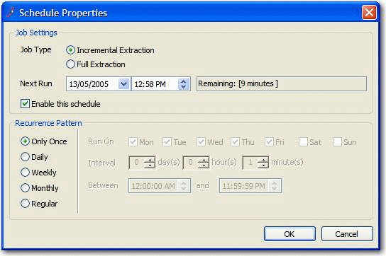
Figure: Good example - Radio Buttons are used and aligned vertically For multiple items selection, multi-select dropdown listboxes have a number of behavioral quirks that make it difficult for users to get used to them:
- They require users to know that you select more than one entry by holding down the Ctrl key
- They lose all selections if you click in the wrong place
- You can't tell if a Listbox is single-select or multi-select at first glance
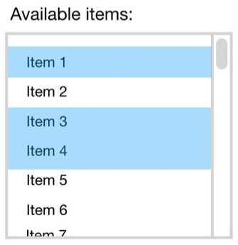
Figure: Bad Example - ListBoxes are impractical for multiple choices Note: It is OK and recommended to use dropdown lists for single item selection, when there is no more than 10 options.
Checked Listboxes are the ideal alternative for multiple items selections. They're much more pleasant to use and are a good deal more intuitive - compare to the list above. Checked Listboxes tell users immediately that they have the ability choose multiple options.
- In ASP.NET, use System.Web.UI.WebControls.CheckBoxList. If you're having problems with there being too many items in the list, use a scrolling div
- In Windows Forms, use System.Windows.Forms.CheckedListBox
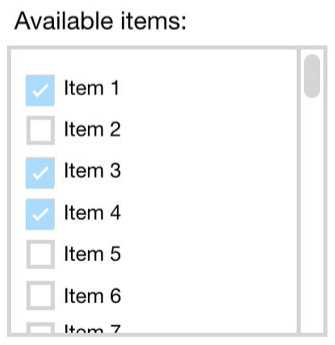
Figure: Good Example - The beauty of the CheckListBox for multiple choices We have a program called SSW Code Auditor to check for this rule.
When asking for an opinion do you give people the option of having no opinion at all? If you only provide "Yes" or "No" as answers to the question "Do you like apples?" then you force people to make a decision which may not be correct.
Do you like apples? ( ) Yes ( ) No
Maybe they only like cooked apples not raw ones. When asking any question in which "Don't know." or "Don't care." is a valid response, always include an option to opt out of answering.
Additionally, when the user don't answer the question at all, the response you would get would be determined by the browser the user was using. Give them an answer they can agree with and you'll reduce the chance of bogus responses.
Do you like apples? ( ) Yes ( ) No ( ) Cannot say
A button should be disabled if it is unavailable, if clicking it would generate an error message, or if it would carry out no function. However, buttons should not be hidden from view simply because they are unavailable, as it confuses the user.
Different button states must have clear and distinct styling that differentiates them from each other and emphasizes them through the creation of a visual hierarchy.
When buttons are in a disabled state the accepted standard is to “grey it out”. Using colour to create contrast like this serves to lower the emphasis on disabled buttons in favour of active ones. Lowering opacity or outline-only greyed buttons are other common ways to indicate a disabled state (Note the latter is only effective if outline buttons are not present elsewhere in the UI). Disabled buttons should also never display on-hover or on-click styles, to further convey their disabled state to the user.
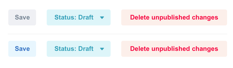
Figure: Bad Example - Low contrast between disabled and active button styles. 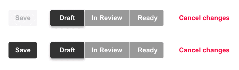
Figure: Good Example - High contrast creates distinct visual hierarchy There are two aspects to this rule:
- Arrange Vertically
- If your user must choose from a variety of responses, or select from a number of items, using either radio buttons or check boxes, arrange the items vertically rather than horizontally as it makes the association much clearer. NOTE: You might want to disregard this rule if screen real estate is at a crucial premium.
Do you like apples? Yes No Cannot say
Do you like apples? Yes No Cannot say - Text on the Right The Option Group or Check Box should always be on the left, with the text following on the right. Once again, this makes it easy for the User to work out what is going on.
Figure: Good Example - Action on the left, text on the right The widths of the fields indicate to a user the data that goes in it. Do not use a large width field when you know the entry will have only few characters (the same for small fields and large entries)
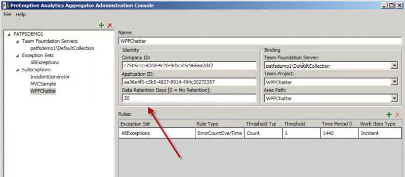
Figure: Bad example - The 'Data Retention Days' field should be reduced In menus (including context menus) or buttons, there are generally two types of actions:
- ones that carry out an action without any further user intervention upon clicking;
- and those that require further user input before the action is carried out
Microsoft applications use this technique to indicate whether or not the action will be carried out without any further user intervention. Your application should also follow this well-established standard, so users will not be caught off guard when an action carried out immediately after they click the menu item.
Figure: Good Example - Options menu in Outlook, with ellipsis 
Figure: Good Example - Ellipsis on buttons that require further input 
Figure: Good Example - Different ways of using the elipsis 
Figure: Good Example - Elipsis being used on a button requiring user input Do you have checkbox (on the top) that let users select or unselect all checkboxes underneath it? If you have a list of checkboxes, you are going to frustrate users unless you provide an easy way to select all. The best way to achieve this is to have a checkbox at the top.
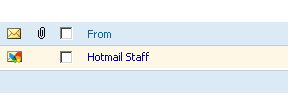
Figure: Good Example - Hotmail does this 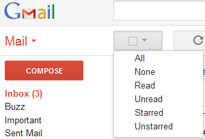
Figure: Google have done it a different way to provide multiple methods (All, All Read, All Unread, All Starred, and All Unstarred) 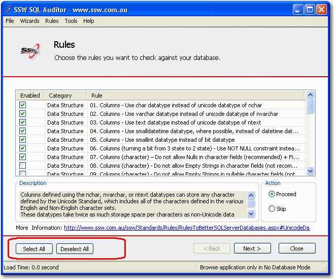
Figure: Bad Example - SQL Auditor - No CheckBox for users to perform a "select all" 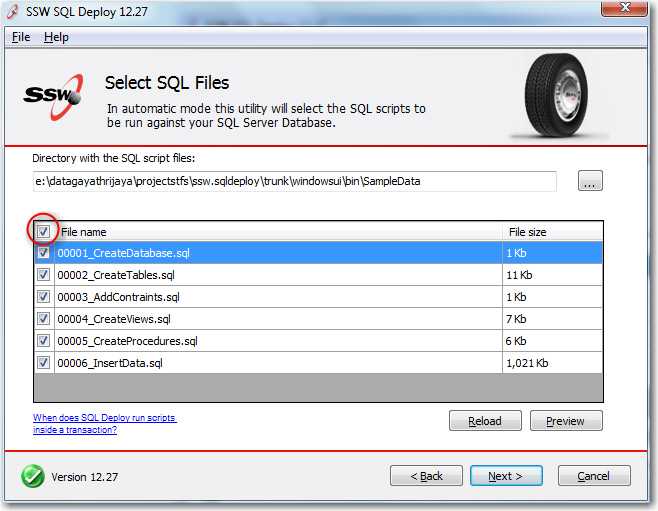
Figure: Good Example - SQL Auditor - CheckBox at the top of the column 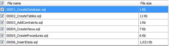
Figure: Selecting all does this - selects all 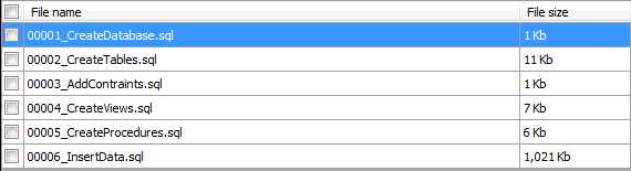
Figure: Deselecting all does this - selects none 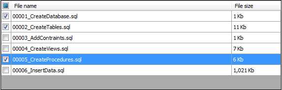
Figure: Selecting some should show the Indeterminate check state - aka customized selection Private Sub CheckBoxSelectAll_CheckedChanged(ByVal sender As System.Object, ByVal e As System.EventArgs) _Handles CheckBoxSelectAll.CheckedChanged'Select checkbox in each rowFor Each sDataGridViewRow As DataGridViewRow In Me.DataGridViewCustomer.RowssDataGridViewRow.Cells(0).Value = Me.CheckBoxSelectAll.CheckedNextEnd SubCode: Code for selecting all checkboxes in a windows form
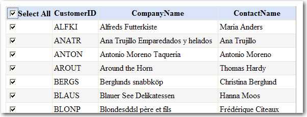
Figure: Select all checkboxes in a web form <script type="text/javascript">function SeleteCheckBox(){for (var n=0; n < document.form1.elements.length; n++){if (document.form1.elements[n].type == "checkbox" && document.form1.elements[n].name == "gridview"){document.form1.elements[n].checked = document.getElementById("CheckBoxAll").checked;}}}</script>Code: Code for selecting all checkboxes in a web formWe have suggestions for Visual Studio .NET about this at A top CheckBox to "select all" in windows forms and A top CheckBox to "select all" in web forms.
ComboBoxes are better than List Boxes for data entry because:
- They occupy less screen space
- They are less trouble to scroll through, owing to the fact that you can afford to have more room for the list (as it's collapsed most of the time)
- As you can see in the figures below, using a combo also makes the required field indicator (*) easier to see.
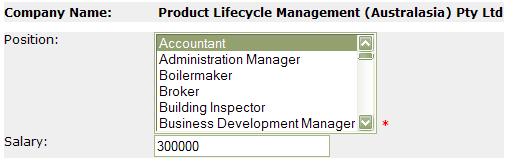
Figure: Bad Example - Using list boxes 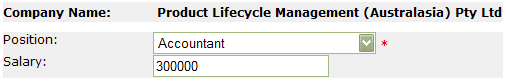
Figure: Good Example - Using ComboBoxes - takes up less screen space and the required field indication is easy to see Note: When are single-select list boxes OK?
As mentioned before, there are exceptions to this rule. It would be hard to imagine the Include/Exclude boxes in the SQL Server Enterprise Manager's Server Registration Wizard being handled with ComboBoxes, for example.
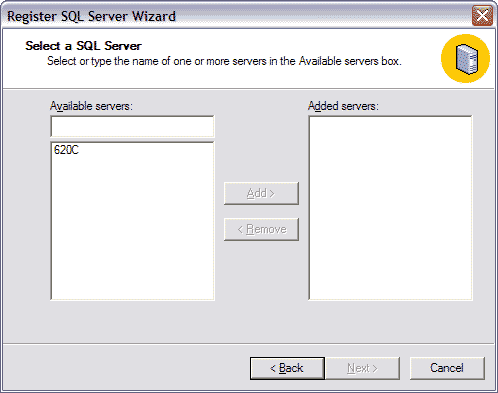
Figure: Include/Exclude Listboxes are an example of a valid use for List Boxes We have a program called SSW Code Auditor to check for this rule.