Rules to Better Content Design - 18 Rules
Content design helps create a frictionless user experience by presenting the right information in the right way and at the right time. This is an application of design thinking principles, improving the ways you structure and present user-oriented content. Effective content leads to better:
- Clarity and comprehension
- User experience, engagement, and satisfaction
- Consistency
- Conversion optimization
- Accessibility
In today's fast-paced world, lengthy emails, web content, and instant messages can be overwhelming and difficult to navigate.
Less is more
To ensure effective written communication, it's crucial to embrace the principle of "less is more". By being concise and focusing on relevant information only, we can capture the reader's attention and prevent important messages from being overlooked or postponed due to time constraints. So, let's keep it short, direct, and to the point, ensuring our messages are accessible and impactful, even for busy individuals on the go.
"I didn't have time to write a short letter, so I wrote a long one instead."
Mark TwainWhen writing any content it is vital you cut unnecessary words to keep the reader interested and focused. This is especially important for dense or technical documentation.Your writing can be less wordy and still get the message across.
Click the "Select" button
Figure: Bad Example - Unnecessary words
Click "Select"
Good Example - Short and direct
"Building Software that People Understand"
Figure: Bad Example - Common filler word "that"
"Building Software People Understand"
Figure: Good Example - Remove filler words for a clearer message
Improve your content and ask - how many words don't provide value or clarity?
People rarely read word by word. Instead they scan the page, picking out individual words and sentences that seem more relevant.
Keep it simple! It is important to break up information, not show it all at once. The visual organization of information is vital to legibility. When displaying information or controls, designers need to visually convey:
- Information structure
- Relation between elements
- Importance and relevance of elements
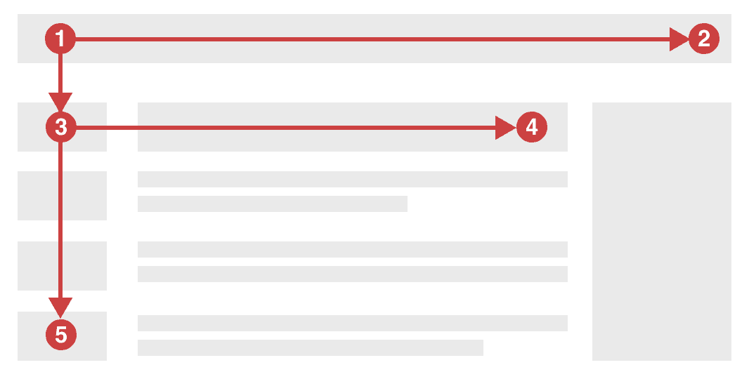
Figure: Bad example - Can you find how to check in? 
Figure: Good example - What about here? Can you find how to check in? The F-shape is a behavioral pattern describing the way users consume web content.Understanding common reading habits is essential for anyone writing content on the web.We can intentionally organize information to create friendly products aligned with natural user behavior.
The F-shaped pattern
The term was popularized in 2006 by the Nielsen Norman Group. These world leaders in user experience research have conducted eye-tracking studies that found:
- Users read only the first few lines of content on a page, so make sure you don't bury your headline
- Users skim down the left side of the page primarily
Figure: The F-shaped pattern reflects our tendency to skim The desire for quick efficiency drives this behaviour. Users seek to avoid the information overload today’s internet throws at them.
Note: The F-shaped pattern is an observation of human behaviour in the age of digital content and media. Research has found the F-shape remains surprisingly relevant to native speakers of many languages. Right-to-left readers use the same pattern, but flipped.
Applying the principle
By placing important information along the user’s likely path we can ensure the user’s journey is an easy one. Some simple ways to achieve this include:
- No walls of text (Be concise).
- Front-loading key content (Don’t bury the lead)
- Bulleted or numbered lists are ideal for blocks of content that are still easy to skim
- Clear headings should be succinct and establish an understandable page structure
- Simple imagery is more consumable than text (A picture speaks a thousand words)
- Icons aligned to the left of text allow for quick scanning and pattern recognition (if they’re not overused)
Secondary reading patterns
The F-shape is the most common way users read content, but other reading patterns exist. Keep in mind these secondary patterns and their respective niches.
- Z-shaped pattern - Where users scan the corners in a zig-zag from top left to bottom right. Typical on pages that are image-based or less text heavy.
- Layer-cake pattern – Where users skim headings and subheadings only, in horizontal lines. Common on dense text-heavy pages.
- Spotted pattern – Where user focus jumps between key elements as if looking for something specific (e.g. reading only the hyperlinks on a page).
- Bypassing pattern – Where users intentionally skip over the first word(s) of the content. Common when many lines or headings begin with the same words.
Remember, understanding how users interact with content is key. Place important landmarks along the user's natural pathway to facilitate comprehension and engagement.
Write in a way that is compelling, engaging, and direct to get the most out of your content. The secret to this is using an active voice.
What is active voice?
Active voice follows the pattern subject -> action -> object. It shows the subject is actively performing an action. This is the opposite of passive voice, where the subject recieves the action instead: object -> action -> subject.
Below are some examples:
When the CD is inserted, a Windows dialog will be shown.
Figure: Bad Example - Passive voice leads the reader down a winding path
Windows shows a dialog when you insert a CD.
Figure: Good Example - Active voice is more direct and engaging
An easy way to tell if you're using the passive voice is to add "by zombies" after the verb (i.e. the action). If your sentence still makes sense, you're using passive voice.
The email was sent (by zombies).
Figure: Bad example - Passive voice
Zombies sent the email.
Figure: Good example - Now that's an engaging sentence
Why avoid passive voice?
- It uses more words. In the figures above, the "Bad examples" are notably longer than the "Good examples"
- It's less impactful. Instead of having the subject make an action, the subject recieves the action
- It obscures the subject. In the bad examples above, you don't know who or what you're reading about until the end of the sentence. With active voice, you know immediately
- It's formal and detached. Passive voice makes your writing feel detached and objective. This can be a useful tool but leads to less engaging content.
One is not inherently better than the other. But if you want to create clear, direct, and punchy content - active voice is the answer.In conclusion:
Do you (subject) write (action) content (object) using active voice?
Web content should be written in 3rd person language, as if read by a newsreader. It is objective and describes its content professionally. A good example of this is Wikipedia.
At SSW we don't use JavaScript. We prefer Angular because...
Figure: Bad example - using 1st person writing makes it sound like opinion
Angular is superior to JavaScript because...
Figure: Good example - using 3rd person writing makes it sound like fact
Quotes
When quoting a testimonial, it is OK to use 1st person writing. Of course, the sentence should be in quotes. Think of it like a newsreader crossing over to an eyewitness for a personal view of the topic.
Don Bradman says: "I thought that SSW's work was fantastic!"
Figure: Good example - 1st person in the context of quoting is appropriate
How you or your product speaks to users is integral to their experience and has notable impact.Tone dictates how your content feels in digital spaces that lack face-to-face communication.
Tone of voice is everywhere in UX and content design, from hero banners to button text and error messages.A casual tone on a corporate website may come across as unprofessional, while a formal voice on a social media can feel detached and unengaging.
Know your audience
Knowing your audience is key to good design.Who are your users? What are their expectations? How can you align with them?
Consider the following:
- Demographics - Analyze the demographics of your audience. E.g. age, gender, location, and cultural background
- Psychographics - Understand the values, beliefs, and preferences of your audience. Tailor your tone accordingly
- Preferred channels - Identify the spaces and tools your audience prefers and adapt to suit them
Find the right voice
Think of your product or brand as a person. How does that person talk and act?
- Formal vs Casual - Official correspondence, or talking to a friend?
- Serious vs Funny - Solemn and stern, or fun and silly?
- Respectful vs Irreverent - Dictionary words, or cultural references and made-up phrases?
- Matter-of-fact vs Enthusiastic - Informative statements, or drama and hyperbole?
Oops! We're in our 404 flop era. Sorry about that!
Figure: Example - Casual, fun, irreverent, and enthusiastic
404 error: We apologize for any inconvenience.
Figure: Example - Formal, serious, respectful, and matter-of-fact
Why tone matters
In a UX study by the Nielsen Norman Group users gave feedback on 4 websites. They saw 2 versions of each site, where the only difference was tone of voice.
Users displayed clear preferences for each product. The right tone felt more credible and trustworthy - key measures of desirability.The tone of voice that creates that feeling of trust will differ based on your specific audience and their concerns.
The Hemmingway Editor is a tool that analyzes content and highlights problematic areas. This process reveals common writing issues that impact readers. Lean on this tool to internalize good writing practices.
Why use Hemmingway?
This is a tool that analyzes text for readability. It's particularly useful for longer pieces, like articles or blog posts.
It highlights:
- Use of passive voice
- Simple alternatives to complex phrases
- Overuse of adverbs
- Long and hard to read sentences
The editor also reports a grade-level readability score. Grade 9 reading level or below indicates the most understandable content.
How to use it
Copy and paste content into the editor for immediate feedback. Action as many suggestions as possible, and try to achieve that grade 9 readability or better.
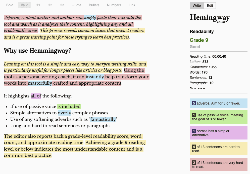
Figure: Bad example - Hemmingway Editor highlighting readability issues 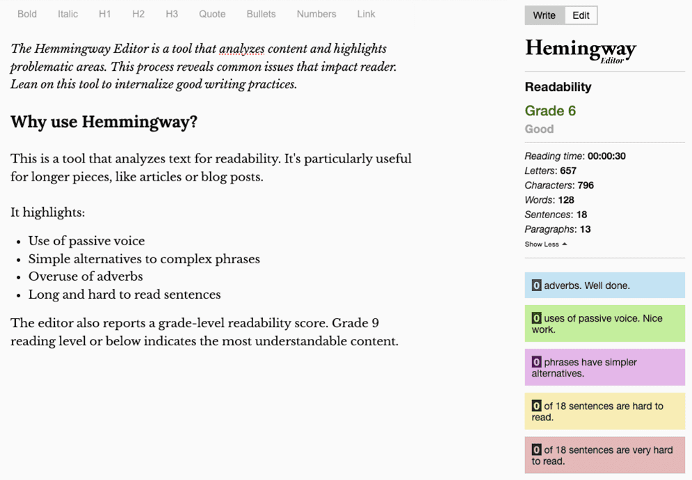
Figure: Good example - Concise, direct, readable content Historically, it’s been the convention to refer to users as ‘he’ in technical documentation. This is obviously outdated and sexist – users may not be a "he". It’s more common now to see "he/she" used, but this is clunky and could also still be considered as misgendering non-binary people.
The best pronoun to use is "they". It’s simple and elegant and doesn't exclude anyone.
This new feature is important if the user runs long tasks. At the end of a process, he will know the amount of time spent. Now that the status bar shows the time taken and progress percentage, he can evaluate how long it will take beforehand. Then he can go get a cup of coffee.
Bad example: User referred to as "he"
This new feature is important if the user runs long tasks. At the end of a process, they will know the amount of time spent. Now that the status bar shows the time taken and progress percentage, they can evaluate how long it will take beforehand. Then they can go get a cup of coffee.
Good example: User referred to as "they"
You can use tools like Alex to get better at considerate writing finding potential occurrences with a tool that suggests helpful alternatives.
This can be run as a pull request check as well - Alex Recommends GitHub Action
It's important to use correct capitalization when writing titles/headings for web content. For main titles, you should capitalize the first word, all nouns, all verbs (even short ones, like "is"), all adjectives, and all proper nouns. Leave subtitles in normal sentence form.
You can find more rules & tips on capitalizing here:
How to Capitalize Titles and Headings Correctly
"The Lord of the rings – Return of the king"
Figure: Bad example for titles - Inconsistency on words' capitalization
"The Lord of the Rings – Return of the King"
Figure: Good example for titles - Only conjunctions and prepositions (both having similar rules) should not be capitalized. E.g. "at", "on", "but", "and", "with", etc
It's best to only do this on main titles, and leave subtitles in normal sentence form - only capitalize the first word and proper nouns. Basically, it saves hassles... English is a confusing language, and there are too many variations that cause too many arguments.
Figure: Good example - The main title has capitalization and the subtitles don't Attention to detail plays a vital role to effective communication. Grammar, spelling, and/or syntax mistakes, though seemingly minor, can significantly affect the clarity and professionalism of your writing.
Common language pitfalls
Embracing the modern standard not only keeps your writing current but also ensures consistency in your communication.
- Use "email" not "e-mail" or "EMail"
- Use "cannot" not "can not"
- Use "website" not "web site"
- Use "username" not "user name"
- Use "taskbar" not "task bar"
- Use "OK" not "Ok" or "okay/Okay"
- Use "aka" not "AKA" or "a.k.a"
Note: Although Wikipedia considers multiple ways to spell the acronym for "also known as", the convention is simply "aka" - with all letters in lowercase and not separated by dots/spaces.
Syntax changes the meaning of certain words
Often when writing technical documents, you will instruct the reader to 'set up' his PC or run a 'setup' file.
- "Setup" is a noun, basically meaning an 'arrangement'(e.g. "The software setup")
- "Set up" is a phrasal verb, most commonly meaning 'to establish something.' (e.g. "To set up a computer")
How can you remember this? Mentally replace "setup" or "set up" with "setting up". If the sentence still basically makes sense, use two words. If it doesn't, use the single word. For example, the sentence "...he is setting up the shop" makes sense. "The setting up was all wrong" does not.
Be careful with homophones
Words like “verses” and “versus” are homophones, meaning they are pronounced the same but have different spelling and different meanings. Always ensure you are using the correct word. If you're not, it won’t be picked up by spell checkers.
- “Verses” refers to lines of poetry or bible passages (e.g. "Matthew 5:41 is one of my favourite bible verses")
- “Versus” refers to 2 or more parties in opposition to one another, especially in sports or legal situations (e.g. "Floyd versus Mayweather")
“Versus” can be shortened to “vs.”, which is common in sporting situations, or “v.”, which is the standard abbreviation for legal scenarios.
More examples
- "Their" shows possession (e.g. "It's their car")
- "There" indicates a place (e.g. "It's over there")
- "They're" is a contraction for "they are" (e.g. "They're going to the party")
- "Principal" can refer to a person who leads a school or organization or can mean the original sum of money (e.g. "The school principal is retiring" or "The principal amount of the loan")
- "Principle" refers to a fundamental truth, rule, or value (e.g. "Honesty is a guiding principle in their company")
- "Weather" relates to the state of the atmosphere (e.g. "The weather is sunny today")
- "Whether" is used to introduce choices or possibilities (e.g. "I'm uncertain whether to attend the meeting")
Language precision is a valuable skill and is essential for effective communication - they significantly impact how your writing is perceived.
By following these guidelines and staying current with language conventions, you can enhance the clarity, professionalism, and effectiveness of your communication.
Acronyms are a common way to shorten words or phrases, but using niche terms can lead to confusion and misunderstandings. It's important to avoid jargon, especially for those new to a particular field or industry. To ensure clear communication, avoid unfamiliar acronyms where possible and use the full term instead.
- Avoid niche acronyms to avoid confusion.
- Don't use acronyms in titles, headings, or other prominent places. This can make it hard for some readers to understand the content those headings describe.
- If you must use an uncommon acronym, clearly define it the first time you use it.
- Be consistent. If you use an acronym for a term or phrase, use it consistently throughout your content.
Ash: I'm attending FBC next week.
Eddie: What is FBC?
Bad example: This conversation is unclear as Eddie doesn't know FBC
Ash: I'm attending FireBootCamp next week
Eddie: Awesome!
Good example: No acronyms, clear communication
Ash: I'm attending FBC (FireBootCamp) next week. Would you like to come with me?
Eddie: Yeah! FBC sounds great.
Good example: Defined acronyms can be used, but be careful to not assume the other person is aware of the term if you don't know for sure
By avoiding unclear acronyms and using the full names of the terms or phrases, the message is easier to understand.
NB: Track this.
Bad example: NB is unclear and old-fashioned
Note: Track this.
Good example: "Note" is more common and understandable
Well-known acronyms that we commonly see (FYI, URL, HTTPS, GIF, etc.) are more acceptable and safe to use.
Crafting content for the web means a keen focus on readability and accessibility.One common pitfall is the indiscriminate use of the ampersand (&) instead of the word "and."
There are cases where the ampersand hurts, and others where it helps.For certain brand names or UI elements the ampersand can be acceptable or even required.However, avoiding the ampersand leads to user-friendly and readable content in most cases.
Why you should write "and"
- Readability: The word "and" is universally recognized and aids reading comprehension.
- Scanning: The & symbol tends to stand out in the middle of other text. Since web users scan instead of reading, the & often draws the eye more than your actual content does.
- Accessibility: The ampersand can be harder to localize than the word "and". Sometimes an ampersand is part of a proper noun (e.g. H&M or Dolce & Gabbana) so it can't just be translated in a single way.
When to use "&"
- Space saving: Character count can quickly add up if you're using "and". An ampersand can be a great tool for making the most of limited space when needed (e.g. menu items or large headings).
- Note taking: Writing "&" is just quicker and easier!
- Informal tone: When it comes to intentional tone of voice, the ampersand can help create content with a more casual tone.
The "Oxford comma" (so-called because the Oxford University Press style guidelines require it) has the distinction of being one of the most hotly debated elements of the English language.
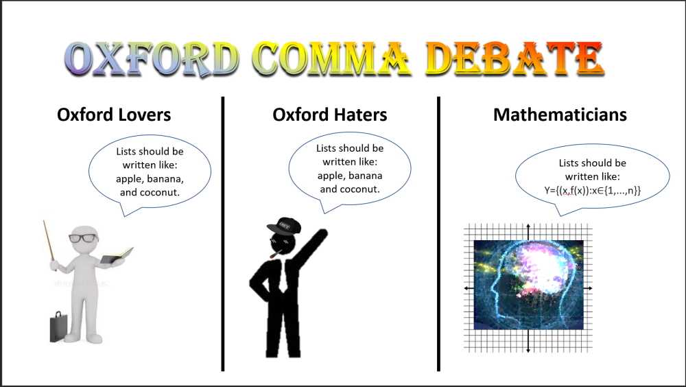
Figure: Some people love Oxford commas, some hate them Knowing when to use the Oxford comma helps to create more consistent and easier to read documentation.
Also referred to as a series comma or serial comma, an Oxford comma is placed in a series of three or more items before the conjunction. It can be used in both "and" and "or" lists as the last comma separating a series of items. It works to help order these items and provide a distinction between the items on the list, particularly the last two items. An Oxford comma is often unnecessary, though.
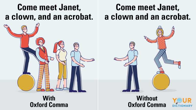
Figure: A sentence with quite different meaning depending on whether an Oxford comma is used or not The rule is that a comma should only be used between the last two items of a list if it removes potential ambiguity, otherwise no comma is required.
Let's look at some examples to illustrate the rule in action.
Adam, Matt, and Lee got on a call to discuss the use of the Oxford comma
Figure: Bad example - the extra comma after "Matt" is unnecessary and just adds clutter
The ice cream comes in an assortment of flavours including banana and strawberry, strawberry and mango, and blueberry.
Figure: Good example - without the Oxford comma, it's not clear whether the flavour is strawberry and mango or mango and blueberry
This short TED Ed talk covers the topic well.
We've all missed a piece of a message and found out later that we'd got it wrong. This can lead to miscommunication, mistakes, and lost time. Even worse, when finding out later that someone has misread something, there can be a lot of work to fix! But, there are ways to prevent this. Do these things to always make your writing clear:
An important case - don't let anybody skim over negation and misinterpret your message:
"We found that moving CodeAuditor's scan engine (docker image) to be hosted on GitHub Action is not feasible."
Figure: Bad example - it's possible to miss the word 'not'
"We found that moving CodeAuditor's scan engine (docker image) to be hosted on GitHub Action is not feasible."
Figure: Good example - The bolding draws attention to the main idea, which is 'No'!
When highlighting items (file names, user commands etc.) be sure to:
- Distinguish the items from the rest of the surrounding text; and
- Be consistent
Warning: Never underline the text if it isn't a link, as per Do you use underlines only on links?
Use the following rules to highlight items in your document:
Style Use this style on Example Bold text Menus, commands, dialog box options, file names and paths To access the application, click Start | Programs | Accessories | System Tools | Disk Defragmenter Initial Capitals + Bold File paths and file names Now open C:\My Documents\Invoice.doc. Different colour styling Web UI - Important words on headings Want to build an Angular application? UPPER CASE Code keywords and database elements Use the INNER JOIN clause in SQL Server to join one table to another. Monospace (Courier New font) Code samples, error messages You will see the following error: error opening database: database is currently in use.Clear communication is essential for success, and especially helpful in professional or technical contexts. You should make your content more visually interesting and easier to scan quickly. Lists and emojis are great tools to achieve that.
Lists are great to make texts easier to digest. Emojis makes it even easier to consume when a lot of information is present. By using them you can enhance the communication experience. But when repeated excessively, they can become a hindrance rather than a help.
DRY, which stands for ‘don’t repeat yourself,’ is a principle of software development that aims at reducing the repetition of patterns and code duplication in favor of abstractions and avoiding redundancy.
Words
This is especially valid for words in lists, but also applies to different types of content.
For lists, you should keep only the part that is unique in each list item.
Following this rule:
- Is important to help you increase productivity
- Is important to help you save time
- Is important to help you reduce stress
Bad example – Repeating words... Not following DRY :(
Following this rule is important to help you to:
- Increase productivity
- Save time
- Reduce stress
Good example – No repeated words by using the DRY principle
Emojis
When there are multiple items listed, it can be challenging to distinguish between them quickly, leading to confusion and miscommunication. If the same emoji is repeated multiple times within a list, it can create visual clutter and make the list more difficult to read.
When creating a list that includes emojis, avoid repeating the same emoji 3 or more times within a list. Instead, add the emoji to a "introductory sentence" or "lead-in sentence". This helps to keep the content concise, readable, and consistent. Thus making it easy to scan the list and understand the benefits and drawbacks of a particular situation.
✅ Pros
- ✅ Increases productivity
- ✅ Saves time
- ✅ Reduces stress
❌ Cons
- ❌ May be challenging to implement
- ❌ May take time to adjust
- ❌ Can be challenging to maintain
Bad example – Using an excessive amount of emojis... Not following DRY :(
✅ Pros
- Increases productivity
- Saves time
- Reduces stress
❌ Cons
- Requires effort to implement
- May take time to adjust
- Can be challenging to maintain
Good example – Following the DRY principle
Following the DRY principle by avoiding excessive repetition of words/emojis helps to create content that are visually interesting and easy to read, while also promoting efficient and maintainable content creation.
Excess punctuation without a purpose can make a document or web page look overly busy. This can add a surprising amount of visual clutter.
As a general rule, avoid full stops in lists and captions altogether.
Bullet points should be short and sharp, and should generally not require full stops at all.
If your bullet point has more than one sentence, consider separating it into two bullet points instead. Alternatively, consider a different separator - like a dash; you could also consider a semicolon instead.
However, if it is necessary for your bullet point to have more than one sentence (should be rare), you of course need the full stop. In this case, you must include the full stop at the end as well. And, for consistency, all the bullet points in that list should also end with a full stop.
Important: Note the mention of "in that list". The rest of the bullet points on your page should not have full stops; only those in that list or group.
- Sentence 1.
- Sentence 2.
- Sentence 3.
Figure: Bad example - Too much punctuation
- Sentence 1
- Sentence 2. Sentence 3
- Sentence 4
Figure: Bad example - Full stop is only used on multiple sentences, but not at the end
- Sentence 1
- Sentence 2. Sentence 3.
- Sentence 4
Figure: OK example - Full stop is used on multiple sentences, and at the end, but the bullets are inconsistent
Full stops should not be used in bullet lists, e.g.:
- In this list of bullet points there are no full stops
- So this one doesn't have one either
- Or this one
However, if you need full stops, make sure your bullets end with them and you maintain consistency, e.g.:
- In this point, there is a full stop. Because of that, there needs to be one at the end too.
- Because a bullet in this list has a full stop, they all need one.
- Even this.
Figure: Good example - Full stops are avoided where possible, but used correctly and consistently where necessary
Writing in large blocks of text is a common practice, but it can hinder readability. Incorporating line breaks and spacing significantly enhances content readability. This allows readers to navigate through the text more easily, absorb information more effectively, and stay engaged with the material.
Warning: For web (HTML/Markdown), line breaks should not be used to to create layout spacing! You should use CSS margin and/or padding instead.
Learn more on HTML
<br>Tag: The Dos and Don'ts of Adding an HTML Line Break.See the more information on line breaks in Markdown.
On the other hand, in regards to emails and/or informal documents, line breaks can be used for spacing. In these cases, correct syntax is not crucial, and breaking a line is more convinient than dealing with margins/line spacing.
Long paragraphs
Consider breaking lines/paragraphs when you have a long block of text. You should aim to separate the information by context.
SSW is made up of a great team of staff that is passionate about technology and how it meets business needs. Today SSW has offices in Sydney, Melbourne, Brisbane, Newcastle, Strasbourg (France) and Hangzhou (China), with over 100 employees. Want to meet them? Have a look at SSW People.
Figure: Bad example - Long block of text
SSW is made up of a great team of staff that is passionate about technology and how it meets business needs.
Today SSW has offices in Sydney, Melbourne, Brisbane, Newcastle, Strasbourg (France) and Hangzhou (China), with over 100 employees.
Want to meet them? Have a look at SSW People.
Figure: Good example - The text is separated by paragraphs
Notes, Tips, PS
Content elements like Note, Tip, PS (and similar) should be on a new line to enable better readability. It is beneficial to bold those words.
Test the login functionality thoroughly. Note: Try both valid and invalid credentials.
Figure: Bad example - No line break before the note
Test the login functionality thoroughly. Note: Try both valid and invalid credentials.
Figure: Good example - The "Note" being on a fresh line and in bold makes it much easier to read
URLs
Breaking a line is also recommended before URLs.
Check out these employment opportunities at SSW: https://www.ssw.com.au/employment#available
Figure: Bad example - No line break before the URL
Check out these employment opportunities at SSW:
https://www.ssw.com.au/employment#availableFigure: Good example - The URL being on a fresh line makes it much easier to read
Headings
It's a good idea to have some space after headings.
Hey Bob, Check out this awesome new video about the SSW Cultural Exchange Program!
Figure: Bad example - No spacing after heading
Hey Bob,
Check out this awesome new video about the SSW Cultural Exchange Program!
Figure: Good example - Spacing after heading
Multiple items as lists
If you text has information that can be turned into multiple items, you should do so, by creating a list. For example, when sending PBIs for a Sprint.
I have 2 PBIs in the coming Sprint: Product Backlog Item 88994: Performance | Create a new App Service plan and Product Backlog Item 88823: Azure | Create a new App Service Plan in West US for SL production resource group. I will do the IoC after.
Figure: Bad example - Block of text
I have 2 PBIs in the coming Sprint:
- PBI 88994: Performance | Create a new App Service plan
- PBI 88823: Azure | Create a new App Service Plan in West US for SL production resource group
I will do the IoC after.
Figure: Good example - List is used to separate information and make it easier to digest
Note: On the example above, see how changing from "Product Backlog Item" to "PBI" also helps with readability. However, you should only use acronyms when the recipient is familiar with the term.
Images and captions
It is also recommended to include spaces after an image or a figure description. These elements need breathing space to help users focus on them.