Rules to Better Power BI - 19 Rules
Want to get Power BI working for you? Check SSW's Power BI Consulting page.
Power BI offers a variety of visualizations, each suited for different types of data and insights. Choosing the correct visualization is crucial for effectively communicating data stories.
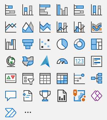
Figure: The out of the box visuals from Power BI Here's a guide to understanding when to use each type of visualization provided in Power BI, according to the visual selector interface.
Column Chart

Figure: Use when: Comparing categories or tracking changes over time. Stacked Column Chart
Figure: Use when: Comparing parts of a whole across categories. Clustered Column Chart
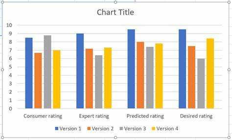
Figure: Use when: Comparing multiple categories and their sub-categories. 100% Stacked Column Chart
Figure: Use when: Showing the percentage distribution across categories. Bar Chart
Figure: Use when: Comparing categories horizontally. Stacked Bar Chart
Figure: Use when: Comparing parts of a whole across categories horizontally. Clustered Bar Chart
Figure: Use when: Comparing multiple categories and their sub-categories horizontally. 100% Stacked Bar Chart
Figure: Use when: Showing the percentage distribution across categories horizontally. Line Chart
Figure: Use when: Displaying trends over time. Line and Stacked Column Chart
Figure: Use when: Combining trends and part-to-whole relationships. Ribbon Chart
Figure: Use when: Visualizing ranking changes in a category over time. Area Chart
Figure: Use when: Demonstrating the magnitude of change over time. An Area Chart would be chosen over a Line Chart when you want to highlight the cumulative magnitude of values over time, showing not just the trend but also the volume beneath the trend line, emphasizing the total value across the timeline.
e.g. If you are looking at the total revenue generated by a product over the same period, an area chart is better than a line chart because it not only shows the trend of revenue over time but also gives a sense of the total revenue accumulation, providing a visual impression of growth beyond just the trend line.
Stacked Area Chart
Figure: Use when: Breaking down the contribution of different components to a whole over time. Area charts are excellent for stacked charts because it’s a simple and clear way to clearly portray the cumulative nature of the data. For example, if the above example was visualized with a line chart, it wouldn’t be immediately apparent to the user that the values are added together, not compared against each other.
Pie Chart
Figure: Use when: Illustrating proportions within a whole. Choose a pie chart when you need a simple, classic representation of each category's contribution to the whole, where the focus is on relative sizes of the parts to the whole.
Donut Chart
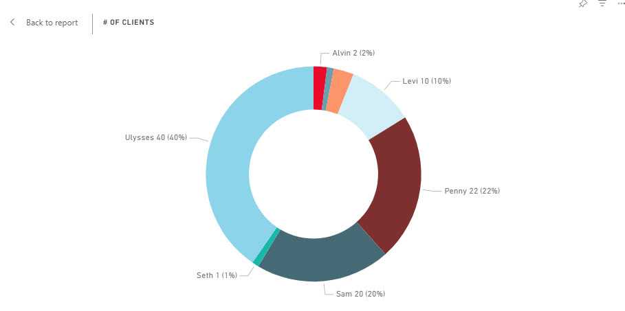
Figure: Use when: Similar to a pie chart but with a hole in the center, to emphasize the parts-to-whole relationship. Opt for a donut chart over a pie chart when you want to include additional information in the center, such as the total value, or to improve readability when comparing multiple pie-like charts.
Treemap
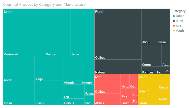
Figure: Use when: Displaying hierarchical data as part of a whole with nested rectangles. A treemap is preferable to a pie or donut chart when you have hierarchical data and need to show part-to-whole relationships across multiple levels in a compact and space-efficient manner.
Map
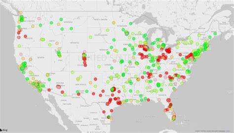
Figure: Use when: Showing geographical data. Filled Map
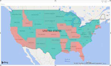
Figure: Use when: Displaying how a value varies across geographic regions, with areas filled in color. Azure Map
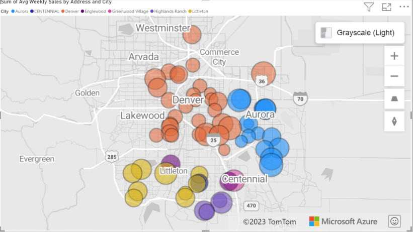
Figure: Use when: Integrating geographical data with the advanced spatial analytics capabilities of Azure. This visualization is suitable when you need not only to plot data points on a map but also to leverage Azure's cloud-based location services for more in-depth geographic analysis, such as calculating routes, visualizing traffic conditions, or creating heatmaps based on the intensity of activity in different areas. It's a powerful tool for scenarios requiring a combination of mapping and intricate spatial operations.
ArcGIS Maps
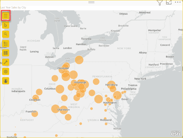
Figure: Use when: Leveraging advanced GIS (Geographic Information Systems) capabilities for sophisticated and detailed geographic data analysis. ArcGIS Maps in Power BI is suitable for scenarios that require more than basic mapping, such as thematic maps, heat maps, and demographic layers. This visual is particularly useful when geographical context and spatial analysis are key to understanding and presenting your data, such as in urban planning, environmental monitoring, or market analysis.
Scatter Chart or Bubble Chart
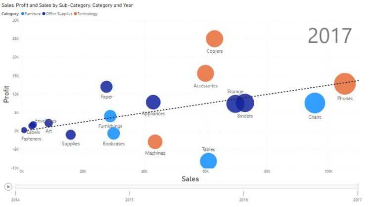
Figure: Use when: Investigating the relationship between different variables. For example, if you're trying to identify if there's a relationship between sales volume and advertising spend, a scatter chart can plot each point of data in the two-dimensional space where one axis represents sales volume and the other represents advertising spend.
This visualization is beneficial when you want to explore potential connections or correlations between variables, identify outliers that don't fit the general pattern, or even to see the distribution and concentration of data points.
If a 3rd dimension is added (as above) it's represented by the size of the bubbles. this sometimes known as a Bubble Chart.
Waterfall Chart
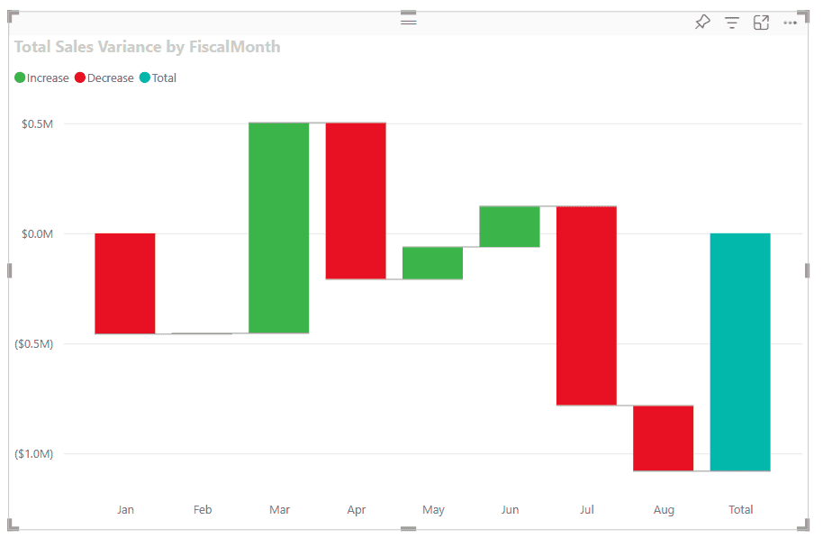
Figure: Use when: Showing a sequential breakdown of intermediate values leading to a final result. The clear visualization of incremental changes helps identify how individual components contribute to the total outcome, making the waterfall chart a powerful tool for detailed, step-by-step analysis.
Funnel Chart
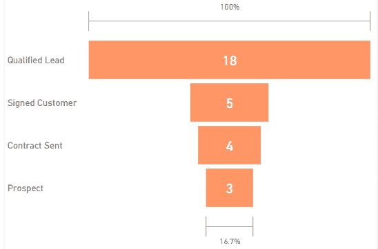
Figure: Use when: Displaying the flow through a process or funnel. Gauge Chart
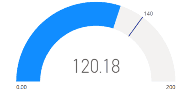
Figure: Use when: Illustrating progress toward a goal or a current value within a range. In this example, a car retailer is tracking the sales team's average sales per month. The gauge needle represents the sales goal of 140 cars sold. The minimum sales average is zero and the maximum is 200. The blue shading shows that the team is averaging about 120 sales this month. They have one more week to reach the goal.
KPI (Key Performance Indicator)
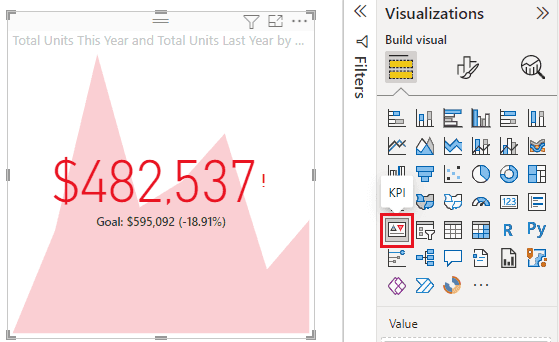
Figure: Use when: Showcasing a single key performance indicator. This space efficient visualisation shows the target number, the current number, the variance %, and the trend of the number over time.
Card
Figure: Use when: Highlighting a single value prominently. Multi-Row Card
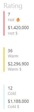
Figure: Use when: Displaying a list of multiple key metrics or attributes. Table
Figure: Use when: Presenting detailed data and metrics in a grid format. Matrix
Figure: Use when: Showing data structured in rows and columns, often with aggregates. You might choose to use a matrix over a table in Power BI when you need to display data with two or more dimensions, allowing for a more complex hierarchical structure with expandable row and column headers, and when summarizing data with built-in aggregations, like sums or averages, is necessary for a condensed view.
Slicer
Figure: Use when: Allowing users to filter and segment the data interactively. Key Influencers
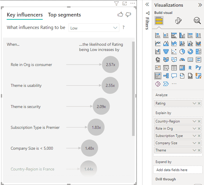
Use when: You want to identify and display which factors most significantly affect a chosen metric or outcome. The Key Influencers visualization helps in discovering patterns in the data, such as which variables most contribute to an increase or decrease in your target metric. It is particularly useful in scenarios where you want to perform a lightweight and interpretable form of analysis to drive business decisions, such as understanding customer satisfaction drivers or pinpointing reasons for sales trends.
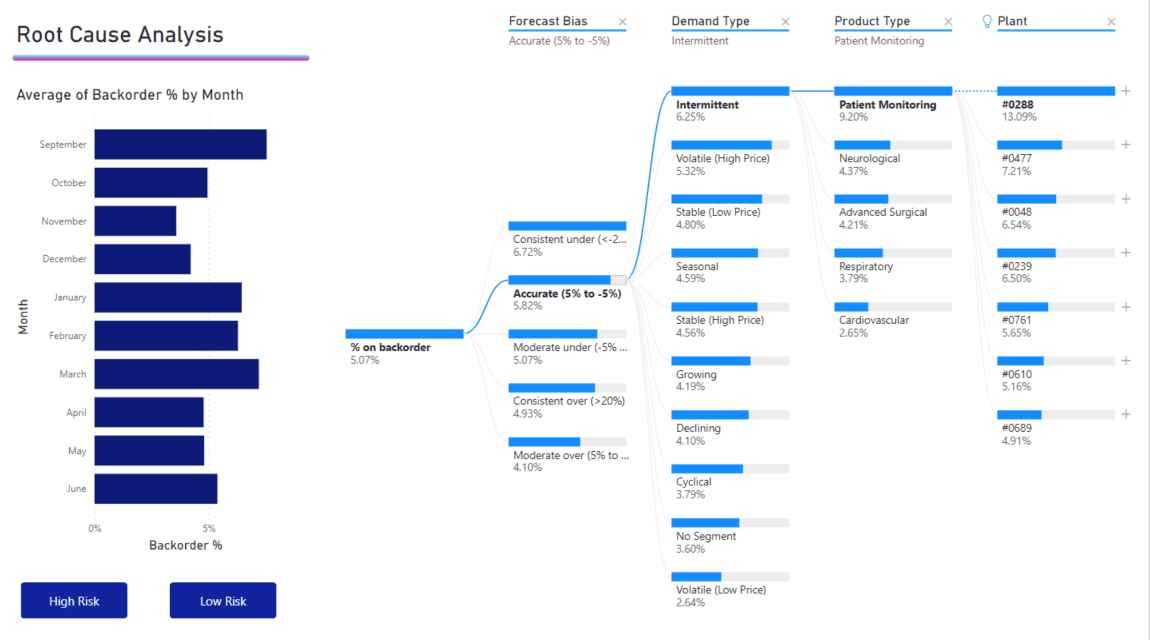
Decomposition Tree

Figure: Use when: You need to explore data hierarchically and break down a metric into its contributing factors to understand the root causes or influences. The decomposition tree is effective for drilling into dimensions of data to see how they contribute to the overall metric, allowing for dynamic exploration by users who can choose the factors to analyze at each level of the tree. It is particularly useful for ad-hoc exploratory analysis and root cause determination.
Q&A
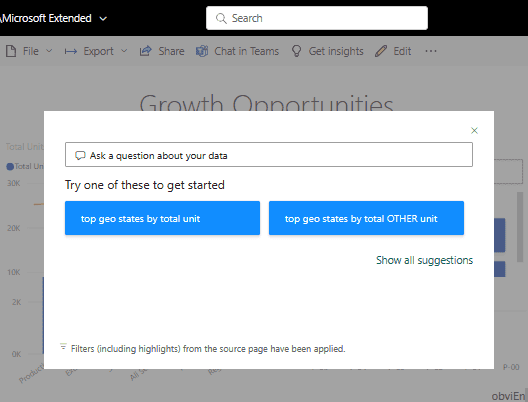
Figure: Use when: You want to interact with your data using natural language queries to get immediate visual responses. The Q&A visual is particularly useful when users may not be familiar with the underlying data model or when they wish to explore the data without pre-defined reports or dashboards. It's a powerful feature for creating a conversational data exploration experience within Power BI.
Smart Narrative
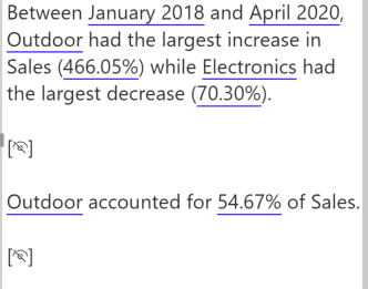
Figure: Use when: Generating summaries and insights from your visuals and data points. Smart Narrative is ideal for creating data-driven narratives that provide context, explanations, and annotations, enhancing the report's storytelling aspect. This feature is particularly useful when you want to provide written explanations alongside your data or to offer automated interpretations of complex visualizations for report viewers.
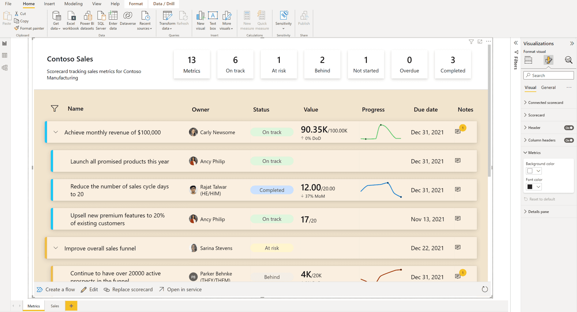
Metrics
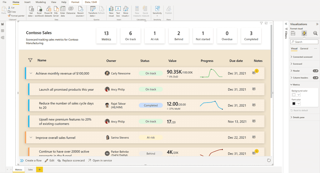
Figure: Use when:** Tracking and displaying key metrics at a glance, often in a scorecard format that highlights data trends and goal progress. The Metrics visual can combine numbers, charts, and conditional formatting to provide a comprehensive snapshot of performance, making it ideal for dashboards that executives and team leaders use for quick status checks and decision-making.
Paginated Reports
Figure: Use when: You require printable, pixel-perfect reports that can be distributed across your organization in a consistent format. Paginated Reports are ideal for creating highly formatted, multi-page documents that can be exported to formats like PDF and Word, often used for regulatory filings, invoice generation, detailed financial statements, or any scenario where the layout and format are as important as the data itself.
Power App
Figure: Use when: Integrating interactive applications within your Power BI reports. The Power Apps visual allows you to bring the capabilities of custom apps into your dashboard, enabling users to perform tasks or input data directly from the report. This is particularly useful for creating a seamless workflow where users can act on data insights without leaving the Power BI environment, such as updating records or triggering business processes.
Power Automate
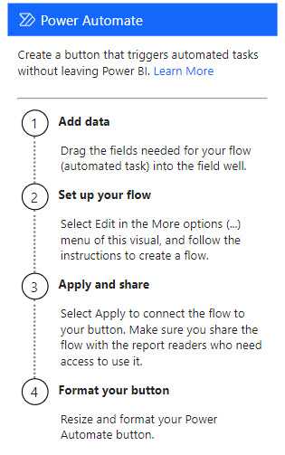
Figure: Use when: Adding a button to kick off an automation based on insights gained from your Power BI data. The Power Automate visual allows you to set up automated workflows that can be triggered directly from your reports. This is ideal for scenarios where immediate action is required based on data changes or thresholds, like sending alerts, integrating with other services, or initiating business processes in response to data-driven events.
Ellipsis (Other)
- Use when: Accessing additional visuals not shown directly on the visualization pane or custom visuals.
Remember, the choice of visualization should not only depend on what looks good but also on what communicates the data most effectively to your audience.
Tip: Always preview your data with different visualizations to determine which one best tells the story of your data.
Your reports and dashboards should tell the right story to your end users. They should be able to get the gist of the report at a glance and not have to work at trying to understand what it means.
Visuals in themselves are neither good nor bad. A visual that users love on one report could be a terrible choice on another report. Power BI comes with quite a few built-in visuals and they are adding more to this all the time. However, sometimes you may need something more than the standard offerings in which case you have 3 options.
- Go to AppSource (previously Marketplace) and choose from the many free/paid offerings
- Use the Charticulator visual in AppSource to create your own custom visual either using templates or DIY using the UI
- Create your own custom visual using custom code with React, Angular, R, etc
Using the pre-built visuals in AppSource saves time and money and should work in most cases. The Charticulator visual has now been integrated in to AppSource which also gives you more flexibility and options. Creating custom visuals from scratch using D3 or similar libraries can be time-consuming. One relatively easy way to add more visual options to your toolset is to create your own visual using React and then use free 3rd party charts to add the extra sizzle. Check out this video to explore this option. https://www.youtube.com/watch?v=eJ6uHwaGJRM
For more inspiration on using amazing visuals have a look at some of these urls:
To follow best practices for version control for Power BI reports you must know about the following features:
- Power BI Desktop projects (PBIP)
-
Git integration in Power BI Service via Microsoft Fabric
- Requires either Fabric capacity or a Power BI Premium per User license
- Currently only integrates with Git repos in Azure DevOps
The following video provides an overview of these features.
Video: Empower every BI professional to do more with Microsoft Fabric | OD06 (Watch from min 5:00 to 13:00)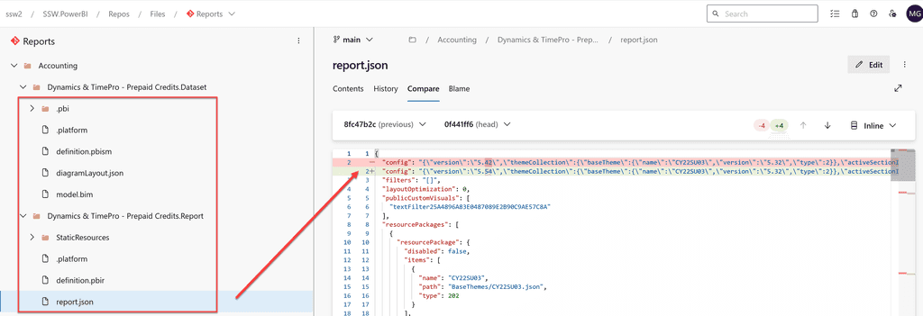
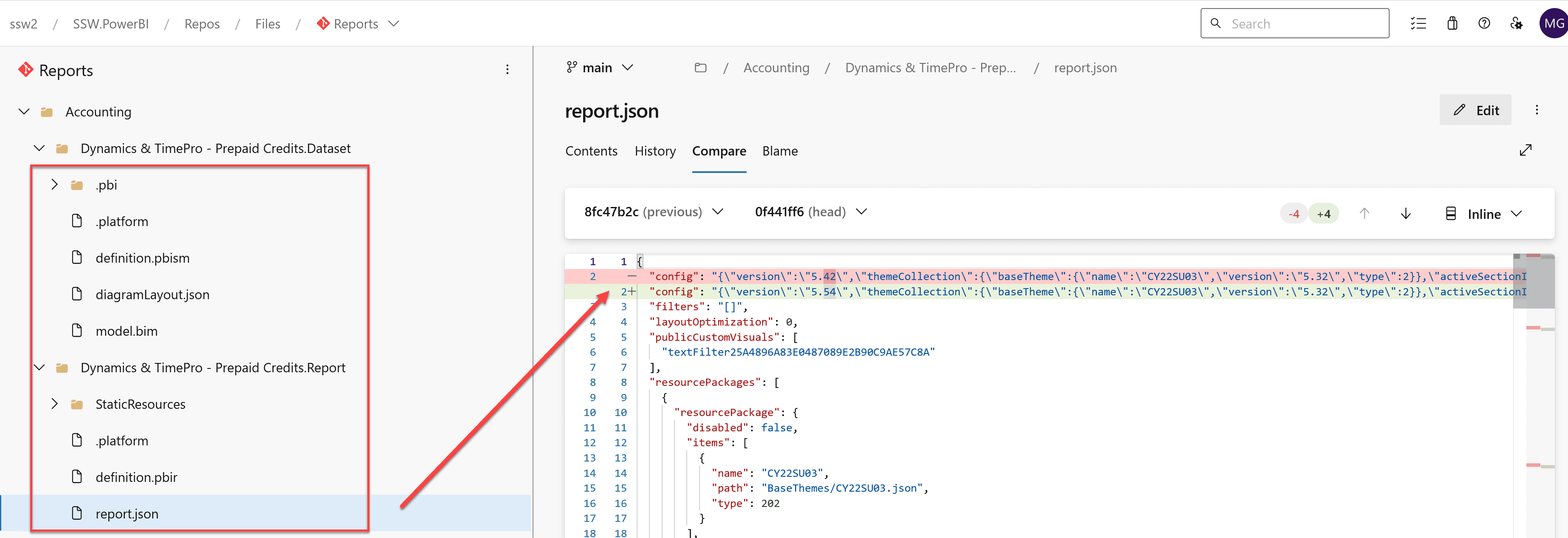
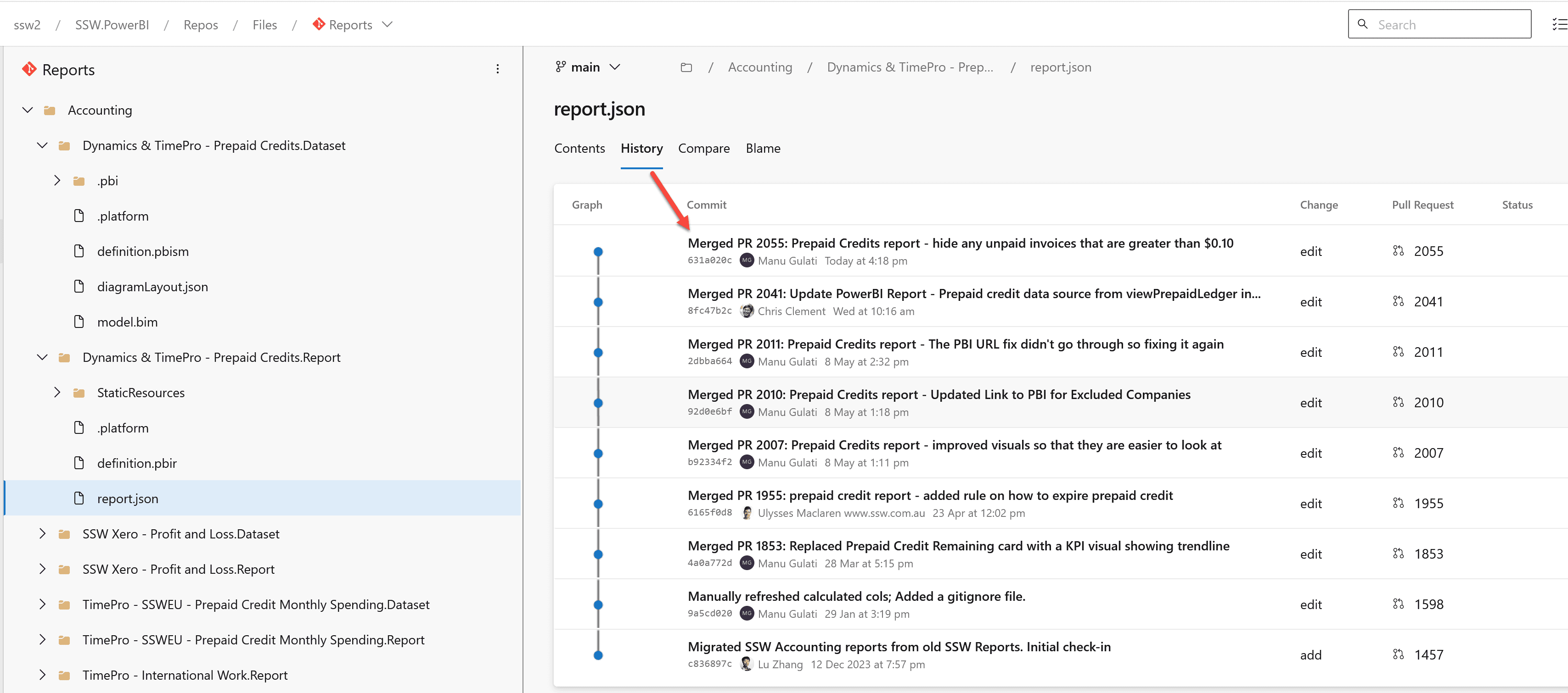
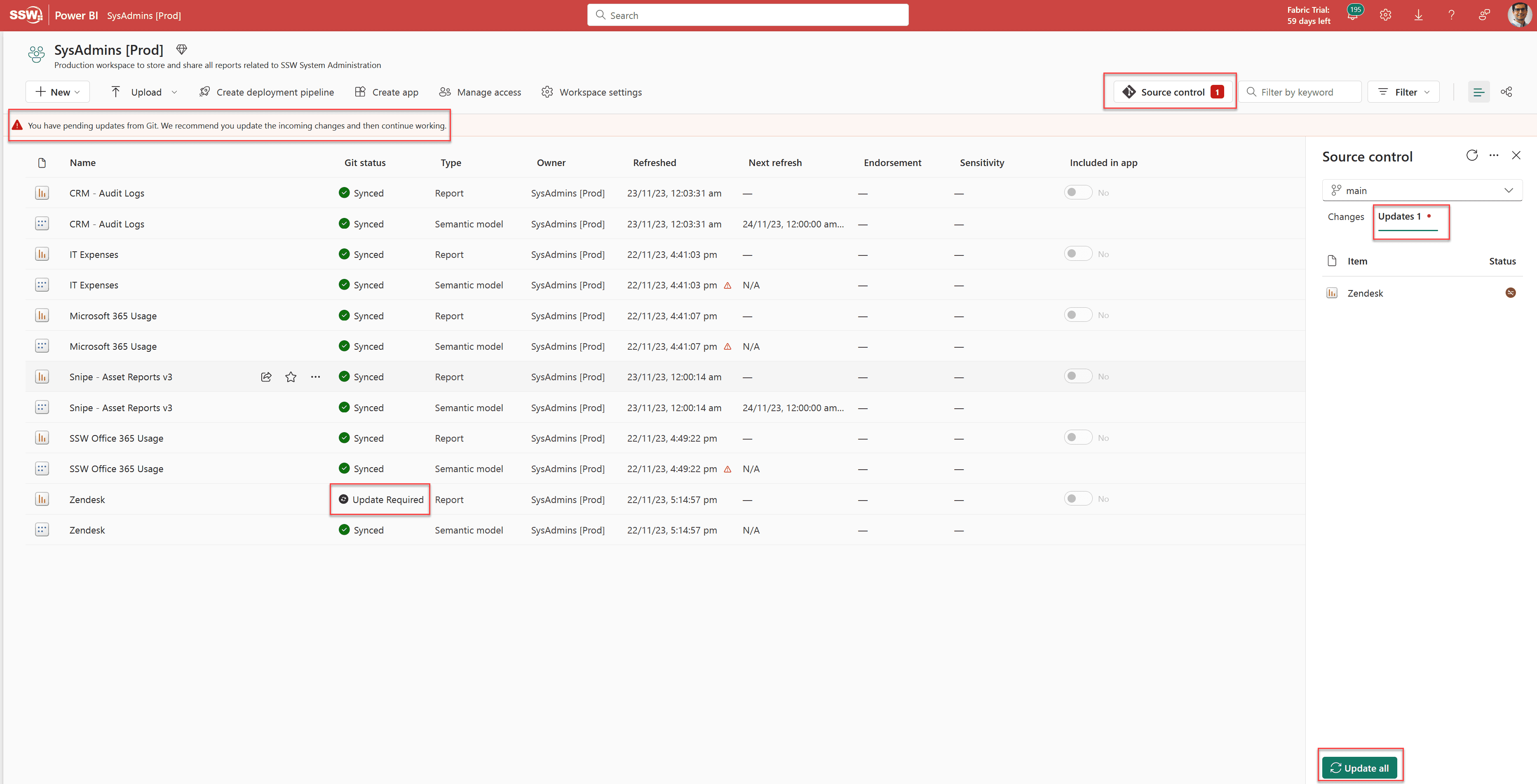
Figure: Once version control has been setup you can see more clearly what changed in the report. -
Convert all your Power BI reports to the PBIP format
- First enable Power BI Projects in Power BI Desktop - File | Option Settings | Options | Preview features | Power BI project (.pbip) save option
- Second "Save As" all your .pbix files as .pbip
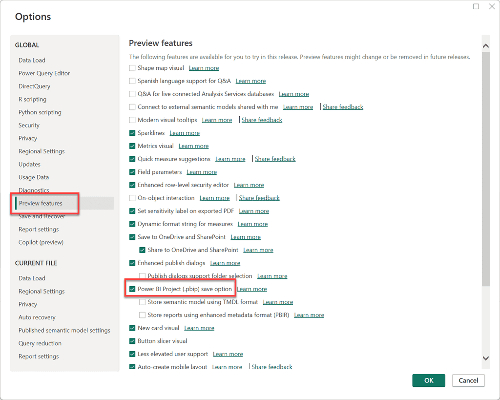
Figure: Enable PBIP format in Power BI Desktop 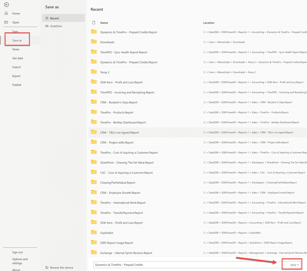
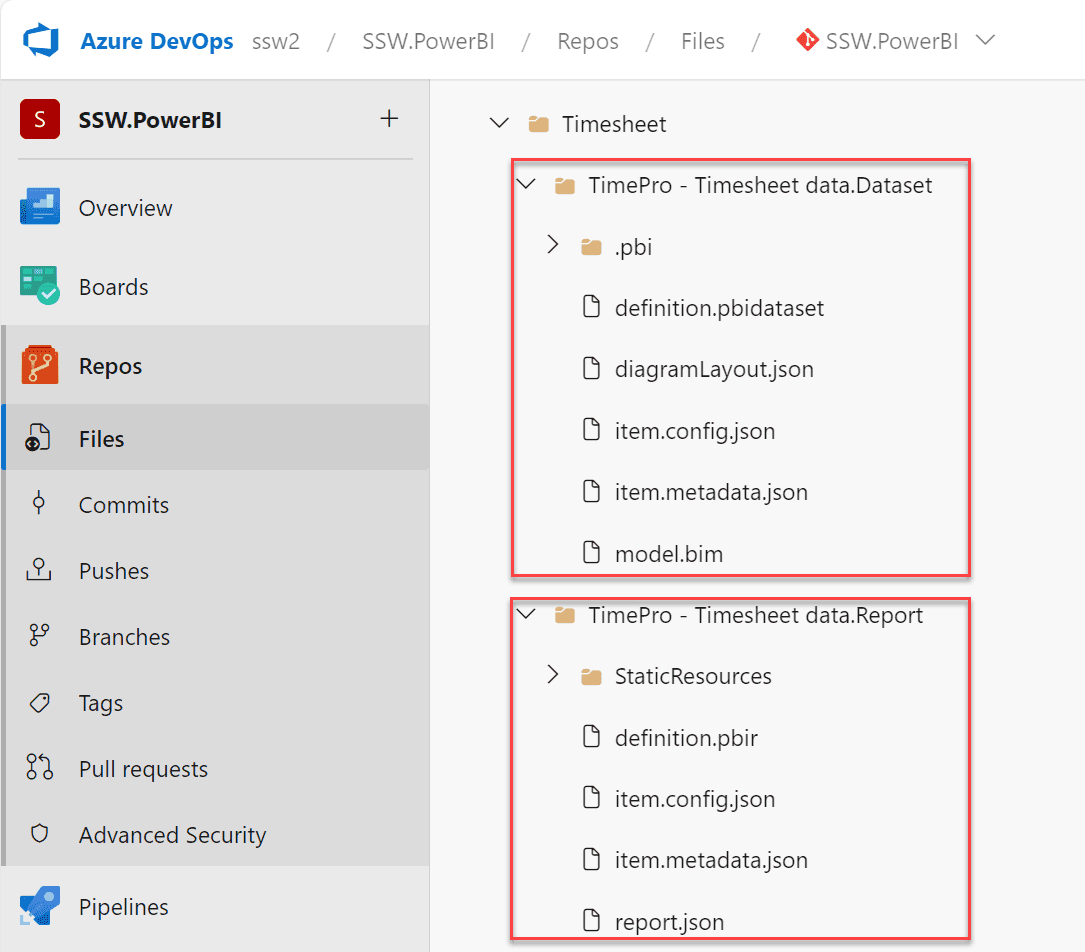
Figure: Convert all .pbix files to PBIP format - Converting reports to the PBIP format decomposes it into the following artifacts.
- A Dataset folder, which contains files and folders representing a Power BI dataset
- A Reports folder, which contains the report settings, metadata for custom visuals, etc.
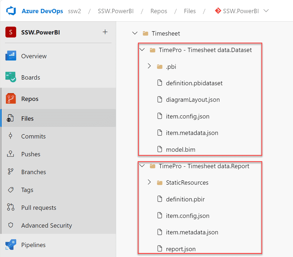
Figure: PBIP artifacts -
Commit the PBIP artifacts into a Git repository in an Azure DevOps project. Note, as of this writing Power BI's Git integration only works with Azure DevOps.
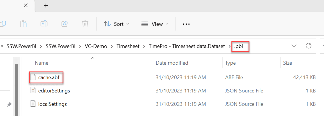
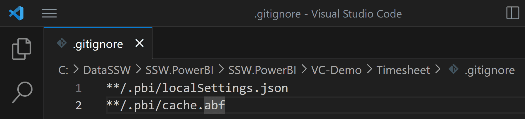
Note: Once you convert the report Power BI Desktop will save a copy of the data into a file called cache.abf which gets stored in a ".pbi" folder inside the Dataset folder. This file should not be saved in version control. You can create a .gitignore file to prevent Git from committing it to the repository.
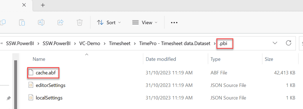
Figure: cache.abf 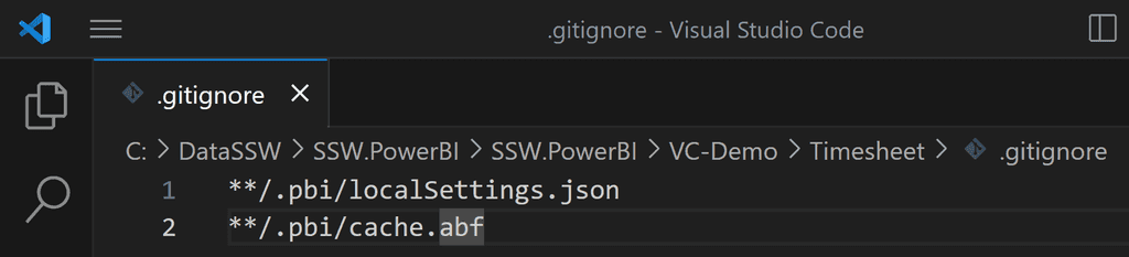
Figure: The .gitignore file - Connect a workspace in Power BI Service with a branch in the Git repo in Azure DevOps
Power BI reports are generally published directly into the Power BI Service. But doing so has many drawbacks. For example, you can't see:
- What was changed
- Who made the change
- When the change was made
In other words, the history of the changes isn't recorded anywhere.
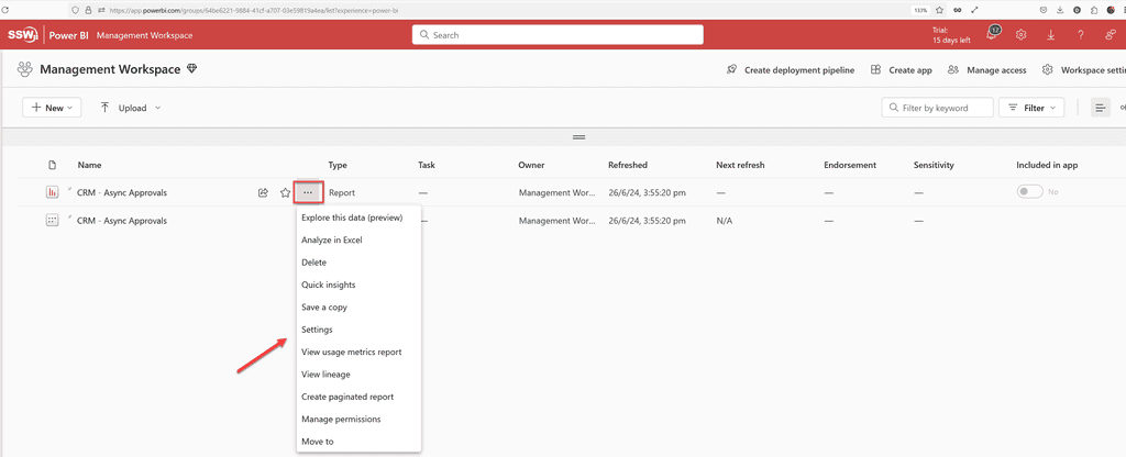
Figure: Bad example - There is no way to see version history of a report in Power BI Service 
Figure: Bad example - Even the report settings do not show its version history 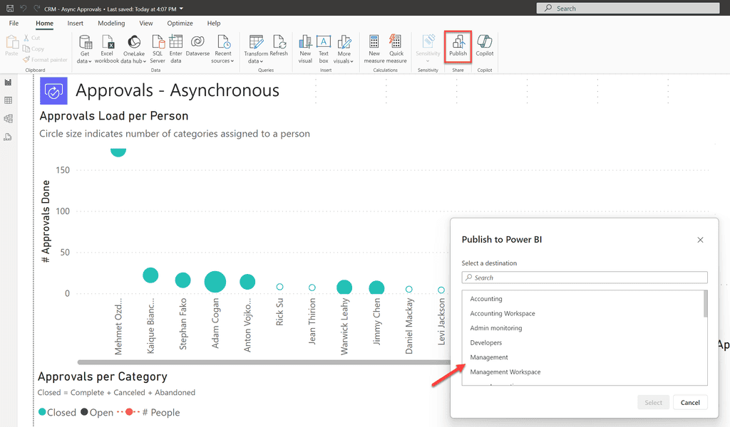
Figure: Bad example - Option 1: Publish reports directly to Power BI Service; however it does not record the history of changes The correct method is the PBIP method, which is:
- Convert your reports to the Power BI Desktop Projects (PBIP) format, and check the files into version control
-
Use Power BI's Git integration to deploy reports
- Requires either Fabric capacity or a Power BI Premium per User license
- Currently only integrates with Git repos in Azure DevOps
Read the rule on Power BI version control features to get a background on this. Note: This does not work for Power BI dashboards. Dashboards do not have a PBIP or PBIX file associated and are only available on Power BI service, and so cannot have any source control or version history.
When a report is saved in the PBIP format, Power BI decomposes it into multiple text files. This allows version control to identify the parts of the report that were changed. Additionally, Power BI saves the data associated with the report separately in a file called cache.abf. This file should not be saved in version control.

Figure: Good example - Option 2: PBIP method - the PBIP format allows comparing changes made to reports by decomposing it into multiple text files 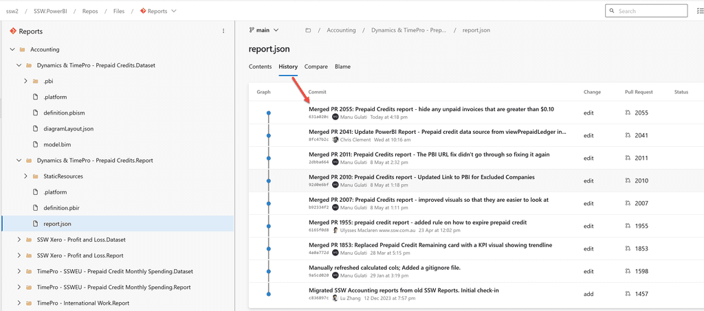
Figure: Good example - PBIP format allows recording history of changes without saving data into version control Historically report developers have used the .pbix or the .pbit format. These are no longer recommended as the new PBIP format overcomes the shortcomings of these 2 formats.
Editing and Committing Reports
Business Users (Use Power BI Service)
If you're a business user, watch the following video to get a walkthrough of the process you would follow to edit and commit reports.
Video: Power BI Source Control for the Business User (timebox 8 min)The entire process is done on Power BI Service (web) (except the step to create a pull request). At a high-level the steps are:
- Create a private workspace corresponding to the workspace where your report resides (1 time)
- Connect the private workspace to repo (1 time)
- Create new feature branch off ‘main’ (every time)
- Setup dataset connections (1 time) (lookup your password manager or take help from SysAdmins or Power BI Admins)
- Edit the report in Power BI Service (every time)
- Commit report to feature branch (every time)
- Create PR (pull request) to merge feature branch into ‘main’ on Azure DevOps and get it reviewed by a Power BI Admin (every time)
- Get a Power BI Admin to deploy the report (every time)
- Next time, create new feature branch on same workspace
If you want to update the report's data model or want more sophisticated editing features, you will need to edit the report in Power BI Desktop instead. The next section explains how you can do so.
Developers (Use Power BI Desktop)
If you're a developer, watch the following video to get a walkthrough of the process you would follow to edit and commit reports.
Video: Power BI Source Control for Developers (timebox 5 min)The process is done on one's PC. You will need to download Power BI Desktop. At a high-level the steps are:
- Setup a local repository on your PC (1 time)
- Create new feature branch off ‘origin/main’ (every time)
- Open Power BI Desktop, and enable Power BI Projects - File | Option Settings | Options | Preview features | Power BI project (.pbip) save option (1 time)
-
Open the definition.pbir file in the
<Report Name>.Reportsfolder on the local repo on your PC. This will open the report in Power BI Desktop. It will allow you to edit both the report and the dataset. (every time)Note: PBIP folders do not by default contain any underlying data. So when you open a definition.pbir file the visuals may show as empty. Please refresh the report to download the data.
- Setup dataset connections for that report (1 time) (lookup your password manager or take help from SysAdmins or Power BI Admins)
- Edit report in Power BI Desktop (every time)
- Commit report to feature branch (every time)
- Create PR to merge feature branch into ‘origin/main’ on Azure DevOps and get it reviewed by a Power BI Admin (every time)
- Get a Power BI Admin to deploy the report (every time)
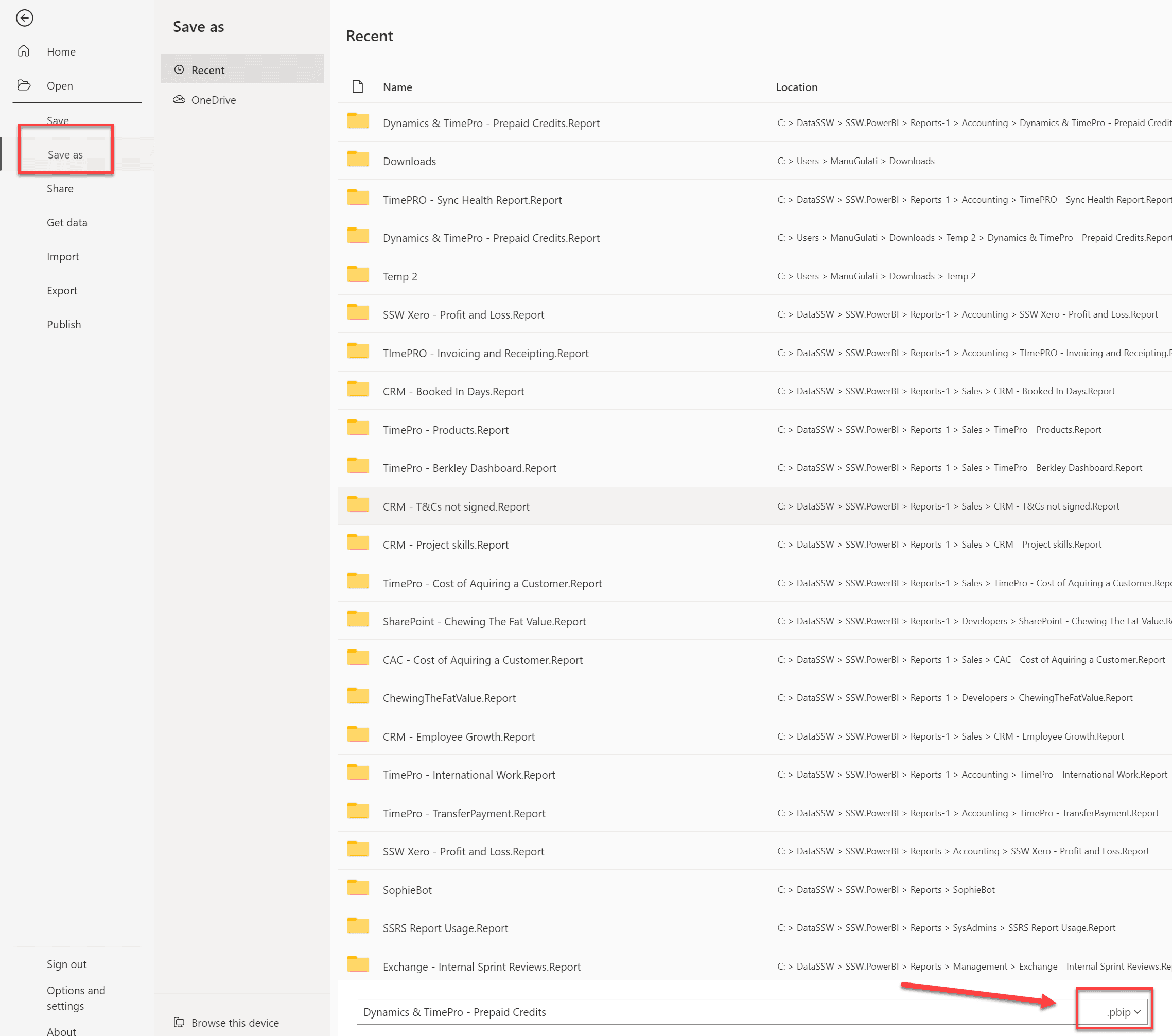
- If you are creating a new report in Power BI Desktop, please save the report as a .pbip report (and not .pbix). You can do so via File | Save as | Select .pbip as the file type
Power BI Admins - Deploying Reports (Use Power BI Service)
Deployments would typically be done by Power BI Admins. You as a dev generally won't do this directly unless you're responsible for a workspace yourself.
Reports can be deployed to a production workspace on Power BI Service by simply syncing the workspace with the 'main' branch in the Reports repository.
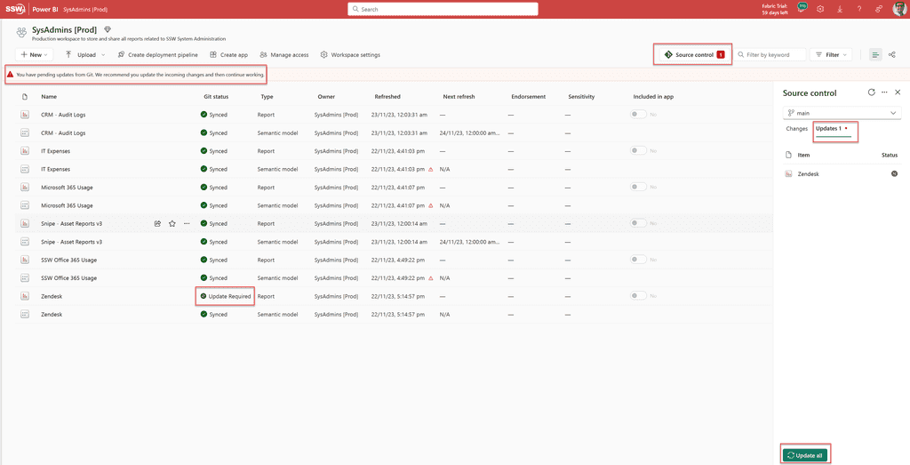
Figure: How to sync changes into a workspace in Power BI Service, effectively deploying reports You can save report under My Workspace and share it with your team. This is bad because if you leave your company, your report is gone!
It's better to save reports under Group Workspace and share it with the team.
Figure: Bad example - saving report under My Workspace 
Figure: Good example - saving report under Group Workspace - Group work space requires all users to have pro license ($10 / month)
- Group work space cannot share report and dashboard via embed link
- Until Microsoft fixes PowerBI's group sharing, it's better to use My Workspace with a shared account (i.e. alias email)
Using colour in reports can bring them to life, or else make them confusing and noisy, so make sure youre intentional with them.
Semantic colours
Remember that some colours have a shared understanding of their meaning:
- Red means pay attention or danger
- Green often means good
- Traffic lights can be used for showing 3 levels
- Cold, Warm, Hot should have appropriate colours that make sense without having to look at the legend
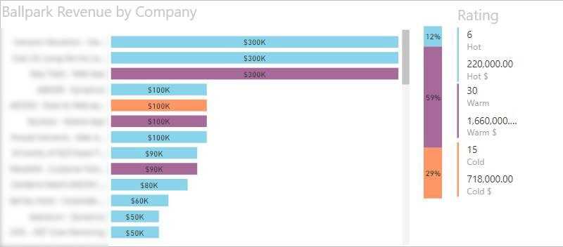
Figure: Bad example – Non-semantic colours cause confusion 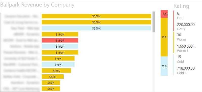
Figure: Good example – Obvious colours used for Cold, Warm, and Hot 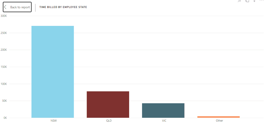
Figure: Good example – Using the correct state colours (e.g. In Australia: NSW = light blue, QLD = maroon, VIC = dark blue, etc) Tufte minimalism
Edward Tufte is often quoted as saying that, on a report where you want to draw the eye to exceptions or out of bounds data, colour should only be used to highlight what you want the user to see.
Figure: Good example – The black stands out as everything else looks translucent Consistent Palette
Make sure you stick with one colour palette, so if you use one pastel colour, make them all pastel. If you have one bold colour, make them all bold
Figure: Bad example – Inconsistent palette feel like the colours clash 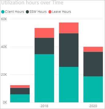
Figure: Good example – Consistent colour palette Colour Blind palette
Just to be difficult, it is worth noting that red/green colour blindness is the most common type, which may make standard semantic colours sometimes less desirable. In this case, use blues and oranges for contrast instead.
Many reports are expanding on what could be expressed as a single number. When this is the case, make sure that number is clear and bold at the top right of the report.
Ideally this should be a single number, not a group of numbers. If there is more than one, make sure one is chosen as the main one and put the others in a less prominent colour, size, or position.
An even better option is to show this number as a KPI, which shows historical values for that number in the background, and potentially a target. this gives contextto whether the number you're seeing is a "good" or "bad".

Figure: Good Example - One number at the top right sums up the whole report in a single number 
Figure: Another good example 
Figure: OK Example - This one showsthe number without the KPI... styill useful but not quite as good Leveraging AI tools for critiquing and enhancing reports and dashboards can significantly improve their quality and effectiveness. Free AI tools such as the Report Enhancer GPT, can be used for this purpose, which checks your report against the International Business Communication Standards (IBCS).
Understanding IBCS Standards
The International Business Communication Standards (IBCS) are widely recognized best practices for the design of business reports and dashboards. These standards focus on:
- Consistency: Harmonizing design for easy understanding and comparison.
- Simplicity: Reducing to the essential to avoid non-data ink.
- Focus: Directing attention to the important information.
How to Use AI for Critiquing Reports and Dashboards
- For Public Reports: If your reports or dashboards are publicly accessible, simply provide the AI tool with the link. The tool will analyze and offer suggestions based on the IBCS standards.
- For Private Reports: For internal reports, take a screenshot and provide it to the AI tool. This GPT has had "Train on this data" disabled, so the information will not end up in ChatGPT's long term knowledge.
Process Overview
- Upload or Link: Go to Report Enhancer and provide your report or dashboard via a link or screenshot.
- AI Analysis: The AI tool will analyze the design, layout, and presentation of your data.
- Recommendations: Receive feedback and recommendations aligned with IBCS standards.
- Implement Changes: Apply the suggestions to enhance clarity, readability, and effectiveness.
By incorporating AI tools in line with IBCS standards, you can significantly enhance the quality and effectiveness of your business reports and dashboards. This approach not only streamlines the process but also ensures that your reports meet high standards of clarity and professionalism.
Tip: Always review AI suggestions critically and ensure they align with your specific reporting goals and audience needs.
The Power BI Portal can be customized with custom branding. The items that can be changed to make Power BI fit into an organizations brand are:
- Logo
- Cover Image
- Theme Colour
To make these changes navigate to: Admin Portal | Custom Branding
Make your changes and save. That's it, you now have a branded Power BI Portal.
Figure: Power BI Portal with Custom SSW Branding It's tempting when you create a Power BI report to put slicers wherever they fit, but this can lead to an incosistent experience for users.
A better solution is to always put your slicers at the top (and towards the right) whenever possible, and also to replace any non-essential slicers with filters instead, as the filter pane fully collapses on the right hand side, and the control to expand it is already at the top right hand corner of the screen.
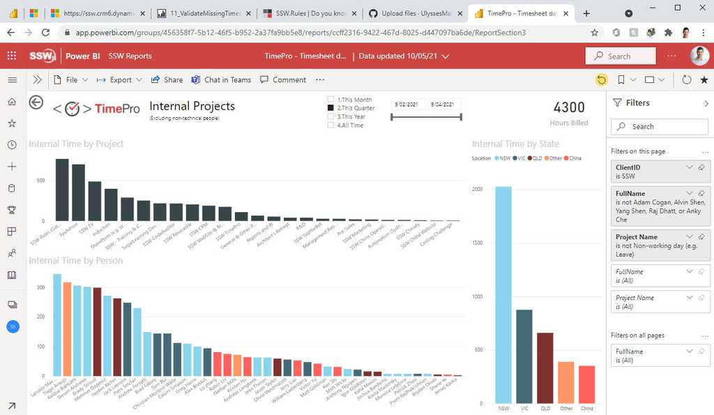
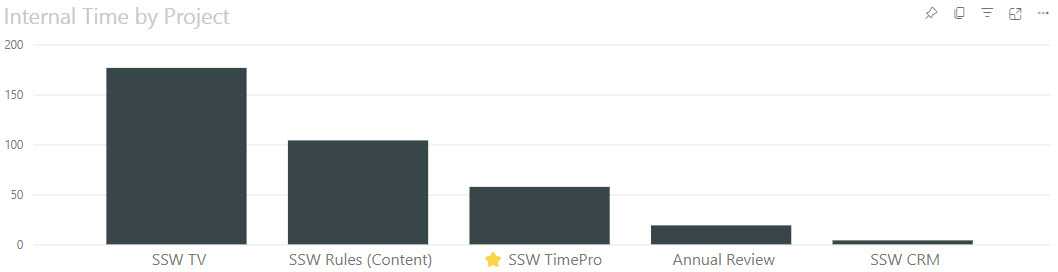
Figure: Good Example - all the slicers are grouped in a consisdtent location and near the filter bar The default sort order for most visualizations is alphabetical, but you should almost always change this.
Alphabetical sorting is really only good if you're specifically looking for one item on the X axis, but it's terrible for seeing ranks, trends, or proportions.

Figure: Bad Example: Alphabetical gives very little information 
Figure - Good Example: Sorting by value shows rank and trends easily Monitoring Power BI report usage provides the organization with a valuable insight into the effectiveness of their reporting strategies. By tracking how reports are being accessed and engaged with, businesses can make data-driven decisions to optimize their content, allocate resources efficiently, and enhance the user experience.
This information is essential for understanding which reports are delivering the most value, enabling organizations to prioritize their efforts, improve content relevance, address performance bottlenecks, and align their resources with actual demand. Moreover, monitoring report usage supports security and compliance efforts by detecting unauthorized access patterns, ensuring data protection.
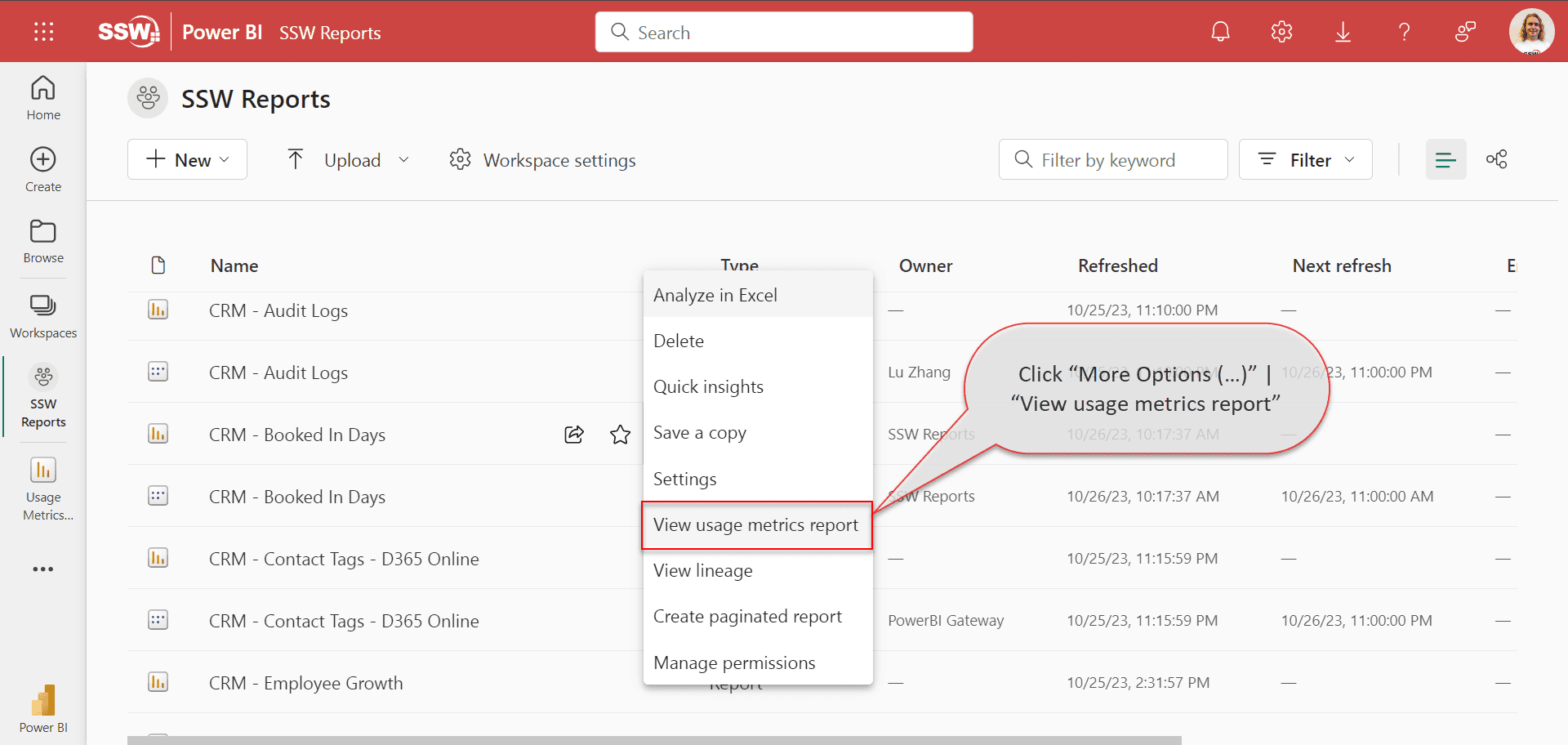
Access Usage Metrics Report
You need one of the below permissions in the Power BI Workspace to access Usage Metrics Report:
- Admin
- Contributor
- Member
You have 2 options to view the Usage Metrics Report for an individual report:
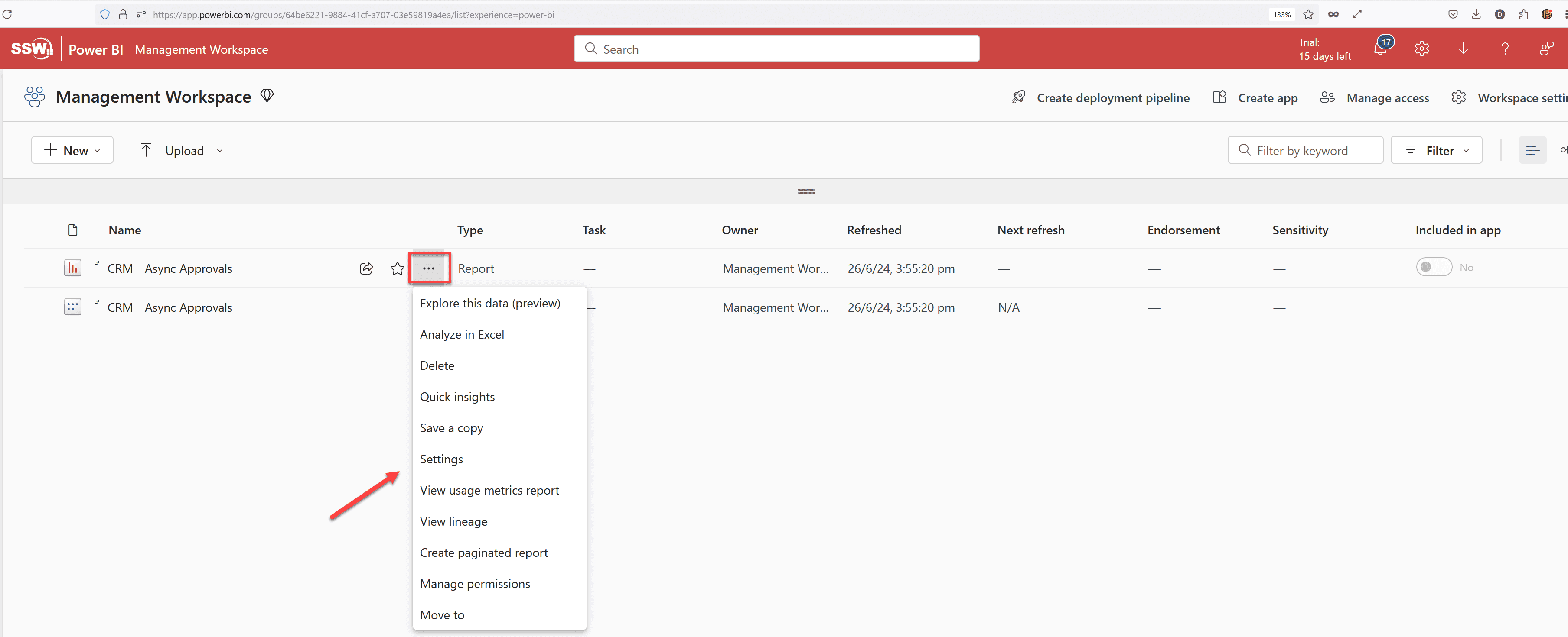
- Inside your Workspace for the Report, that you are interested in, click “More Options (…)” | “View usage metrics report”.

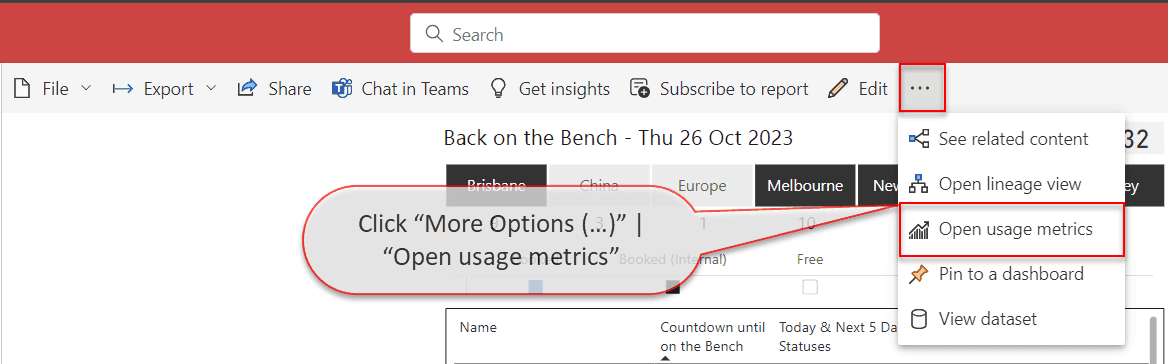
Figure: From Workspace - click “More Options (…)” | “View usage metrics report” - Inside opened Report in the command bar click “More Options (…)” | “Open usage metrics”.

Figure: From Report - click “More Options (…)” | “Open usage metrics”
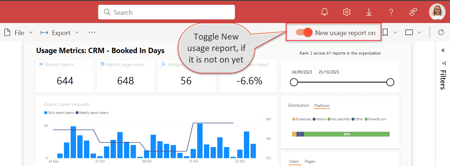
If you're viewing a Usage Metrics report for the first time, Power BI may initially open the old version of the this report. To access the enhanced Usage Metrics report, toggle the "New usage report" switch located in the command bar.

Figure: Toggle New usage report Usage Metrics Report dataset contains data for the last 30 days and refreshes daily.
The report contains 4 pages:
- Report usage – Shows such information as number of report open requests and views per user or per page
- Report performance – Shows trends of Open Report actions
- Report list – Shows the list of all reports in the workspace and their metrics
- FAQ – Shows the answers to frequently asked questions about Usage Metrics Report
Customize Usage Metrics Report
While Usage Metrics Report already provides valuable information, it can be potentially further enhanced.
If you want, for example exclude certain users or reports from these metrics, it can be achieved modifying this report.
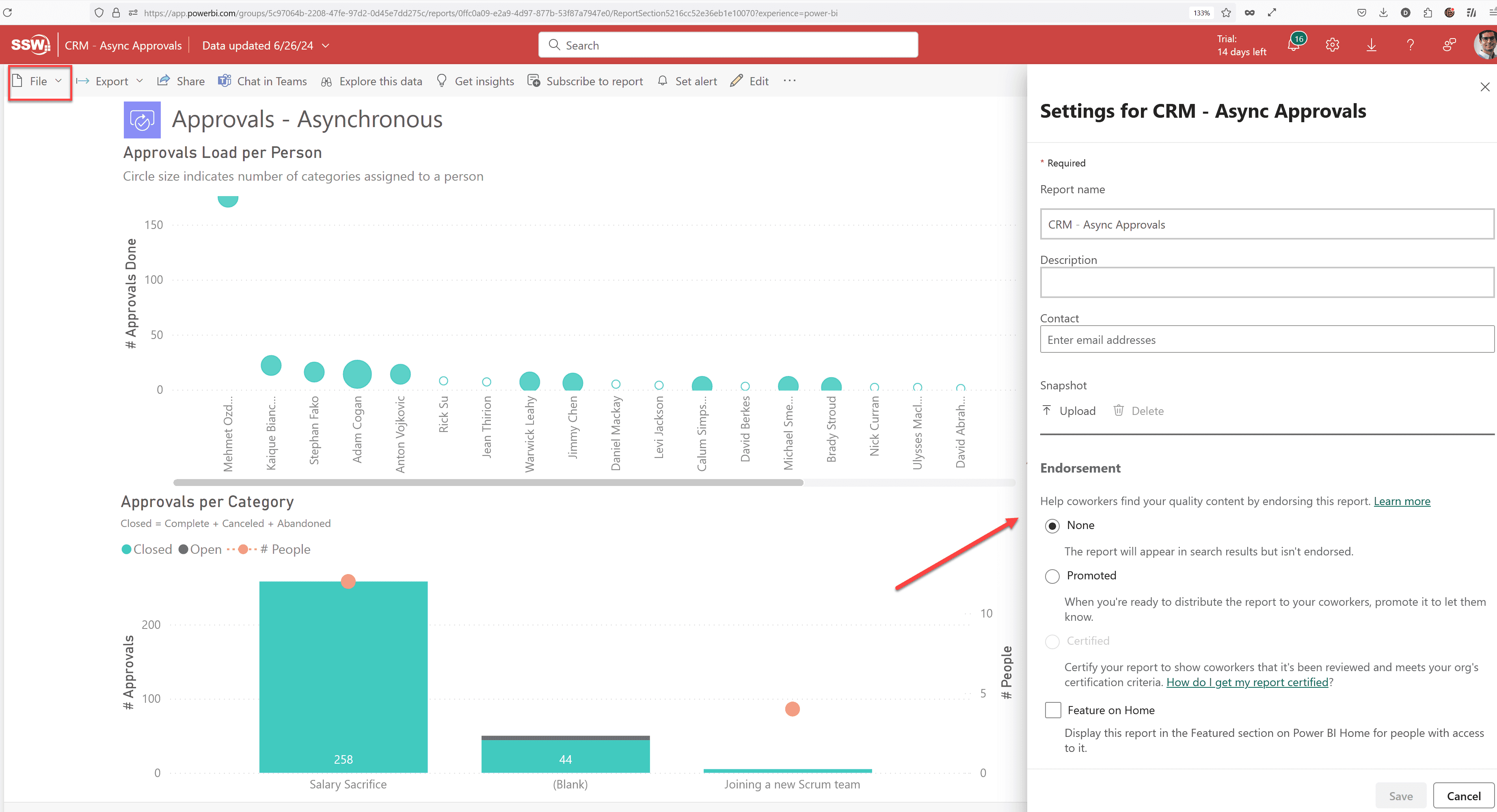
If your workspace does not already contain a customised Power BI Report Usage report, you must first save a copy of your Usage Metrics Report by clicking File | Save a copy. You will then need to input the name for a new report and select the workspace where you want to save it.
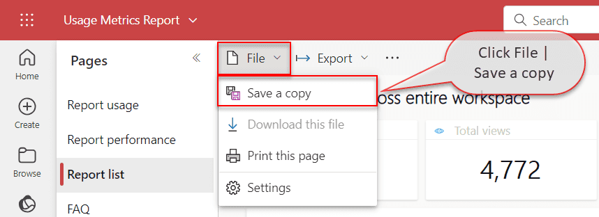
Figure: Save a copy of the report - click File | Save a copy The new Power BI Report Usage report will be visible to the users with the Viewer role, unlike the default Usage Metrics Report.
The report will have Edit button available in the command bar. It allows you to go into the Editing view, as with any regular report, and change filters, add new pages and more.
Users can quickly subscribe to emails of the report pages that matter most. Once subscribed, Power BI will regularly send screenshots and a link for the report page directly to your inbox.
Video: Power BI Email Subscriptions - Many people love getting reports in their inbox monthly
There are 2 ways to integrate Power BI with SSRS (SQL Reporting Services) that will allow you to be able to find all of your relevant reports from wherever you look for them
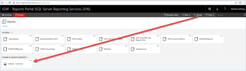
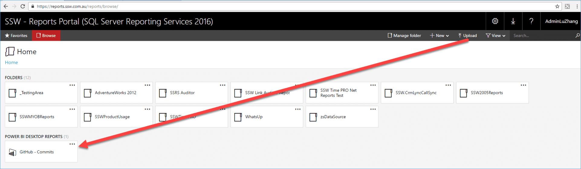
In SSRS 2016, you can list Power BI reports as if they were SSRS ones.

Figure - Good Example: Power BI dashboards can show charts from SSRS reports, and link through to them when clicked.
When you run into a wall in Power BI and feel like you've exhausted the out of the box functionality, that when it's time to investigate what a bit of DAX can do for you.
There are 2 different things you can do with DAX, create a Measure or a Calculated Column.
Calculated columns:
- Stored in the database
- Often used to filter/group data
Measures:
- Computed on aggregates of values
- Computed at query time
- Often used to give a numerical metric
GroupingColumn = if (value<x, small, if(value<y, medium, large))Figure - Good Example: Nested if statements are a great way to split up your data into groups
When creating a Power BI connection to Dynamics 365, the first thing that comes to mind when searching for a connector is to search for Dynamics 365, seems logical enough right?
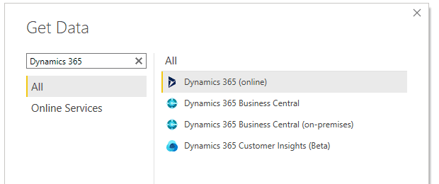
Figure: Bad example - Searching for Dynamics 365 connector Wrong.
When connecting to Dynamics 365 data always use the Dataverse connector (if it is available). Your system admin will need to tinker with some settings to enable this support, but it's simple and easy enough to do, here's the link: https://docs.microsoft.com/en-us/powerapps/maker/data-platform/view-entity-data-power-bi.
Once enabled instead of using Dynamics 365 (online) connector use the Dataverse connector.
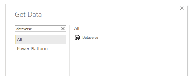
Figure: Good example - Use the Dataverse connector instead The advantages of using the Dataverse connector are:
- Supports both Import and Direct Query (Direct Query means live reporting 🙂)
- Dataverse is built on top of TDS (Tabular Data Stream), meaning it should be much faster than the WebAPI connector
- Potential to write custom SQL queries for data sources
The disadvantages of using the Dataverse connector are:
- None
Knowing when to use SQL Server Reporting Services (SSRS) over Power BI can ensure that you are using the tools most efficiently to help drive your business.
Many organizations see Power BI as a replacement for SSRS due to a lack of major advancements in the SSRS space however while similar they both fill different key needs for organizations and the BI team at Microsoft has invested a lot of time into improving the SSRS offering.
SSRS is better for "Pixel perfect" reports that you can design exactly to your specifications, whereas most Power BI visualizations only have a finite amount of visual tinkering possible.
SSRS provides a stronger ability when it comes to static representational reports, like invoices, monthly reports, mailing lists...
Power BI however is better for a dynamic interrogation of data as it currently stands so this can allow power users to drill into live data to identify trends.
Feature Power BI SSRS Printing - ✅ Mobile app ✅ - Connectors ✅ ✅ Language support ✅ ✅ Realtime data filters ✅ - Report parameters - ✅ Embedding support ✅ - Figure: Power BI/SSRS feature comparison
The emails exchanged within your company are more than just communication tools, they are a rich source of data. By analyzing and interpreting this data, you can:
- Gain insights into a company's operations
- Detect bottlenecks (nobody likes to get blocked)
- Better distribute workload
- Make strategic decisions
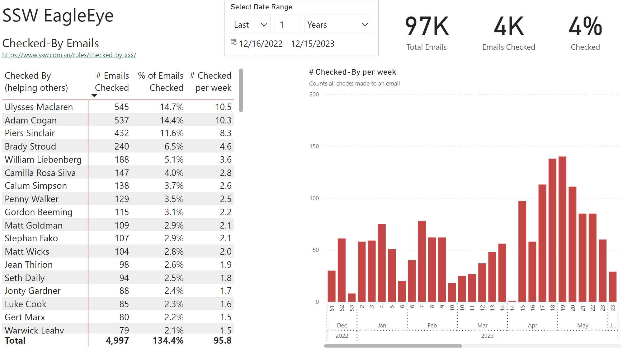
Emails should follow a set of email rules that make communication consistent and structured. When emails have standard format and content, data analysis is possible.

Figure: Good example - We can see that Uly checked more emails than anyone else in the company Actionable insights
Collecting data is great, but if you're not creating actionable insights, you're missing out on the real value. Here are some examples of actionable insights you can gain from analyzing company emails:
Workload distribution
Through analyzing company emails, one can assess whether tasks and responsibilities are allocated evenly across teams. Some rules capturing these emails:
Project management
Email analysis can reveal insights into project timelines, milestones, and communication patterns. Some rules capturing these emails:
- Do you create a Sprint Review/Retro email?
- Teamwork - Do you manage up? (Give a recommendation)
- Do you escalate key updates and deliverables?
Sales
By examining email exchanges with clients and trends in customer enquiries. Some rules capturing these emails:
Finance
Finding engineers that talk time frames and $. Some rules capturing these emails:
- Office environment - Do you know how to get approval for a purchase?
- Budgets - Do you monitor your costs in Azure?
Meetings
Finding people that have efficient meetings. Some rules capturing these emails:
Communications
So many problems in business come down to a lack of clear and effective communication. Some rules capturing these emails:
Creating Power BI Template Apps is an efficient way to manage and distribute Power BI reports and dashboards with other external users.
Once the Template App is created it will live in the Power BI Apps marketplace. Users have the ability to use the template app with their own data or use the default data provided.
✅ Pros
- Ease of Distribution: Template apps provide an easy way to distribute Power BI content to external users. Once published to the Power BI service, these apps can be shared widely without needing to individually manage access permissions
- Ease of Maintainance: Template apps simplify the process of updating and maintaining the Power BI content with their Release Management
- Data Source Flexibility: Users can easily integrate their own data
- Trial with Sample Data: Testing the app with sample data allows users to easily explore and understand features before using their own data. As an added bonus this is also great for demos
❌ Cons
- Dependency on Power BI Environment: External users need to have access to Power BI (Pro or Premium license), which may limit the accessibility for some users. To create Template Apps a Power BI Pro license is necessary
- Initial Setup Complexity: Setting up a template app for external sharing require more overhead to set it up
- Limited Customization for End Users: While creators can customize the app, end users have limited ability to modify or interact with the content beyond basic filtering and slicing
- Performance Considerations: Large datasets or complex visualizations may impact the performance and loading times for end users
Creating Power BI Template Apps
Prerequisite
- Power BI Pro license
- Sample database with dummy data as the default connection for the template app (See section on "Configure a Database for Template Apps" for more information)
Steps
-
Enable "Develop Template Apps" in the Workspace
Enabling "Develop Template Apps" in your Workspace allows you to create apps within the workspace.
In the workspace you can then choose which of your reports goes into an app, and you can share the app with other people without exposing the entire workspace.
To enable Template Apps you can either enable the current workspace or create a new workspace.* **Option A: Enable in Existing Workspace** 1. Navigate to your Power BI workspace settings 2. Ensure the "Develop Template Apps" option is enabled 
Note: The workspace might need to be upgraded, if so request an admin to upgrade the workspace.
-
Option B: Create a New Workspace
- Create a new workspace
- Go to "Advanced", and under the "Template Apps" tick off "Develop Template Apps"
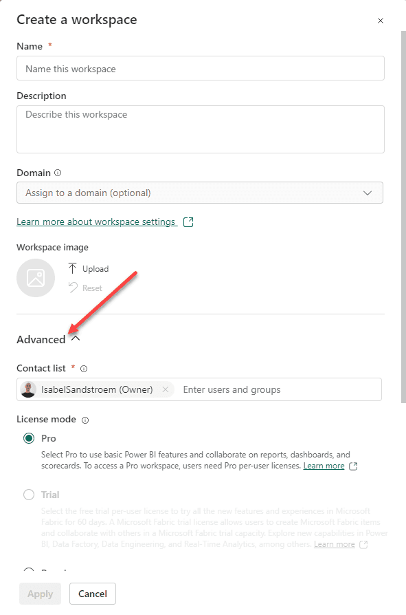
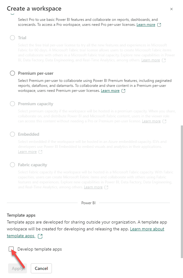
Note: Once enabled, this setting cannot be reversed. Learn more.
- Add Reports in Workspace Add reports in your workspace as you normally would by creating or uploading reports.
-
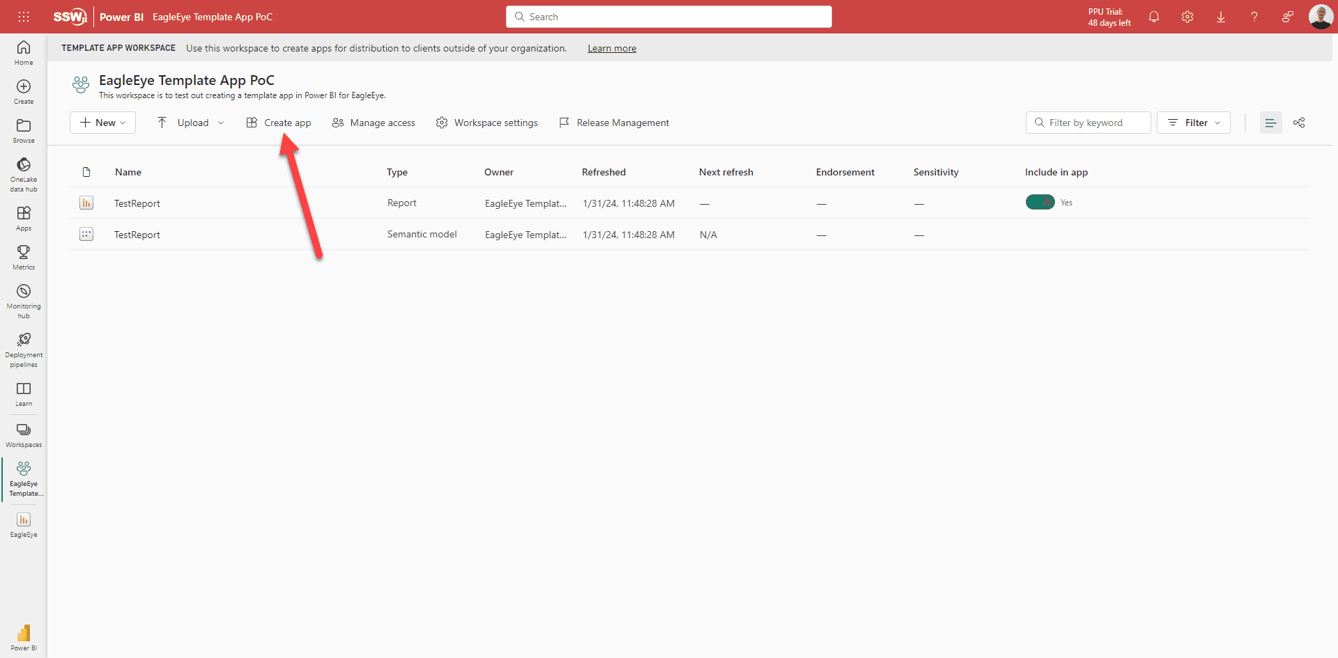
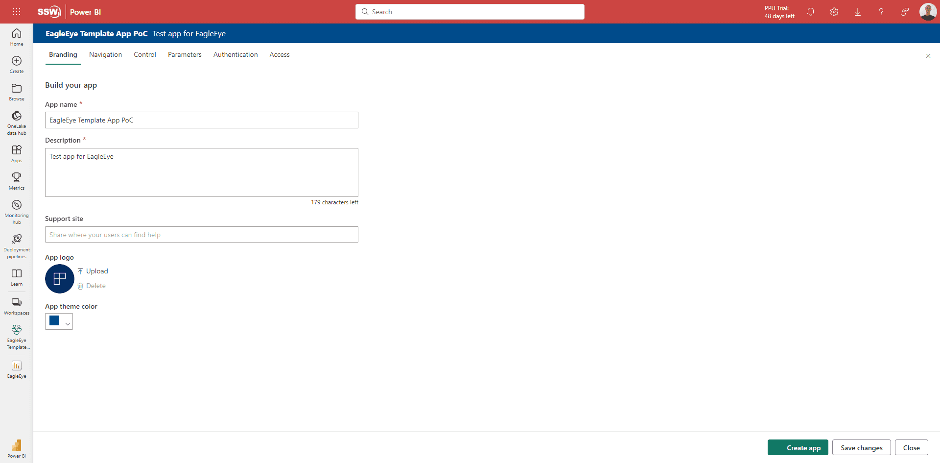
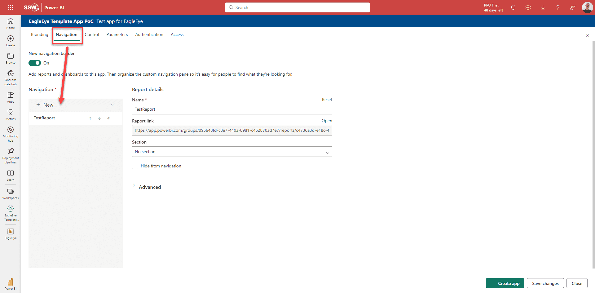
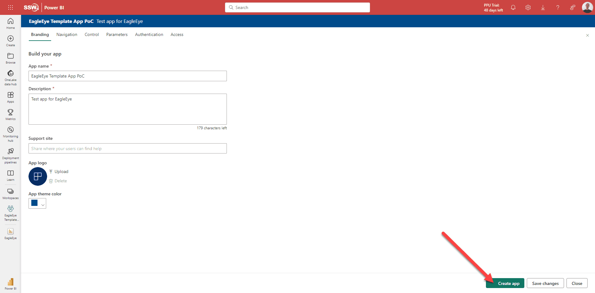
Create and Configure the App
- Within the workspace, create your app by clicking "Create App"
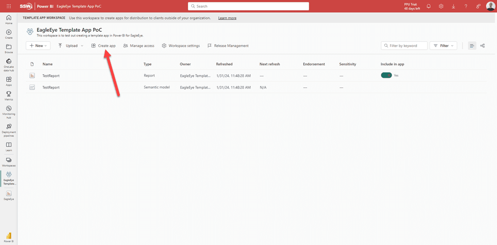
- This will open up a form, fill out all the fields

- In the Navigation pane, select the reports to be included in the app
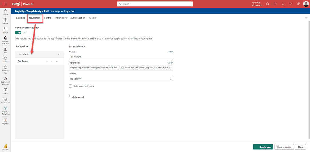
- Once everything is filled out, click the "Create app" button

-
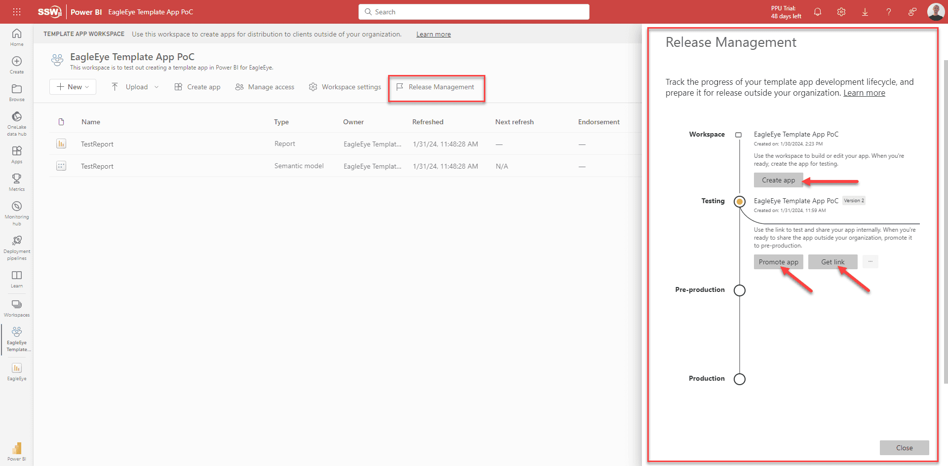
Manage the App
Manage your app in the "Release Management" pane. Here you can:- Update the app once you have new changes in the report by clicking "Create App"
- Share the app to specific people to test it out by clicking "Get Link"
- Publish the app by clicking "Promote app"

Note: Users need to be granted access before they can use the link. This can be done in "Manage Access".
Note: The reports in the app will be read-only.
Configure a Database for Template Apps
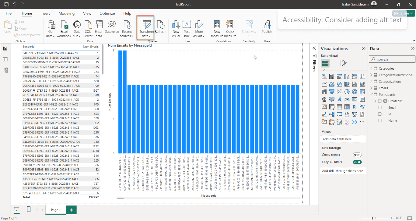
Set Up Database Parameters in Power BI
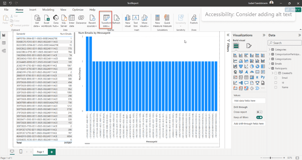
- In Power BI go to Home | Transform Data. This will open up a new window
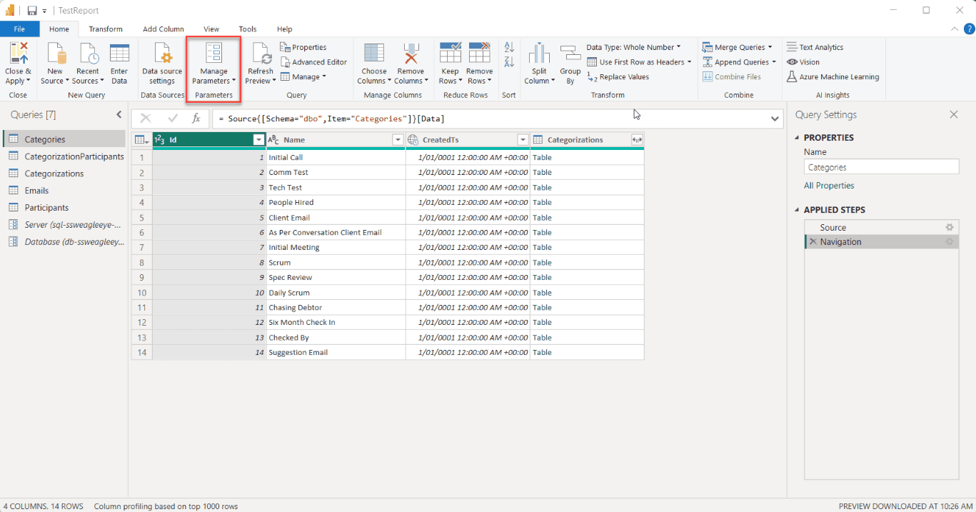
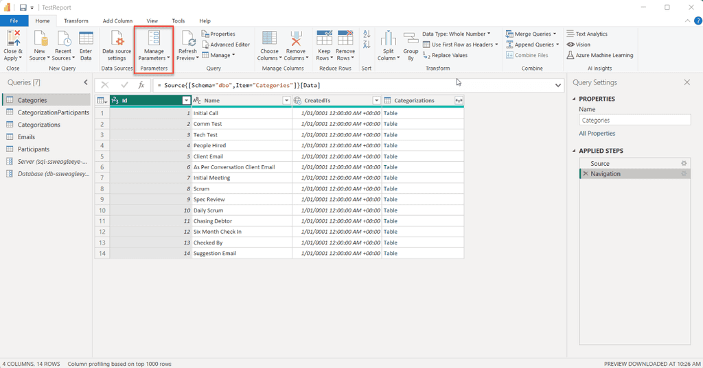
- Add a new parameter by going to Home | Manage Parameters | New Parameters
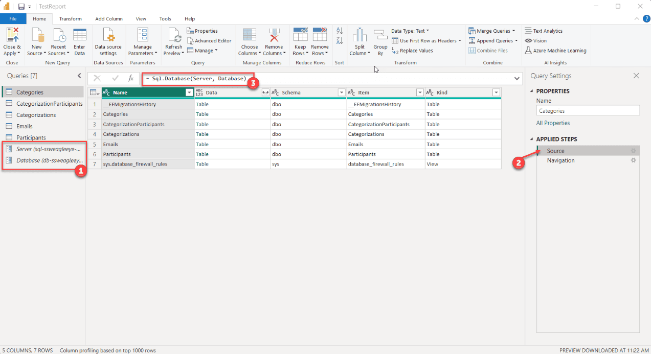
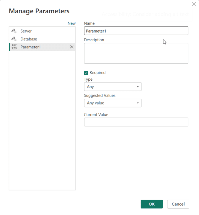
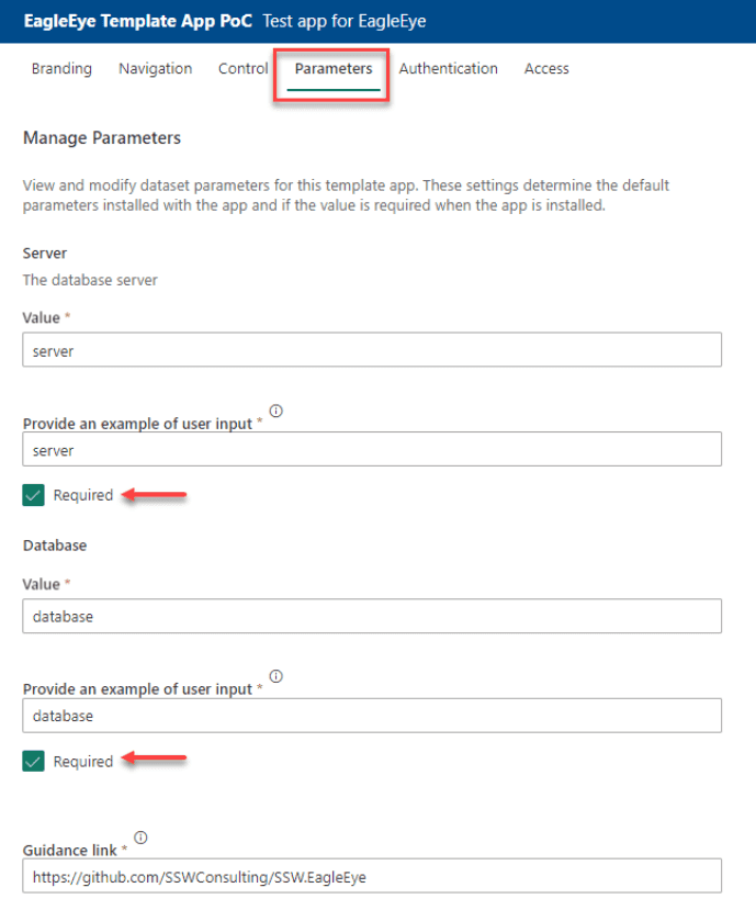
- Fill out the pop-up box for a new parameter and press "OK" E.g. For a database you might need a parameter for Server and a parameter for Database
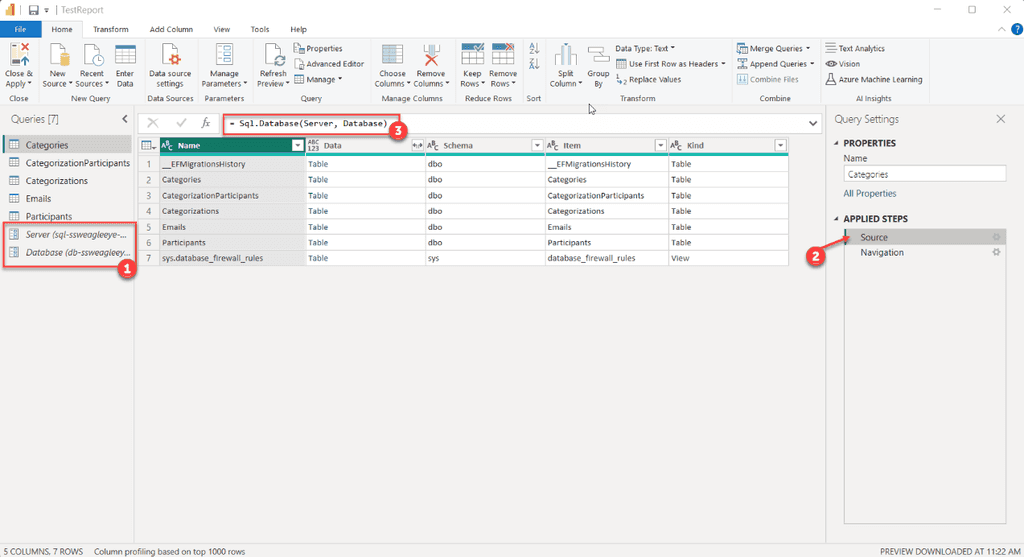
- Back in the Transform Data window you have two new parameters. You can see them in the left pane (See #1 in image below)
- To edit the source to use the parameters click on the Applied Steps | Source in the right pane (#2), and edit the source in the function field (#3)
- When creating the app, set the parameters default value in the "Parameters" pane and tick them off as "Required". The default values should go to the dummy database
User Setup for Installed Apps
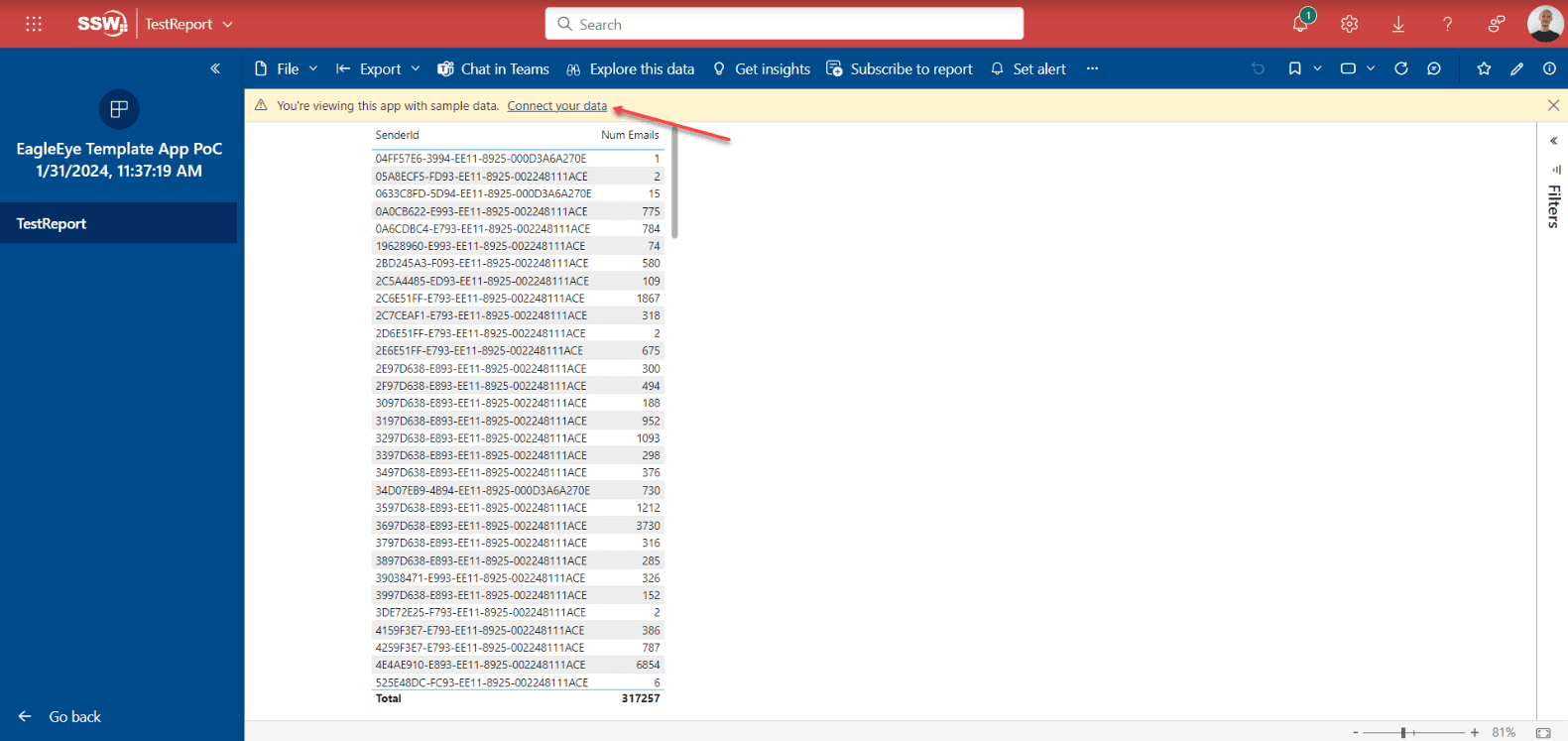
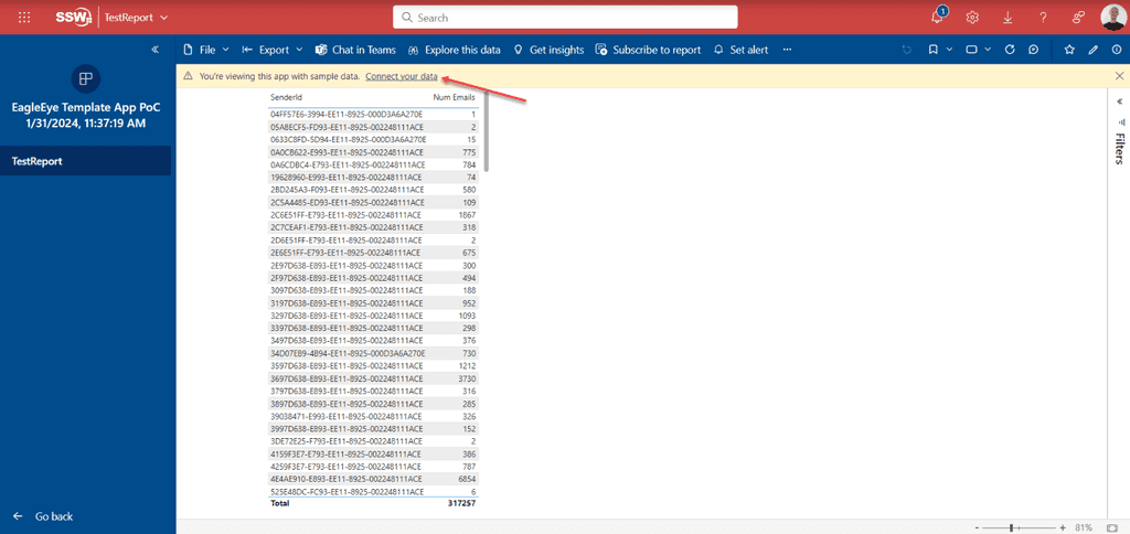
When users install and open the app they can browse the app with the dummy data from the default connection.
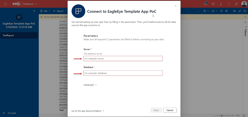
The user will have the option to connect their data by following the following steps:- Select "Connect your data" in the message at the top of the page
- Enter details for the "Server" and "Database" parameters in the pop-up
- Authenticate to the database
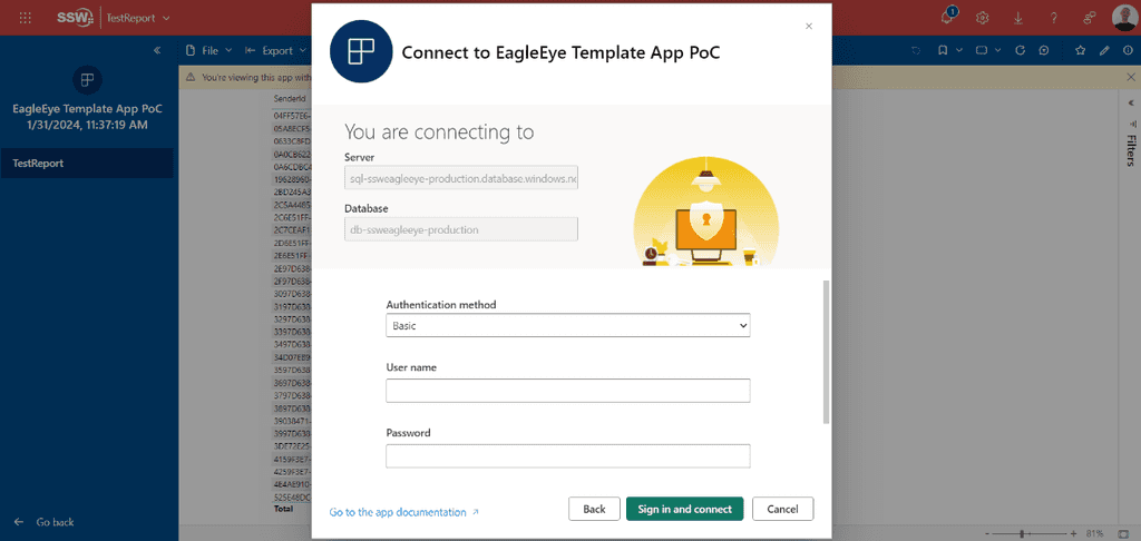
- Once authenticated, users can start exploring the app with their own data 🚀
More information