
Rules to Better Reporting Services - 34 Rules
If you still need help, visit Enterprise Reporting and BI and book in a consultant.
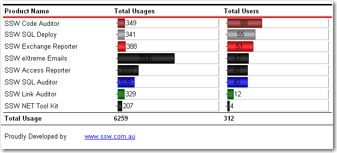
By default SSRS will track reporting execution for the last 60 days. This might be OK in most cases, but you may want to adjust the retention days if you want better report usage statistics.
To update the value you can:
- Connect to the ReportServer database in SQL Management Studio
- Execute the following script and update the value to the number of days you want to track
EXEC SetConfigurationInfo @Name=N'ExecutionLogDaysKept',@Value=N'365'After you have this, you can query the ExecutionLog table to find useful information about report execution like:
- Which users are actively using the reports
- How long reports are executing
- The last time a report was executed
SSRS keeps track of each report that gets executed and records useful information like:
- How long did the report take to generate
- Who requested the report
- When was the report generated
- Report Parameters used
So it's quite simply a matter of querying the ReportServer database for information in the ExecutionLog table.
WITH RankedReports
AS
(SELECT ReportID,
        TimeStart,
        UserName,
        RANK() OVER (PARTITION BY ReportID ORDER BY TimeStart DESC) AS iRank
   FROM dbo.ExecutionLog t1
        JOIN
        dbo.Catalog t2
          ON t1.ReportID = t2.ItemID
)
SELECT t2.Name AS ReportName,
       MAX(t1.TimeStart) LastAccessed,
       --t1.UserName,
       t2.Path,
       SUBSTRING(t2.Path, 0, CHARINDEX('/', t2.Path, 2)) ParentFolder,
       t1.ReportID
  FROM RankedReports t1
       JOIN
       dbo.Catalog t2
         ON t1.ReportID = t2.ItemID
 WHERE t1.iRank = 1
GROUP BY t2.Name, Path, ReportID
ORDER BY MAX(t1.TimeStart) DESC;
The query above gives you the last reports that were accessed (Credit to Eric Phan - SSRS - Find out which reports are being used (handy for migrating only the useful reports to a new server))
Like any solution, Reporting Services has its pros and cons. From our experience, we have discovered these things about Reporting Services:
Cons
- Parameters - you are forced to use built-in controls.
- Query string - when you change the parameters and refresh a report, the values do not appear directly in the query string, making it hard to copy/paste URLs.
- Can't separate SQL into a strongly-typed dataset or middle-tier object like in ASP.NET.
- There are potential difficulties with the deployment of RS reports and the exposing of them. However, once we have the infrastructure...
- Not able to work natively with modern .NET.
Pros
- You can develop read only reports faster in Reporting Services than ASP.NET.
- Maintenance with RS is easier than ASP.NET, as with most cases you don't have to write any code.
- Flexibility with groupings and totals is easier. In ASP.NET you would need to iterate through the DataSet, keeping variables with the totals.
- Parameters are built-in. In ASP.NET there is code.
- Drilldown interactivity. In ASP.NET you need to code up a treeview.
- Users can have reports automatically emailed to them on a schedule.
- Users can export natively to PDF and XLS, plus a variety of other popular formats.
Nowadays, better technologies are used to handle reports. Examples include
- Power BI: cloud-based solution that provides visually appealing reports and dashboards.
- HTML based reports: HTML frameworks have evolved significantly, making it quick and easy to make great reports.
For a more detailed comparison between reporting solutions, take a look at our Guidelines for Report Solutions - Web Clients.
Figure: Reporting Services has built-in support for PDF/XLS export and can be embedded in your ASP.NET pages Figure: How to migrate SSRS reports from an old server to another
Let's say you want to migrate SSRS reports from an old reporting service server (e.g. SQL Server 2008 R2) to a new one (e.g. SQL Server 2016). What involves?
There are 3 steps:
Step 1: Find the reports that don't need to be migrated
- Find those reports are not-in-use, as per a rule: Do you know which reports are being used?
-
Find creators of those reports, by clicking “Detail Views” in reports folder
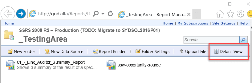
Figure: Find reports creators by clicking "Details View" inside report folder -
Send an email to report creater ask for permission to delete
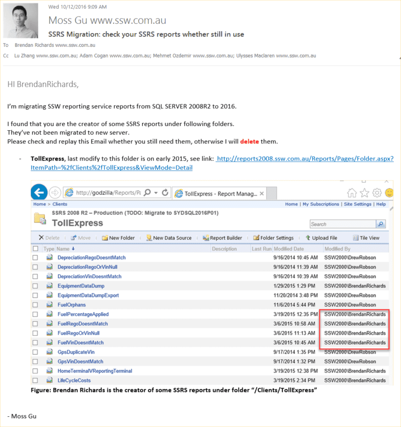
Figure: Send an email to ask permission 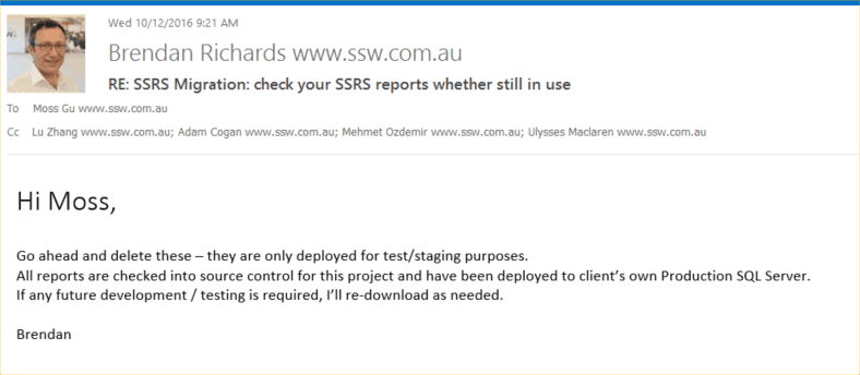
Figure: Email received with permission to delete from creator
2. Migrate those in-use reports from old server to new server
Tip: Use the ReportSync tool to save time.
3. Check audit results
- Run SSW SQL Reporting Service Auditor on both sides
- Compare audit results. Note that even error and warning messages also need to be the same
If audit results are exactly the same on old and new servers, it indicates that migration is successful.
When working with SSRS reports, you need to have the right type of project otherwise it will be difficult for a developer, to create new reports or update existing ones.
If you have some reports and want to check them into source control, if you add them to project that is not a report project, your reports will not open in the design/preview view (allowing to see the DataSource and DataSets). They will open in the XML view (which is not pretty to work with).
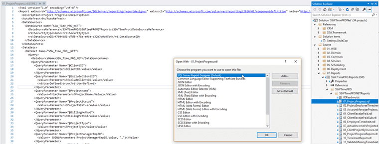
Figure: Bad example – C# project with reports opening as XML To open the reports in the right view you will need to:
- Be sure that you VS has the tool/extensions Microsoft Reporting Services Projects installed, go to Tools | Extensions and Updates | Online, and search for services
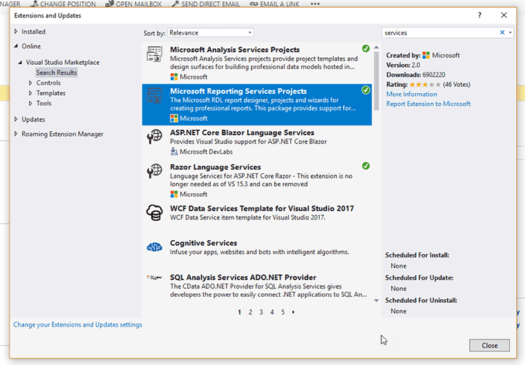
Figure: Checking Microsoft Reporting Services Projects is installed - In SQL Server Data Tools (SSDT) for Visual Studio website you will find all the instructions to install the tool via Marketplace or SSDT standalone installer.
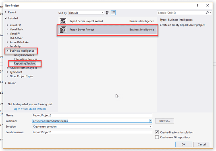
- Create the project selecting Business Intelligence | Reporting Services | Report Server Project
- Add existing reports and create your new DataSource (based in the information on your Report Portal)
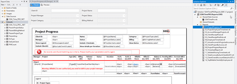
Figure: Good Example – Report Server project with reports opening in the design/preview view The default configuration for Report Server isn't accessible by most mobile browsers and some desktop browsers too. You can adjust the authentication types allowed to increase the range.
The configuration file for the Report Server is named RSReportServer.config and the default location is:
**C:\Program Files\Microsoft SQL Server\MSRS13.MSSQLSERVER\Reporting Services\ReportServer**
You should make a backup of the configuration before editing it so you can rollback if you make a mistake.
We normally change the AuthenticationTypes node from:
<AuthenticationTypes>
  <RSWindowsNegotiate />
</AuthenticationTypes>
to:
<AuthenticationTypes>
  <RSWindowsNegotiate />
  <RSWindowsKerberos />
  <RSWindowsNTLM />
</AuthenticationTypes>
Check out the different Authentication Types in the Report Server documentation and select the types that suit your needs.
More details on configuring Windows authentication on the report server can be found here: Configure Windows Authentication on the Report Server.
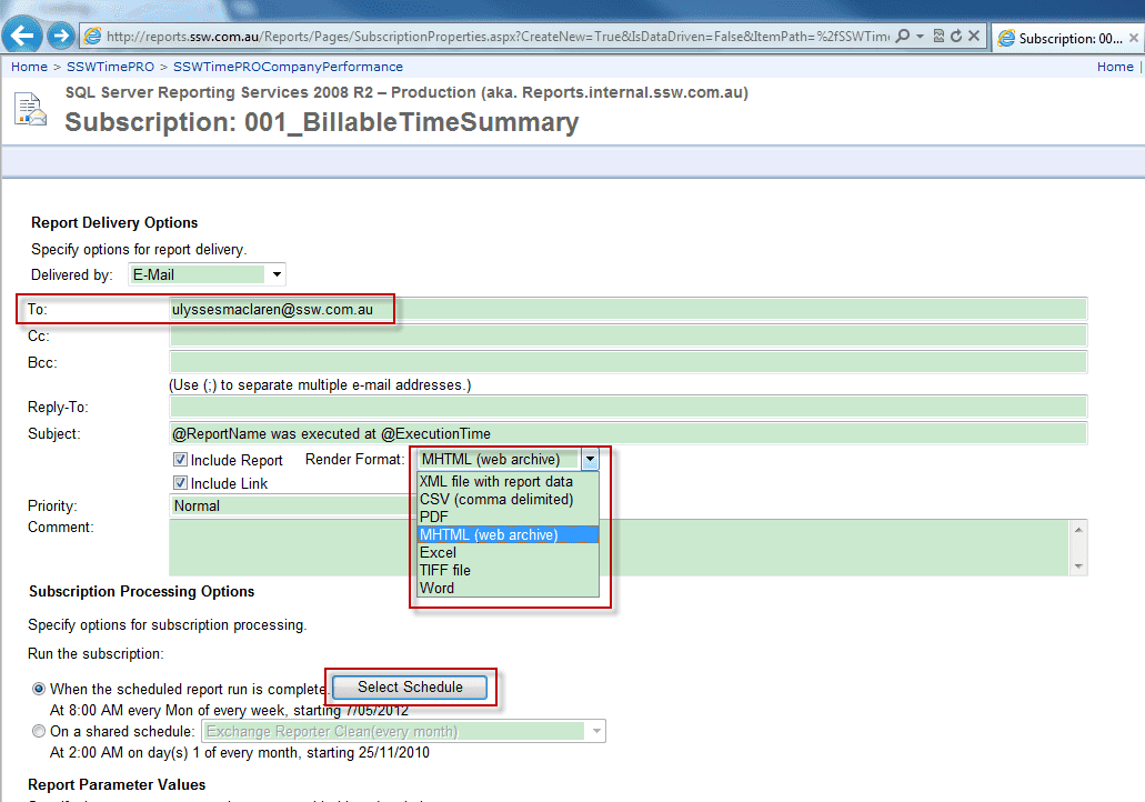
Here are the steps to subscribe a report:
- Open IE, go to the folder view which contains the report you're going to subscribe.
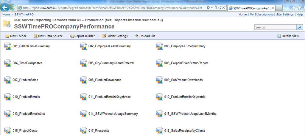
Figure: Reports folder view - Click the report you're going to subscribe and select "Subscribe...".
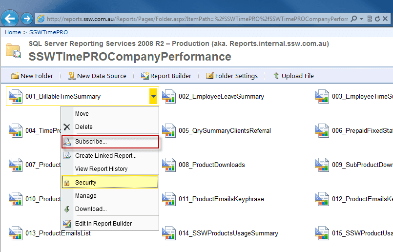
Figure: Subscribe report - Configuring the subscriber's email address, report render type and schedule.
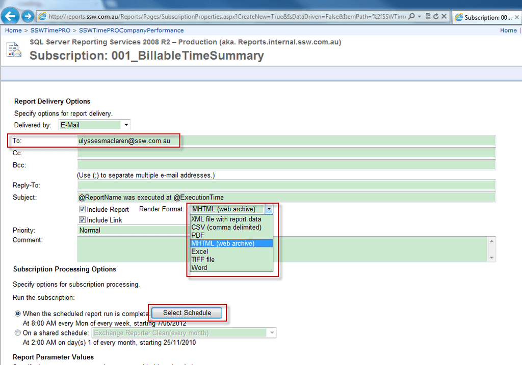
Figure: Configuring subscribe settings SQL Server 2008 R2 Reporting Services comes with some great samples that will help get you started. Unfortunately, they aren't installed by default.
These samples include:
- Report Project based on the Adventure Works 2008 R2 database
- Report Builder Model based on the Adventure Works 2008 R2 database
Upon installing the samples successfully, you should see 3 folders (shown below) in your Report Manager.
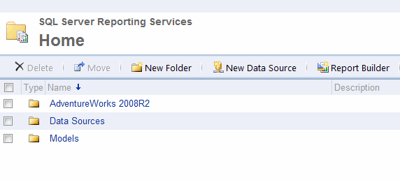
Figure: A proper installation of the samples For more information, visit the following links:
A lot of the time, you will want a hard copy of your reports. Obviously reports are different sizes on screen and on paper, so you need to format your report so it exports to PDF and prints properly. Here's how.
-
Change the report's page width to 28cm (or 11in) and top and bottom margins to 0.5cm.
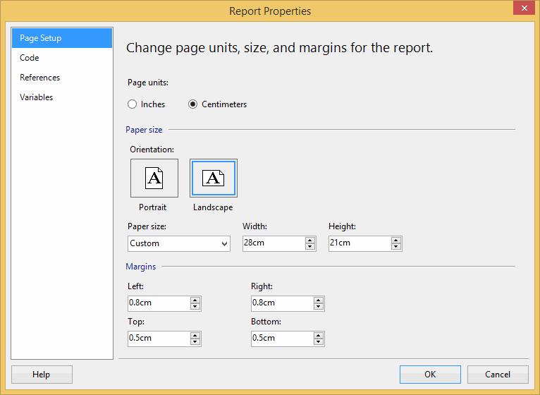
Figure: Good example - For proper printing, first change the Report's Page Width to 28cm (or 11in) and top and bottom margins to 0.5cm -
Change the Body width to 25.4cm (or 10in)
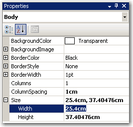
Figure: Good example - Then change the Report's Body Width to 25.4cm (or 10in) 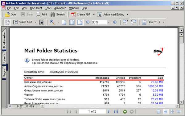
Figure: Bad example - PDF page with 1cm margin (wasted much space on top and bottom) 
Figure: Good example - PDF page with 0.5cm margin (you have more room for content) You can see the 0.5cm margin looks much better than 1cm, and you have more space to organize your content, especailly for a landscape print view.
- Resize report items (tables and charts) to fit the page. The easiest way to do this is to select (Ctrl+click) all report items that should span the whole width of the page, and set their Width property to 25.4cm (or 10in).
Tip: Export your report to PDF and do a print preview, so you don't have to print a lot of testing pages to find out the best page settings.
Tip: Remove top and bottom paddings in header and footer text can also give you more space.
Note: Reporting Services reports accept both inches and cm, so you can use either.
We have a program called SSW Code Auditor to check for this rule.
-
When designing custom applications you want to include branding on reports. You should always include a useful and informative footer at the bottom of your reports.
Include:
- Date and Time Printed and User who printed it - see warning below (e.g. Printed by SSW\DaveSmith on 3/1/2024 3:16:30 PM)
- Execution Time (e.g. Execution time: 1 minute, 10 seconds)
- Page x of y (e.g. Page 3 of 10)
- Link to company website + slogan (e.g. <www.ssw.com.au> - Enterprise Sopftware Development)
Bad example - This footer doesn't provide any useful information 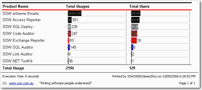
Good example - Useful and informative information should be displayed in your report footer Use these handy report expressions to show the above information.
Note: Do not use
System.DateTime.Nowfor Execution Time because if you do it will return the result at time of printing the document/PDF. Instead store the value in a variable (for exampleGroupExecutionTime) and then call that.Use these handy report expressions to show the above information.
Footer Item Expression Sample Output Date and Time printed / User ID ="Printed by " + User!UserID + " on " + Globals!ExecutionTime.ToString() Printed by SSW2000\JatinValabjee on 3/1/2006 3:16:30 PM Execution Time ="Execution Time: " + IIf(System.DateTime.Now.Subtract(Globals!ExecutionTime).TotalSeconds < 1, "0 seconds", ( IIf(System.DateTime.Now.Subtract(Globals!ExecutionTime).Hours > 0, System.DateTime.Now.Subtract(Globals!ExecutionTime).Hours & " hour(s), ", "") + IIf(System.DateTime.Now.Subtract(Globals!ExecutionTime).Minutes > 0, System.DateTime.Now.Subtract(Globals!ExecutionTime).Minutes & " minute(s), ", "") + IIf(System.DateTime.Now.Subtract(Globals!ExecutionTime).Seconds > 0, System.DateTime.Now.Subtract(Globals!ExecutionTime).Seconds & " second(s)", "")) ) Execution time: 1 minute, 10 seconds Page x of y ="Page " + Globals!PageNumber.ToString() + " of " + Globals!TotalPages.ToString() Page 3 of 10 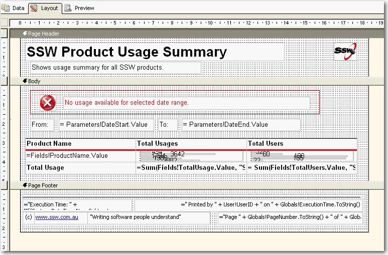
Figure: Good example - Footer in visual studio designer Tip: Copy and Paste this XML into the
for the recommended footer of all your *.rdl files. <PageFooter> Paste here </PageFooter>Warning: Adding the User who printed it stops all data-driven subscriptions.
When you try to add the User your data-driven subscriptions will fail with the following error:
'The '/GroupHealth' report has user profile dependencies and cannot be run unattended. (rsHasUserProfileDependencies)'.
A quick workaround is to add a user function to fallback the error to a nice message, like "SYSTEM":
 Public Function UserName()
 Try
 Return Report.User!UserID
 Catch
 Return "System"
 End Try
 End Function
Use above function to replace your reference to
Report.User!UserIDwill allow the subscription to work correctly.We believe the word 'Report' is redundant in a report, so we avoid using this word in our reports.
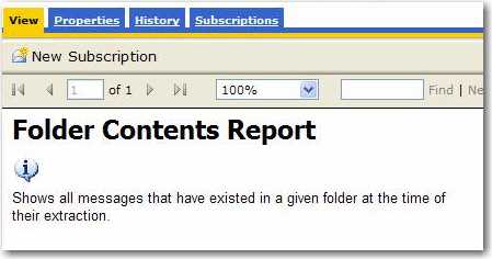
Figure: Bad example - Redundant use of the word 'report' in a report 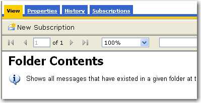
Figure: Good example - Avoidance of the word 'report' in a report The Hyperlink Action allows users to navigate between reports smoothly, but users may ignore the navigation functionality in your reports.
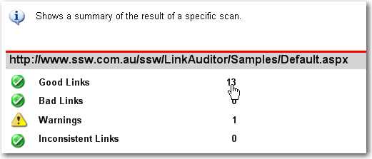
Figure: Bad example - No underline for hyperlink item 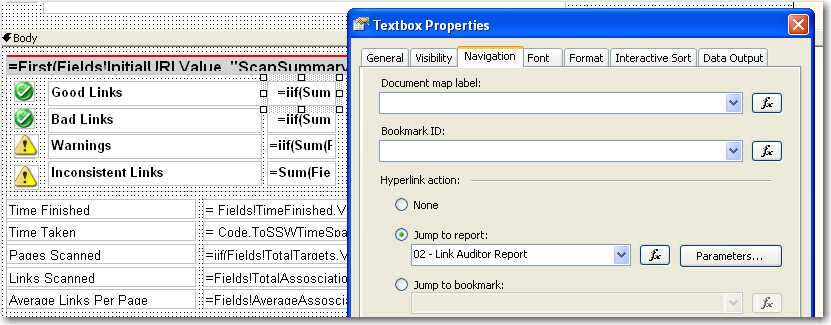
Figure: Bad example - No underline for the textbox with hyperlink action With the underline effect on your hyperlink items, it will be easy for users to find the navigation on your reports.
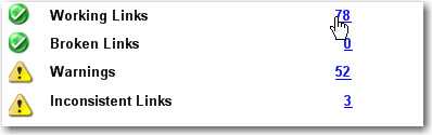
Figure: Good example - Underline for hyperlink item 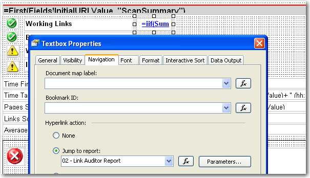
Figure: Good example - Underline for textbox with hyperlink action We have a program called SSW Code Auditor to check for this rule.
Errors on reports should not occur but when they do it is best to make it clear to the reader that they have just experienced an error.
How evident are the error messages on the 1st report below?
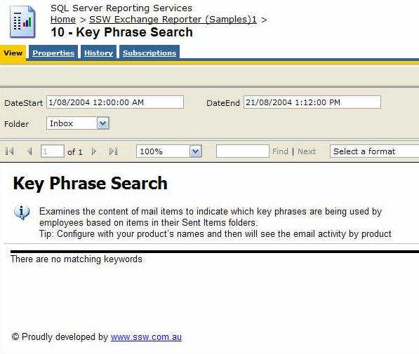
Figure: Bad example - Using the default NoRows property of the table control - error message is not clear enough 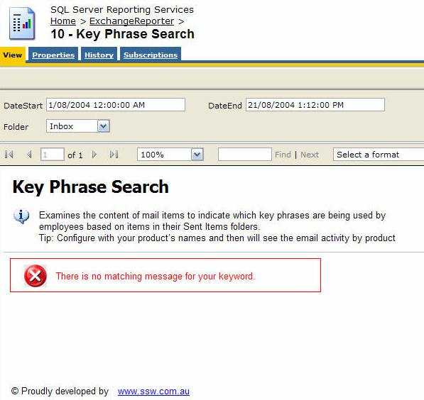
Figure: Good example - Use a customized textbox and icon to show the error message in red Reporting Services allows you to set the 'NoRows' property of a table control to warn your user when there is no data available. This is similar to handle the 'NoData event' in Access report but there is no advanced control on this message, not even a Color property - this has not been improved in RS2005, see our Better Software Suggestions page.
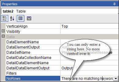
Figure: NoRow property of Table control only allow simple string Here's how to add a custom "NoData" textbox with a red icon to your report:
- Add a rectangle to the top of your report, above any report items in the body. Set its BorderColor to Red.
- Drop a textbox into the rectangle and give it the value No records were found matching your criteria. Please modify your parameters and try again.
-
Add an Image control next to it. Use this error icon. This opens in a New Window as the Image (add it to your Images folder in your solution and reference it like Images/fatalerrorinfo.gif). Your report will now look similar to the one below.
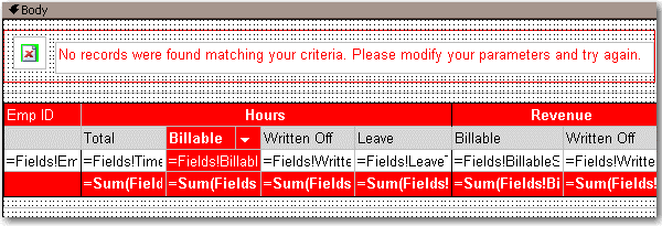
Figure: Adding a custom error message to your report -
In the Hidden property of the Rectangle, add an expression to show/hide it depending on whether any rows were returned. Use the following expression, substituting the bold for your own values (e.g. checking if the sum of all orders is < 0)
--Expression to set the visibility of the error message controls

= iif( Sum(Fields!SaleTotal.Value, "MyDataSet")>0, True, False)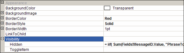
Figure: The Hidden property of the rectangle - Group all other report items into a rectangle - you want to be able to show and hide them dynamically.
-
In the Hidden property of this Rectangle, add an expression to show/hide it depending on whether any rows were returned. Switch the True and False values around, so that it shows if it does have records, and hides if it does not have records (the opposite behaviour to the error box). So, in the example above, the expression would be:
--Expression to set the visibility of the main report items

= iif( Sum(Fields!SaleTotal.Value, "MyDataSet")>0, **False**, **True**)
A professional report should have consistent name.
Figure: Bad example - Inconsistent report name 
Figure: Good example - Consistent report name A professional report should have the feedback information, then users can give suggestions directly to the designers.
Figure: Good example - Include feedback information See how AI is used in Power BI to provide feedback in Reports in this rule
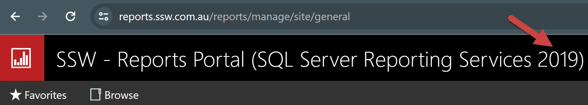
You can add the version number to the name of the reporting server by:
- Going to Site Settings
- Add 2005, 2008, 2012, 2014, 2016, 2017, 2019 or 2022 to the name
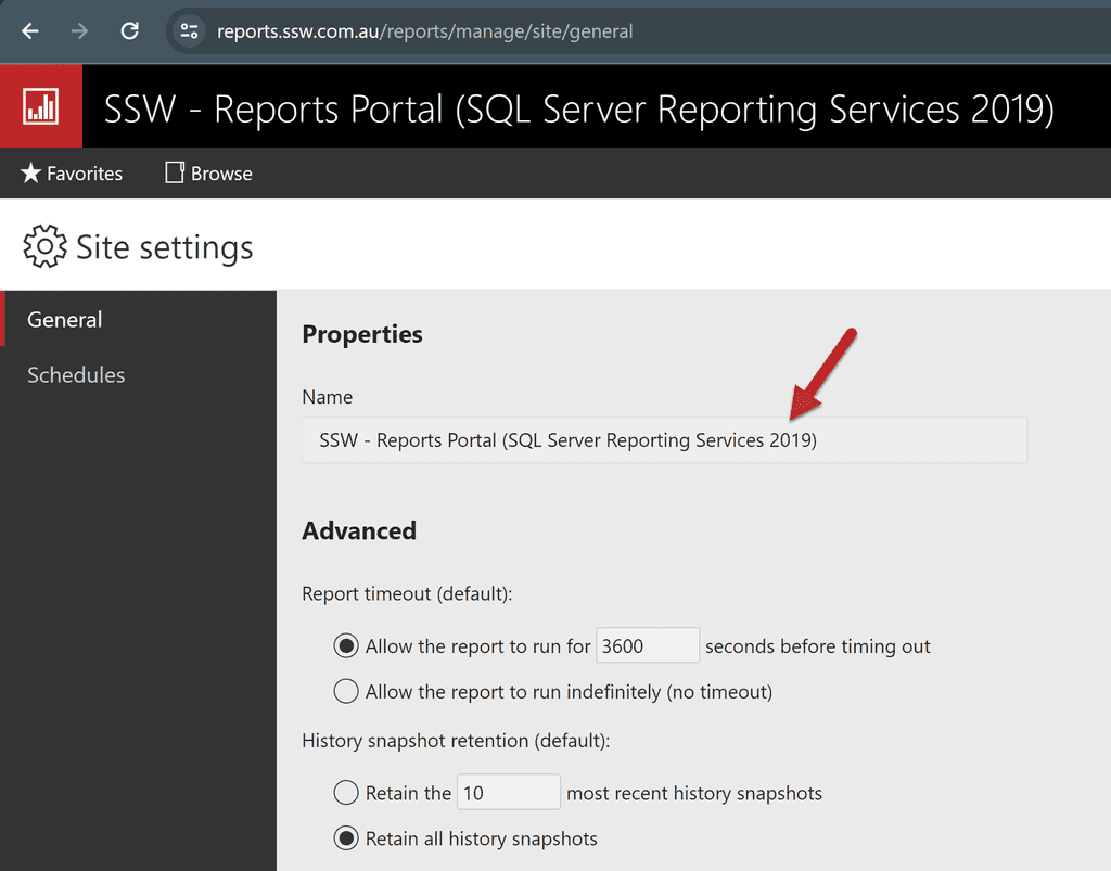
Figure: Reporting Service version 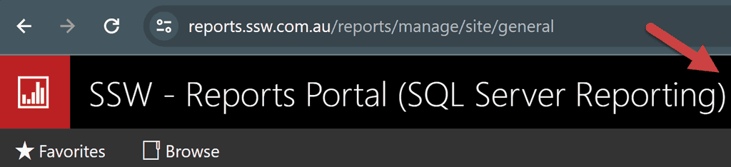
Figure: Bad example - You can't tell what version of reporting services you are running 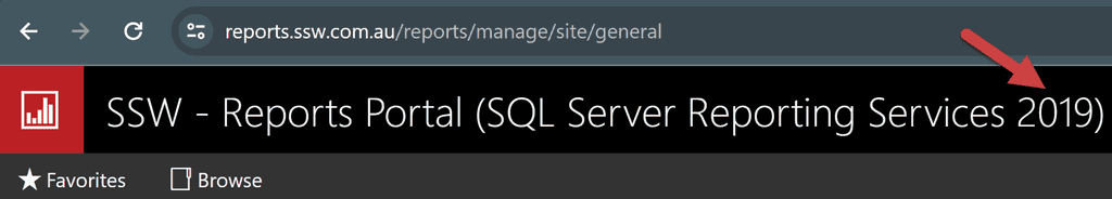
Figure: Good example - We can clearly see that this is running Reporting Services 2019 Things in a report page header repeat on every page. To avoid duplicate and save paper when printing, we put content as less as possible in the header.
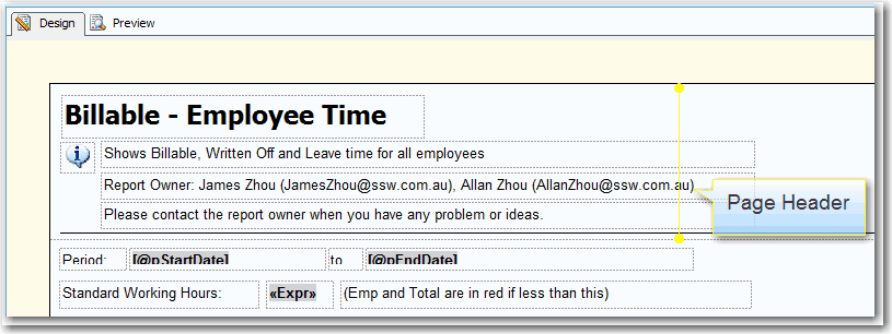
Figure: Bad example - 4 lines in the page header 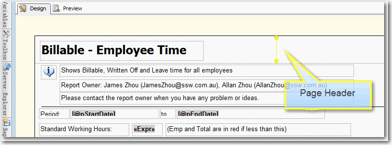
Figure: Good example - One line in the page header When you are working with reports that use time-based data (sales figures, employee productivity etc.), it is handy to see how you went this month compared to the past 6 months. The best way to show this is on a bar chart.
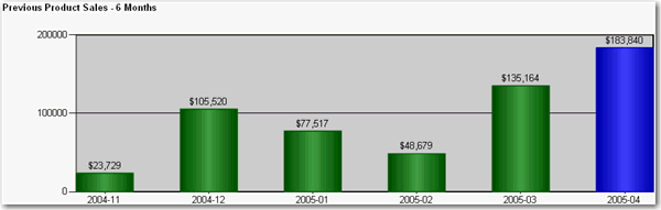
Figure: Good example - Use of bar chart to show the past 6 months of totals at the end of your report for easy comparison To do this:
- Create a new dataset in your report.
- Enter the following query, substituting "MyDate" for the name of the date field you are referencing, "MyTable" for the view or table you are selecting from, and "@pEndDate" for the name of the report parameter you are using for the data end date:
SELECT DISTINCT TOP 6 CONVERT(varchar(12), Year(MyDate), 101) + '-' + RIGHT('0' + Convert(Varchar(2), MyDate, 101), 2) AS Y , Sum(PaidTotal) * -1 AS Total FROM MyTable WHERE MyDate BETWEEN DateAdd(Month,-5,convert(varchar(12), Month(@pEndDate)) + '/1/' + convert(varchar(12), Year(@pEndDate))) AND CASE WHEN datepart(d,@pEndDate) = 1 THEN DateAdd(d, 1, @pEndDate) ELSE @pEndDate END GROUP BY CONVERT(varchar(12), Year(MyDate), 101) + '-' + RIGHT('0' + Convert(Varchar(2), MyDate, 101), 2) ORDER BY CONVERT(varchar(12), Year(MyDate), 101) + '-' + RIGHT('0' + Convert(Varchar(2), MyDate, 101), 2)- Configure the new added parameter 'pEndDate'
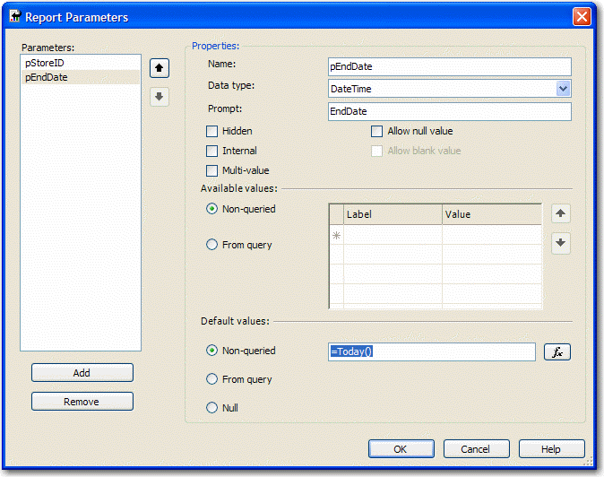
Figure: Change Data Type to DateTime and assign to the proper default values - Add a chart to your report in Layout view and change its type to "Simple Column".
- Drag the "Total" field from the Datasets window into the Data area on the chart, and the "Y" field into the Category area. Your chart will now look similar to the one below.
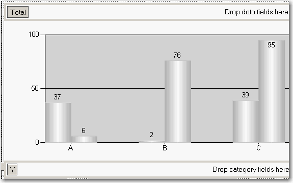
Figure: Build up the column chart in layout view - Now you need to set the last column to be a different color so it stands out. Right-click the chart and click Properties.
- Click the "Data" tab, click "Edit..." next to the "Values" box, then go to the "Appearance" tab and click "Series Style..." then the "Fill" tab.
- In the "Color" textbox, enter this expression, then OK all dialogs to return to the report:
=iif(Right(Fields!Y.Value, 2)=Month(Parameters!pEndDate.Value), "Blue", "Green")Users of the report service will find the data easier to understand and compare. However, in order for the report to be understandable, the data and chart must be clear and uncluttered.
Figure: Bad example - There is no chart to visually represent the data 
Figure: Bad example - There is a chart, however it is not clear 
Figure: Good example - Data and chart are clearly integrated into one 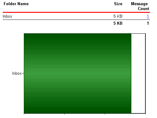
Figure: Bad example - Just a chart - poor scaling for only 1 record 
Figure: Bad example - Just a chart - poorly scaling when many records The reason for this problem is that the 'size' property of the chart control doesn't support expressions like 'Count(Rows) or queried values like 'Fields!RowCount.Value', so the chart control cannot adjust its size according to the data.
The solution for this problem is to use an embedded chart within the table - this will create a dynamic chart list similar to the list shown below.
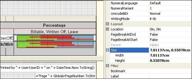
Figure: Size property of the chart control 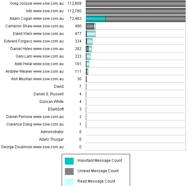
Figure: Good example - A table with chart To do this, you need to create a table in your report and add a chart into each of the rows.
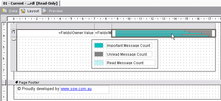
Figure: Embedded chart in a table will generate dynamic chart list Note: When rendering a report to your browser or an email, Reporting Services generates a separate image for every single image in the report, even if they are identical. When you are using graphs, images or charts in your report, this can cause a large number of images to be generated. Always include a red warning at the top of any emailed reports so that users do not try and forward or reply to them. Use a warning like this:
Warning: Do not reply to or forward this report in an email - Outlook may slow down or even hang.
In Reporting Services 2005 you can use an expression to specify the scale of your charts. If you do not specify a maximum value for your y axis, the bar charts become inaccurate, as you can see in this figure.
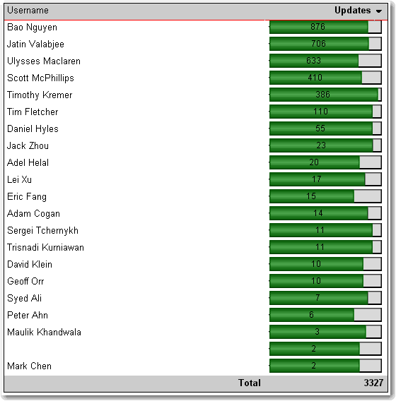
Figure: Bad example - With no scale value set, the charts do not display based on the correct scale Here's how to set the scale.
- In Layout view, add a new row to the bottom of the table
- At the bottom of the column with the chart, set the textbox value to =Max(Fields!MyTotal.Value), where "MyTotal" is the Data field you're using in the chart.
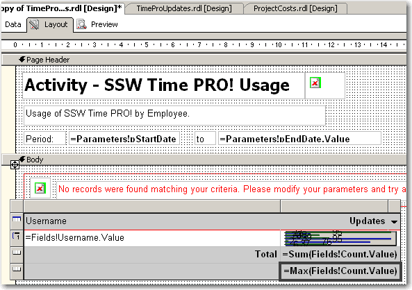
Figure: Add a new row to your table and set the max value - Set the textbox's Name property to MaxMyTotal (e.g. MaxCount)
- Set the new row's Visibility/Hidden property to true - you don't want to show it in the report
- Open the Chart properties and select the "Y Axis" tab
- Set the Maximum value to the value of the textbox, i.e. "=ReportItems!MaxMyTotal.Value"
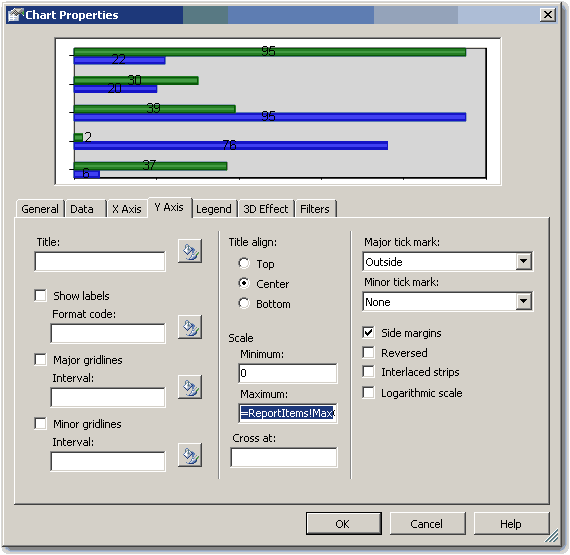
Figure: Set the maximum value to the value of the textbox - If you expect to have negative values in the chart (e.g. when comparing 2 values), set the Minimum to -1 multiplied by the max value, i.e. "=-1 * ReportItems!MaxMyTotal.Value". Otherwise set it to 0 (zero).
- If you expect to have negative values in the chart, select the chart value in the Data tab and click "Edit..." . Go to Appearance->Series Style->Fill and enter the following expression:
=iif(Fields!Change.Value > 0, "Green", "Red")Where "Change" is the name of your data field. This sets the color of the bar to green if it is positive, and red if it is negative
- Click OK and preview the report. The chart will now be using the maximum value across all the charts.
Figure: Good example - The scale is now correct This way is tedious and a "hack". We think that the scale should be automatically set with an option to customize it via an expression. See our suggestion about this on Microsoft SQL Reporting Services Suggestions.
Updated - fixed by Microsoft, see https://learn.microsoft.com/en-us/sql/reporting-services/report-design/set-a-minimum-or-maximum-on-a-gauge-report-builder-and-ssrs?view=sql-server-ver16
It is important to show previous and current data, as well as the changes between the two.
Figure: Bad example - Does not show the change between the previous and current data 
Figure: Good example - Shows the change between the previous and current data There will be cases in which the Change column has no meaning then you'd better to make this column invisible in your reports. In one of our reports we use an expression on Hidden property of this column to determine whether to show it based on the value of a parameter.
=iif(Parameters!ComparedExtractionID.Label = "N/A",true,false)Expression for Hidden property
When comparing two sets of data in a report (for example, sales this month compared to last), showing the change as a percentage is a bad idea.
For example, if you made 1 sale last month and 2 this month, you have had a 100% increase. If for another product you made 1000 sales last month and 2000 this month, that is also a 100% increase, but you've sold 1000 of that product compared to 1 of the other product.
For this reason, show the difference as an actual value, so you can compare all values easily. See the figures below for examples. To see how to create the negative/positive valued chart, see Do you use expressions to show the correct scale on charts?
Bad - Notice how the "change" column in the report doesn't accurately reflect the difference in downloads - 1 download last month and 2 downloads this month will yield a 100% increase - which looks impressive as a percentage but really isn't.
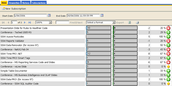
Figure: Bad example - The percentage change column in this Reporting Services product downloads report is misleading Good - This works better just showing the difference between the two values over the 2 months.
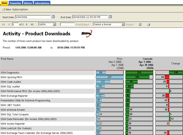
Figure: Good example - The column works better as just a difference between the current and previous download totals For readability, always use alternating row colors.
Use White and Gainsboro (a light shade of grey). Select the row, and enter this expression in the BackgroundColor property:
= iif(RowNumber(Nothing) Mod 2, "White", "Gainsboro")
Figure: Good example - Alternating row colors greatly improve the readability of reports, and is very easy to do in Reporting Services A report with drill through like this should have the number in nodes like Outlook.
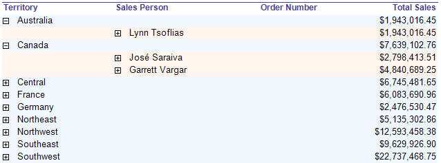
Figure: Bad example - This does not have the nodes count 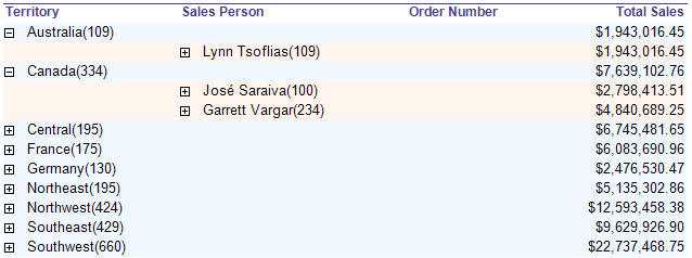
Figure: Good example - This does have the nodes count Here's how to add nodes count to the textbox with "collapsed(+)" in your report:
In the Expression property of the Textbox, add an expression to show nodes count. Use the following expression:
--Change the SQL ( or add a new DataSet )
SELECT a.TerritoryID, ( CONVERT ( varchar,a.TerritoryDescription ) + ' (' + CONVERT ( varchar, count ( c.TerritoryID ) ) + ')' ) AS Number, ... FROM Territories a INNER JOIN EmployeeTerritories b ON a.TerritoryID=b.TerritoryID, ... GROUP BY a.TerritoryID, a.TerritoryDescription,...

--Expression to show nodes count

= Fields!Number.Value
Bad example - Get the Outlook Node Count look by changing the SQL.
--Expression to show nodes count

= Fields!Name.Value + "(" + CStr ( CountRows( ) ) + ")"
Use the CountRows() function to get the Outlook Node Count look
Note: The CountRows function is one of the several native functions provided by Reporting Services and returns the count of rows within a specified scope. If no scope is specified, it defaults to the innermost scope, which in our case resolves to the static group that defines the values in the data cells.
Having decimal places is generally not required when the numbers are there to show a general indication.
Only include decimal places on reports for accountants that will be used for reconcilations.
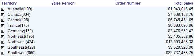
Figure: Bad example - This does display decimal place 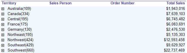
Figure: Good example - This avoid displaying decimal place Here's how to remove decimal place in your report:
In the Expression property of the Textbox, add an expression to format currency values. Use the following expression:
--Expression to remove decimal place

c0 = FormatCurrency( Sum(Fields!TotalDue.Value), 0)
Note: The FormatCurrency function is one of several native functions provided by Reporting Services and returns an expression formatted as a currency value using a currency symbol according to the language setting on the textbox.
What is some managers don't want decimals and accountants do?
For some users (usually accountants) the number is critical to accurate reporting and reconciliation. In such cases, add a parameter to let the users choose.
This workaround should not be necessary. See the suggestion to Reporting Services ?Give users a runtime option to increase or decrease decimals places, so we don't need this workaround.
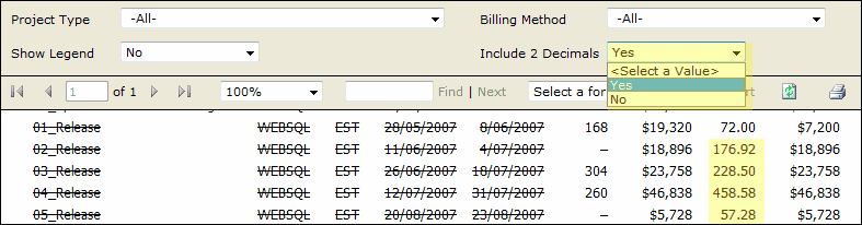
Figure: Good example - Add a parameter to set the decimal places format Same height of table row across all reports gives users consistent and professional impression.
We use the default height of table row (0.63492cm) as a standard to make sure all tables in our reports have consistent row height.
This rule also applies to height of Textbox in all reports.
Figure: Bad example - Bad Height 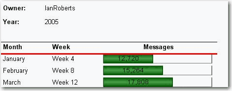
Figure: Good example - Good Height 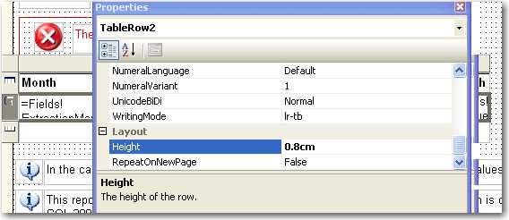
Figure: Bad example - Bad Height In Design View 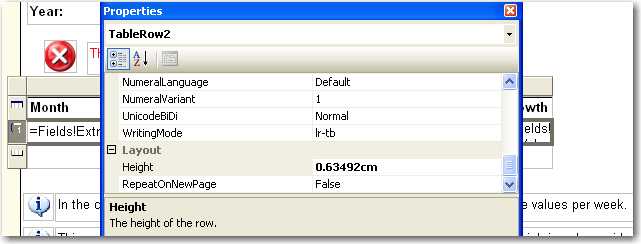
Figure: Good example - Good Height In Design View We have a program called SSW Code Auditor to check for this rule.
It looks better to display zero numbers as blank than to leave lots of '0' in a report.
Figure: Bad example - Bad zero number format 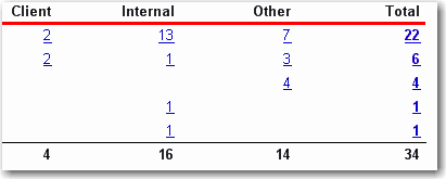
Figure: Good example - Good zero number format It's easy to do with a simple format code '#,#'.
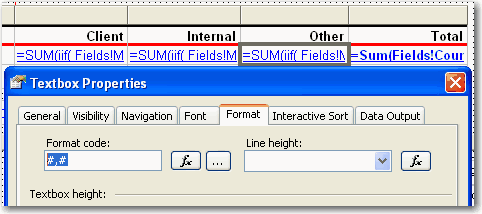
Figure: Format code It will give a professional look for your report to show time in a clear and consistant format.
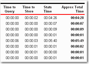
Figure: Bad example - Bad time format 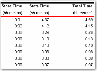
Figure: Good example - Clear time format It is much better to display all of the report parameters in report body, because it will be clear for users to know what they search not only in IE but also in exported file (PDF, Excel).

Figure: Bad example - Not displaying all report parameters 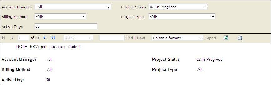
Figure: Good example - Displaying all report parameters Sometime you want your report to break at somewhere to separate different part of content into individual pages. A logical page break is what you need.
Logical page breaks are defined in the report definition by using the PageBreakAtStart and PageBreakAtEnd properties in various report elements, including group, rectangle, list, table, matrix, and chart.
Here is an example of how we add logical page breaks in a report to make each subreport start showing at right beginning in a new page.
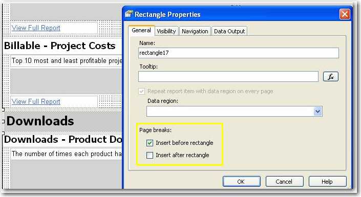
Figure: Insert a logical page break before a rectangle containing a subreport 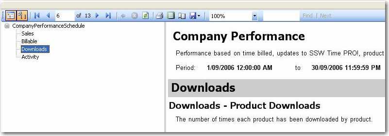
Figure: The subreport started in a new page By default charts in table grow with rows. This makes height of charts inconsistent and the report ugly.
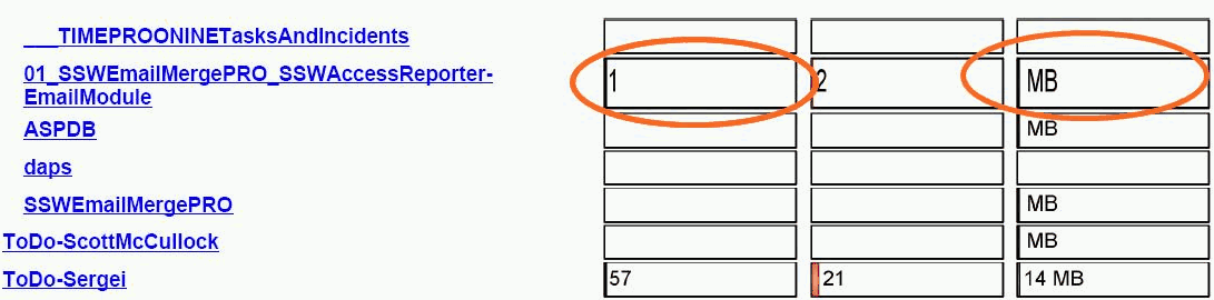
Figure: Bad example - Inconsistent chart height Putting a rectangle in table cell and placing your chart in the rectangle fixes this problem.
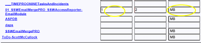
Figure: Good example - Consistent chart height When a report has many columns and each column contains small amount of data, it is a good idea to use vertical text for the column headers.
By changing the WriteMode of a text box from:
lr-tb (left to right, top to bottom)To
tb-lr (top to bottom, left to right)...your text will become vertical, and you save lots of space.

Figure: Bad example - Not using vertical text for headings, when you have lots of thin columns 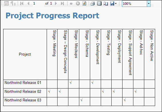
Figure: OK example - Not using ticks and crosses Take it to the next level by using emojis in your report.
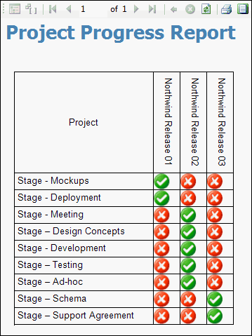
Figure: Good example - Use emojis to improve the quality of your report Emojis can add visual interest and make your report more engaging and easier to interpret at a glance.
Note: Microsoft have not given us the option of having the vertical text bottom to top. It would be easier to read. This suggestion has been added to Suggestions for Microsoft RS.
It's common that gray color means old, so we use gray for past data in reports.
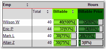
Figure: Bad example - Old data not in gray 
Figure: Good example - Old data in gray


