Microsoft SharePoint and Office Forum
Challenge
Microsoft Australia approached SSW to develop a "showcase" website that they wanted to use for the 3 years of Microsoft Forum Conference Event for SharePoint and Office. The prior website required a new design + and overhaul of the layout, interaction and navigation. In addition to it being a clean public SharePoint 2013 site, it integrates with various other technologies.
Many highlights to see, including a great use of jQuery here: http://sharepoint.microsoft.com
A key requirement of the engagement was to deliver the completed site in less than three weeks. This would allow Microsoft and the marketing teams involved in the event to deliver invitations directing invitees to the website well in advance of the event dates. In the time allocated, SSW had to carry out the following
- Create a site concept and design
- Implement the site in SharePoint
- Add site content provided by Microsoft
- Internal testing and UAT
- Implement changes demanded by software audits undertaken by Microsoft
- Provide the completed site with a deployment strategy to the hosting company
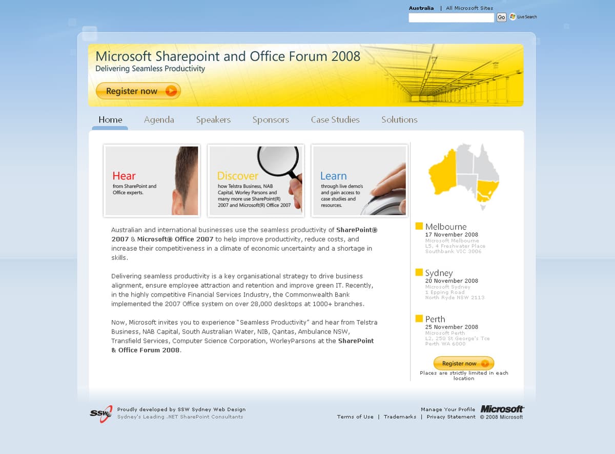
Figure: The SharePoint and Office Forum website home page
The SSW team of designers, SharePoint developers and a project manager was assembled and work began.
Process
At the very start of the project, we involved our lead user experience designer to investigate and identify the key areas of the website and the message that we wanted the website to convey. The SharePoint site structure was then developed to support the content provided by Microsoft.
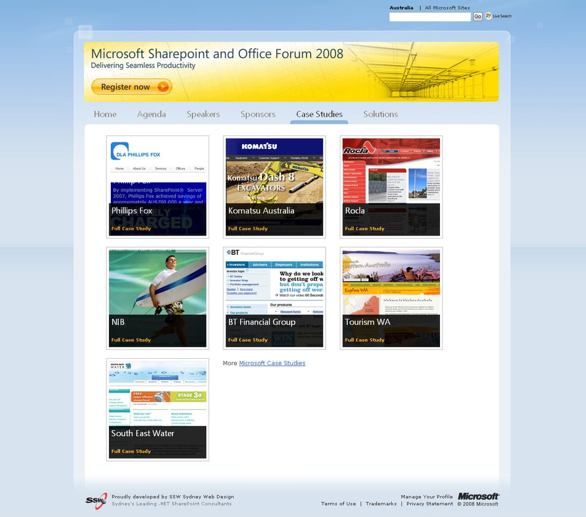
Figure: The Case Studies page
The site design evolved as the graphic designers worked closely with the developers over the entire project. The team worked seamlessly to match one anothers requirements and limitations without compromising quality and to avoid unknowns. This unorthodox approach ultimately played a key part in allowing the project to be delivered on time.
User Experience
Microsoft requested that the SharePoint Conference website should be simple to use whilst looking clean and professional, in favor of the heavy, product-oriented layout which typified previous Forum site designs. In addition, the site was required to demonstrate the possibilities when customizing a public SharePoint site. In essence it should steer clear of the default designs provided by SharePoint.
Images were used to communicate the site content and are immediately recognizable for end users. Structurally, each page is arranged in such a way that users can quickly register for the event whilst providing easy access to related information about SharePoint and Office products.
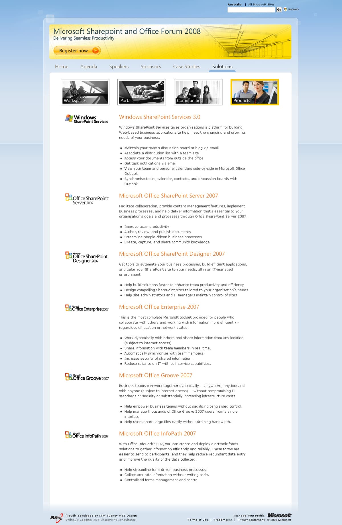
Figure: The Solutions page demonstrating the use of images as a navigation tool
The Agenda page was improved dramatically to provide rich content about each session including topics and speaker info. This allowed the user to gather in depth information about the agenda without navigating back and forth between pages.
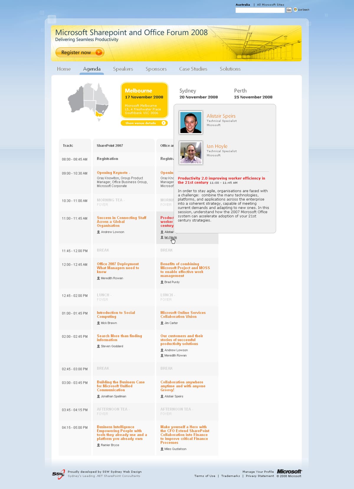
Figure: The Agenda page with speaker and presentation information displayed
Technologies
The Web site is built on SharePoint. One of the key benefits of SharePoint is the web publishing features that allow Microsoft to manage the site content. The site is built on SharePoint lists which host repeated information in the site such as agenda, speakers and venues. The use of lists allows content to be modified in one place and immediately be reflected in different parts of the website. Microsoft can manage the site content without relying on developers, allowing the site to be far easier to maintain.
JQuery was used throughout the site to create a rich Web 2.0 website in SharePoint. The Agenda page is one example where JQuery allowed us to enhance the user experiencing by efficiently presenting data. Bing Maps (and Google Maps) integration was used on the Venue pages to identify the event locations.
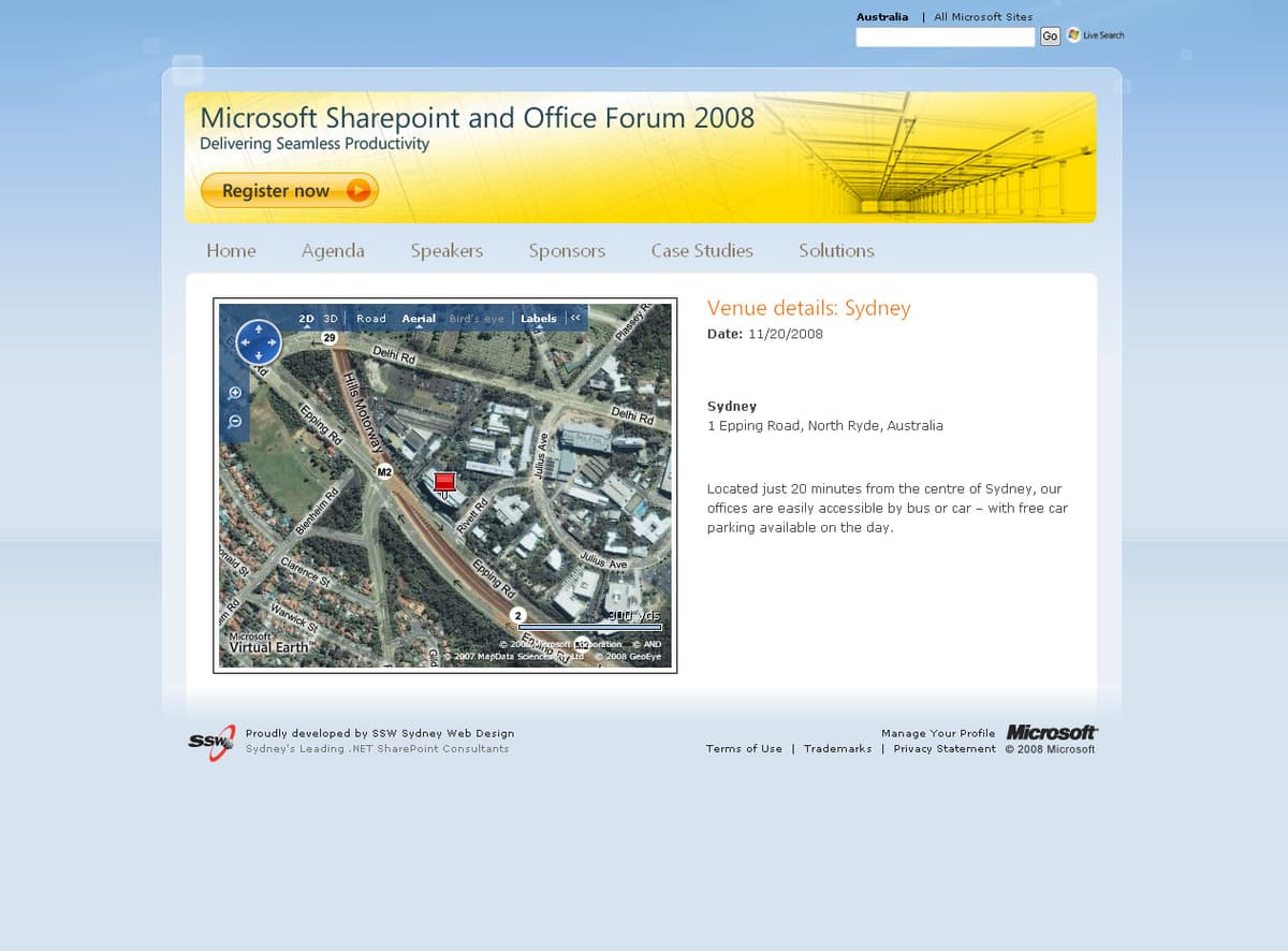
Figure: Bing Maps (and Google Maps) integration on the Venue page
Results
The website has been released to the public on schedule. Both the client and the development team were very satisfied with the result.
"The people at SSW were great to work with from concept to delivery, welcoming, friendly and professional - the outcome for us was a high quality site delivered in a very short timeframe"- ROBIN YOUNG, MICROSOFT PROJECT LEAD